Pebble just keeps getting better and better. But will it be enough?
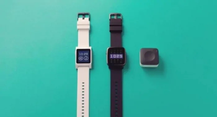
Nextgen Pebble smartwatches are around the corner. In the coming months the Silicon Valley upstart will ship the Pebble 2 ($129) and Pebble Time 2 ($199). Update models include heart rate monitors, larger e-paper displays, and even better battery life.

Also, look for an update to the operating system. Pebble OS 4 is just around the corner. Scanning the key features in the upcoming release reveals a series of refinements designed to make Pebble’s ease-of-use that much better.
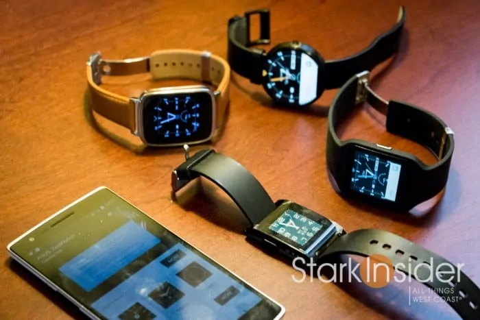
I’ve been a fan of Pebble’s simplicity since the original was released in 2014. Not that I don’t like the Apple Watch and Android Wear devices. They’re decent. Time and again, though, I find myself picking up trusty old Pebble Time instead of say, the Wear-based Huawei Watch (unreadable outdoors in direct sun) or the Moto 360 (terrible battery life). Pebble gets a lot of the little things right: long battery life, easy-to-read display, always on screen, fun watchfaces, intuitive physical buttons. All told it’s a smartwatch that just works. And doesn’t cost and arm and a leg.
So along with a pair of new watches, Pebble is set to unleash Pebble OS 4. Here’s some of the more interesting things that will be coming along with the update.
Timeline Quick View
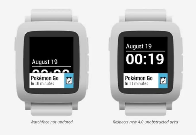
It’s called Timeline Quick View. The new feature will push upcoming appointments to your watch face. Nothing new about that. But, with Quick View, the notification will appear at the bottom. If the watchface supports the new OS 4 capability, it will move up and out of the way. That way you can see the calendar notification, and still be able to see the time, like this:
More (Cute?) Icons
Pebble! Now twice the fun! With more icons!
Look for more, possibly cute, possibly annoying, icons.
Should they choose, developers can incorporate custom icons for their Pebble faces and apps. I like what Pebble has done with the overall aesthetic of its UI. It doesn’t take itself too seriously, yet functions as exactly as you’d expect. Sure, the experience can feel a little bit Pokemon at times. But there charm is undeniable.
Heart Rate Monitor UI
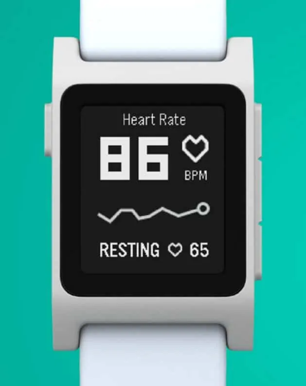
Not sure how this will look yet (though you can get a sneak peek in above photo), but if it’s anything like what Pebble has done with fitness and sleep tracking, look for a simplistic approach to heart rate tracking. That will likely include a daily average, along with a second page that will include a trend chart over the last seven days.
And there’s more in Pebble OS 4.0
Look for AppGlances. These are single lines of text that will scroll across their respective apps when a user is scrolling through the launcher. These quick status updates could come in handy when, for instance, looking at the weather, a recent reminder, or ETA for your Uber.
As the name implies, One Click Actions will allow users to click a button to perform the most common action associated with an app.
Smartwatches: The Next Wave

The coming months will be interesting for the wearable market, and, in particular, for smartwatches. Growth has been quite anemic. After a brief honeymoon phase, consumers have generally rejected the idea of a $300+ nice-to-have notification device for the wrist. Prices of existing models have plummeted.
Apple is readying its sequel to the Apple Watch.
Google is in the final legs of testing for its updated platform. Android Wear 2.0 should begin to appear on new (and many of the existing) smartwatches in the coming months.
And, little Pebble keeps chugging on, Kickstarting its way year-on-year, innovating along the way. Amazingly, even against the big guys, it’s Pebble that seems to be the only one that values simplicity and ease-of-use over complexity and a never ending parade of dubious features.
Take phone calls for instance.
Who in their right mind would want to take a call on a watch? Wouldn’t the smartphone in your pocket do a much better job? And wouldn’t it also be the more polite thing to use in a public space? That hasn’t stopped Google from chasing down it’s Dick Tracy dream, and incorporating capabilities for speakers and microphones into its smartwatch platform. A fun party trick to be sure. But wouldn’t it be nice if they could improve health tracking, the usability of the Wear app (it’s a mess), and Bluetooth connection reliability? Sometimes I fear Google-think (that everything,e very feature, every function, must be re-engineered and made vastly superior thanks to the Googlenauts) infects straight-forward, rational thinking — the kind of thinking that might put Wear devices into the hands of regular people for feedback. Pebble seems to get this.
As Google (and its partners), Apple and Pebble prep for the next wave of smartwatch innovation, it will be interesting to see how their respective strategies intersect — or diverge.
Will fitness tracking be a continued point of emphasis?
Will smartwatch apps take-off?
Will battery life on the Apple Watch and Wear devices improve significantly?
And… what about prices? It seems as though there’s not much long-term demand for devices that cost $300+. Even Apple had to discount its firstgen watch to clear inventory.
So many questions. Meantime look for Pebble OS 4 to arrive at about the same time the Pebble 2 lands, which should be some time during September 2016.


