 Being a marketing vp here in the valley means I get to lead all kinds of marketing organizations and products. But it seems that nothing draws on heart strings more than a logo. Or as the NY and SF crowd call it… branding.
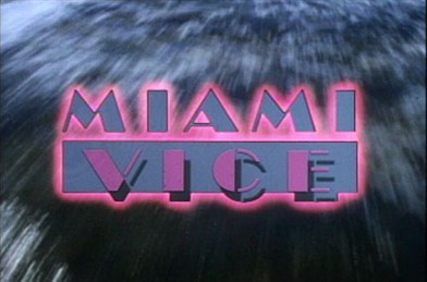
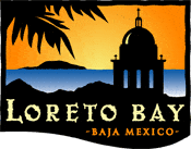
So it was a small surprise yesterday when I received an email from Loreto Bay (promoting an upcoming homeowner’s weekend) with what appears to be a new corporate logo. My first reaction: Miami Vice. This apparently new logo brings back a lot of 80’s nostalgia. Don’t get me wrong – I love new wave, Testarossas, Wall Street, and Scarface, but not necessarily when we’re talking about Baja, Sea of Cortes, vacation homes, and beaches.
Take a look, and you be the judge.
CURRENT LORETO BAY LOGO:

- Classy, unique border shape
- Evokes mission, sense of history
- Great use of color
- Property starts $400K+
NEW LORETO BAY LOGO (unconfirmed):
- 80’s Miami Vice
- Dated look, clunky
- Colors are horrid
- Property starts $4,000+


