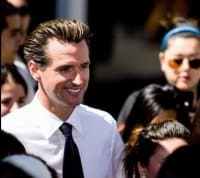
 Our very own social media savvy San Francisco mayor, Gavin Newsom, knows how to build some good old fashioned Twitter and Facebook buzz. This time, it’s a vote, not yet for Governor, but for his new campaign logo.
Branding and marketing gurus, it’s your time to shine and put a click of the mouse to work.
While many stories focus on his hair, his restaurant, or wine business, it seems that, finally, the word is getting out that he’s running for Governor of California.
First, though, a brief history, then my take on the 6 logos.
In 2004, Gavin Newsom became the youngest mayor in more than 100 years. Many thought to themselves, finally this city is becoming more liberal! He founded PlumpJack Wines, now a thriving, statewide enterprise of 15 businesses with almost 1,000 employees.
So, then, what next? Maybe it’s time to take on what is possibly the most mathematically complex State budget and run for Governor of California. After all, we’re kind of due for a change of accent here.
Now onto the logos. Team Newsom have thrown out 6 logos for your voting pleasure:
Here’s my take on each.
1. All-Star Sports Logo?
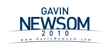
I like the simplicity of the font and colors. I don’t like the arc in the blue sub-title and the way it covers Newsom. It also feels somehow like an all-star game logo, no?
2. Sunrise
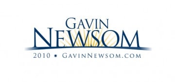
This is my favorite. It provides all the pertinent information: campaign year, Web site address, in addition to his name of course. But it then adds that most pleasant of thoughts: morning California sun.
3. Green Jeans
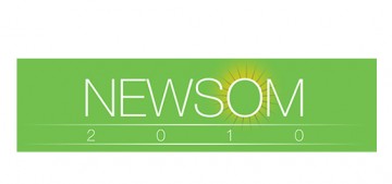
You know, there was a time when green—the color—was cool. But that day is not now. It’s been bludgeoned to death thanks to every single environmental marketing hobo living on this green earth, driving a green car, buying organic green food and smoking green cigarettes.
4. Looks Familiar!
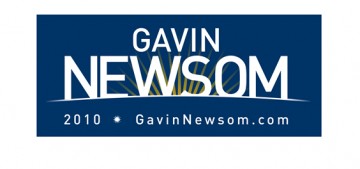
Thought I wouldn’t notice? They took my favorite logo, inverted the background and changed to a non-serif font. Trying to pull a fast one on poor us! Please don’t tell me this is how Gavin will run things in Sacramento. At least give us some variety here.
5. Mr. Stretchy
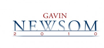
Not bad. Probably my #2. But you don’t get the Web site address (although it’s probably not hard to deduce), and there’s one too many Photoshop effects in play for my taste.
6. Doomsday
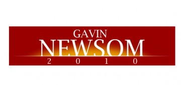
More a nuclear vision than campaign victory. Either that or an AM Television talk show.
Want to vote, here’s the link: Campaign Logo Contest

