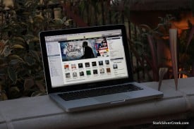
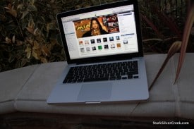
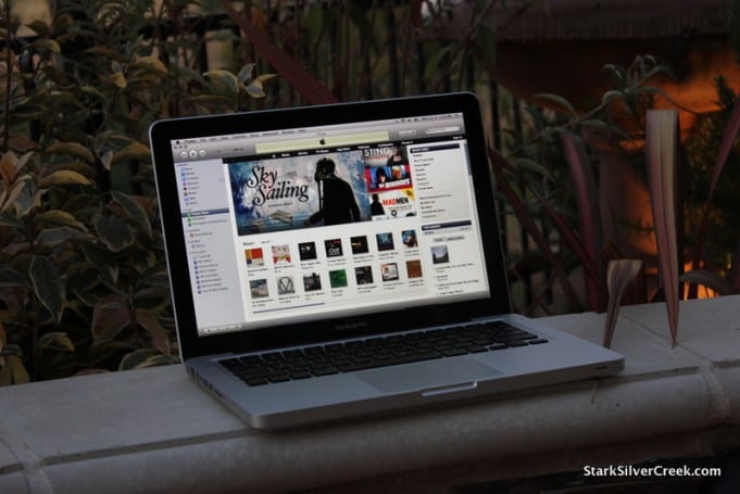
 … the display. Hands down, the MacBook Pro has one of the best—if not the best—display of any laptop I’ve seen on the market today. It’s the primary factor in making “the switch.” As a die-hard Lenovo fan it was a tough decision. I’m addicted to the little red nub, or TrackPoint, found on most ThinkPad models. Over the past decade I became accustomed to using it to quickly move the cursor without having to remove my hands from the keyboard. If it wasn’t for the convenience of the nub, the decision to move to Mac would be a lot easier. Still, in the end, the screen won me over. And, as of 3 weeks ago, I’m now using a MacBook Pro 13″.
Like a lot of you I’m sure, I spend most of my life in front of a computer screen, professionally and personally. Who doesn’t? I still read the odd magazine in traditional format—notably Bloomberg BusinessWeek, Car & Driver, and Wine Spectator (like the large layout)—but for the most part I read my news online, do my work online, connect with others online, rant online and, generally, live online.
So, for me, the screen is the thing. Ultimately, it trumped the little red nub pointer from Lenovo. I’d rather adjust to using a touchpad then have my eyes fatigue because contrast is not good enough, for example.
What makes the MBP display great?

Two things: contrast and brightness. Both are best-in-class.
The contrast simply means the text has pop. There is more distinction between black characters and the white background. Why does it matter? Over time it means less of the aforementioned eye fatigue. Ultimately I can work longer, and feel less tired. I might even have the energy now to chase Loni with the Canon T2i DSLR through the streets of San Francisco or across wine country.
Brightness, too, is important since it means I can actually work outside. I’d guess the MBP (I’m basing this on the 13″ model which is the one I use) is about 50% brighter than, say, the ThinkPad T60p and about 25% brighter than the new ThinkPad Edge. This is not scientific of course. But I’ve also researched it on notebookreview.com which takes these matters quite technically.
Am I missing little red nub?
Yes. But I’m quickly adjusting.

The luxurious, glass TrackPad on the Mac is brilliant. I’ve become hopelessly accustomed to the two-finger inertia scroll which is a perfect replacement for using the page-up and page-down keys. For my money, though, the best keyboards are still found on ThinkPads. Lenovo has perfected the tradition that IBM started; comfortable travel, sculpted keys. But Mac is a solid number two. Plus I appreciate the lighted keyboard too; very handy when I’m typing out back, listening to the fountain while pleading for inspiration to strike so I don’t need to stare at an empty screen with blinking cursor, for too long.
What do I think of Mac OS X, battery life, apps, build quality? Stay tuned as the (riveting) MacStark adventure continues.
On a side note: When did Apple become Big Brother? Someone call Alanis Morissette (go Ottawa)… now, that’s ironic!


