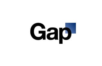
Say it ain’t so. The new Gap logo (and I use that term loosely) is stirring up huge buzz on the Internet, and I’m wondering if that’s exactly the goal HQ had in mind. Either that or the marketing department plebes have completely lost their minds.
I, for one, didn’t realize Microsoft had a logo design division. But how hard is it to upgrade from the old logo, and is this as good as XP? The money seems to be suggesting this new logo is a flop of Vista-level proportions.

The new logo uses a sans-serif font and ditches the classic blue-blox, instead using a small square in the upper corner with what some might consider a grade-school level gradient effect. So much for iconic glory.
New York Daily News writes, “The Helvetica font, which is perceived as utilitarian – the MTA uses it for subway and bus signs – is not seen at the most creative choice.” Ugh, the new Gap, styling for public transportation.
Comments on Gap’s Facebook page are, shall we say, choice:
“I hope that this new logo wasn’t paid for.”
“What a shi!@#y, shi!@#y thing to do.”
“GAP, you guys are brilliant!! The Buzz, the free PR, the free logo design and opinions from designers all over the world! This campaign is awesome! Kudos!!”
Many note that The Gap has only replaced the logo on a few places including gap.com, perhaps suggesting the move is not permanent, or a publicity stunt.
Is The Gap thinking outside the box or pulling another all-too-common viral prank?


