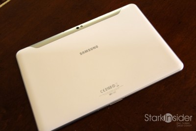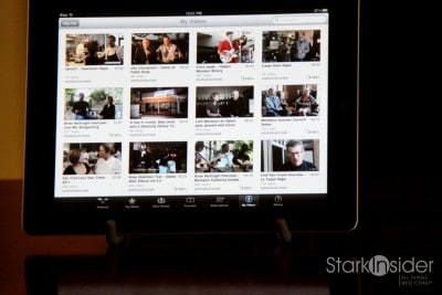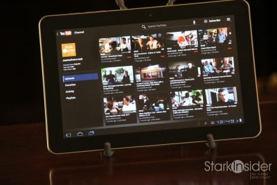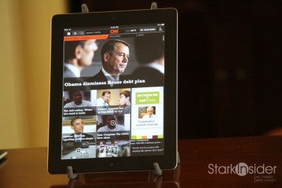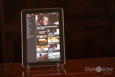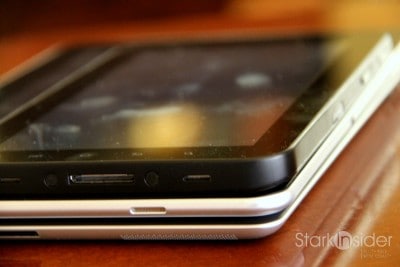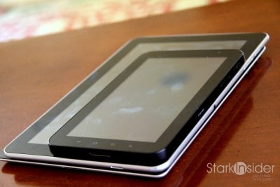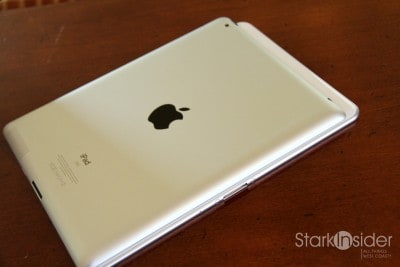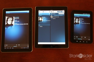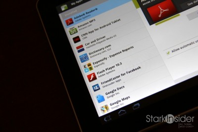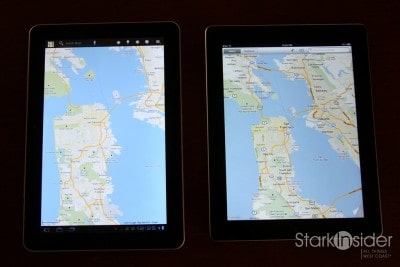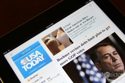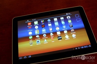
Can the Samsung Galaxy Tab 10.1 top the almighty Apple iPad 2? It’s a tall order. And I’ve been testing the new tablet (16GB, $499) that Samsung sent us for a week or so now, and will have my full take on it, plus my answer to that very question, in the coming days.
Fortunately we have all manner of tablets around here — netbook… netbook who?! — and so it’s been very telling which devices those in our office and beyond turn to. And for us new media types whose lives perpetually unfold on the (run) go, these tablets can make for interesting travel mates.
So far I’ve tested this Tab at a winery (a most perfect pairing), on the road (all signs point to go), on a plane (where’d the time go?) and, of course, around the home.
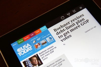
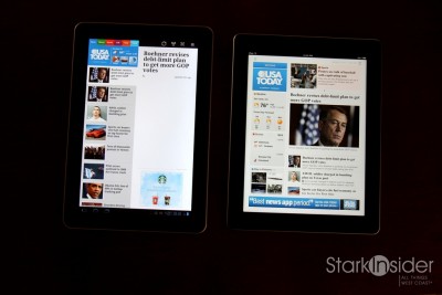
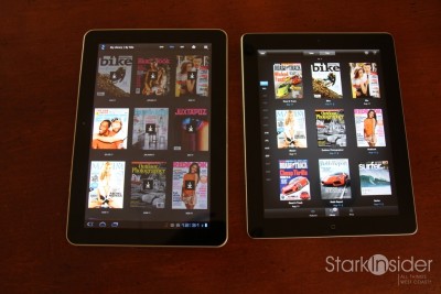
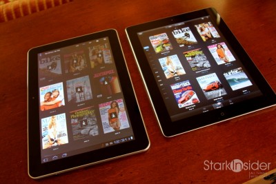
I know the world doesn’t exactly need yet one more review of this tablet, or yet more comparison of Android Honeycomb to iOS, but I’m going to come at this shoot-out from a decidedly non-spec perspective. Sure, numbers tell part of the story, and this Samsung brings decent firepower to the party. But they don’t mean bunko, really, when it come to real world use. Does it do what you want? Is it easy to use? Productive? Fun? Talk to me.
And that necessarily means apps will likely be the focus. Without software we really aren’t left with much. I’ll be comparing various apps across multiple categories including news, e-readers, music and vide players/services, document viewers, social networking tools, and games.
I’m an unabashed fan of Android, having owned the original Droid since November 2009. When I travel I absolutely must have the original T-Mobile Samsung Galaxy 7″ tablet with me. Google Music is a winner. But I also enjoy unwinding in the evening with a glass of Napa Chard, and Flipboard on the iPad. Call me an equal opportunist technophile.

First impressions: Samsung Galaxy Tab 10.1
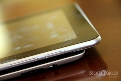
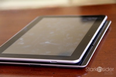
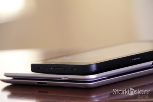
— Nice build quality- Samsung knows hardware (witness the killer kit of Android smartphones, the Galaxy S II).
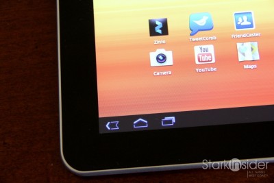
— Not liking the home (and back) button placement in lower left; doesn’t feel natural and is inconvenient to reach. I should note this is a Honeycomb issue, not a fault of the Tab.
— Where’s Netflix, and Hulu? Come on Google, get on it! While you’re at it, pay Mike McCue a bundle to get Flipboard on Android too.
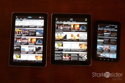
— Fonts look a little cleaner and sharper compared to the iPad 2.
— Swiping and scrolling rules on iPad still — the Tab is decent, but nothing seems to top what Apple can do here.
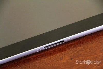
— Same charging connector as the original 7-inch tab: like it.
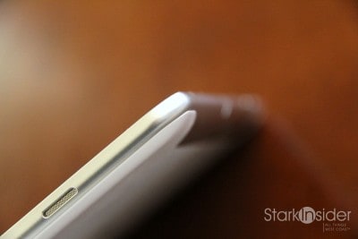
— I also like the two small stereo speaker placement on edges, near top (better placement than iPad 2).
— Notification rules all on Honeycomb; far better than iOS.
— Android Honeycomb and the Tab 10.1 feel like more of a netbook than an e-reader which is not a bad thing; the desktop and widgets of Honeycomb in particular give it a more powerful feeling — but it’s also more complex to learn compared to the click and go simplicity of the iPad.
— Social Networking letdown: I can’t find a decent Twitter OR Facebook app for Honeycomb; TweetComb is decent but can’t hold a candle to the native Twitter app on the iPad; Meanwhile, Google+ is uninspired — was this designed by and for engineers, by chance?
— Google Navigation = killer. Say no more.
— Price… too high. Android will only win (at this point) as a value play. Apple has premium design and can command premium price. $499? I can get an iPad 2 for that. This needs to sell for $250 (think Netbook positioning) – there it can do well in my humble estimation.
On the business side, it’s not much of a stretch to suggest that RIM’s woes are a direct result of the stunning success of Android (and to a lesser extent iOS). More on that later.
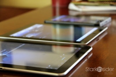
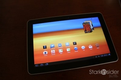
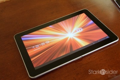
For now, here are the photos. Easy viewing for a summer Friday.


