This is part 2 of a 5-part review series of magazine and news discovery and aggregation apps for iPad and Android. Part 1 featured a review of Zite for iPad. Now Android gets some action too.
Barely a year old now, Pulse was one of the original nextgen news apps — swipe-able, easy to set-up, and not without a certain amount of visual swank. And it’s still one of the best.
Available for iPad and Android, it was among the first apps I’d turn to when toting around my 7-inch Galaxy Tab (a workhorse I tell you!).
Best of all, unlike Flipboard and Zite, it’s available to us sexy-app starved Android fans. Think of it as Flipboard lite. It’s highly functional, but doesn’t quite pack all of the pizazz of the market leader. Still — and I guess I’ve already spilled the beans here — if you’re on a Samsung Galaxy Tab 10.1 or Moto Zoom, what are you waiting for already: head to the Google Market, and witness news and RSS aggregation in its glory. Small caveat. It doesn’t run that well on slower devices such as my trusty Moto Droid (gen1) – although that doesn’t matter much as the screen is too small anyways, and Pulse is best suited for tablets 7-inches and larger.
Like a fully stocked bar…
Pulse comes ready to play. Like many of its peers, when you first load the app you’ve already got a nice collection of topics — tech, news, business — to whet the appetite. I found sorting news sources, and adding new columns very easy. Everything is draggable. In short order you can sort, and organize to your news-loving heart’s content. Browsing the Pulse directory of “top picks” is great stuff. All the big names are here: ESPN, USA Today, Wall Street Journal. Plus, the biggest and hottest Blogs are here. Mashable. TechCrunch (if not just a tad soapy these days). Engadget. ArsTechnica. Take your picke. Verge? Don’t see that one yet.
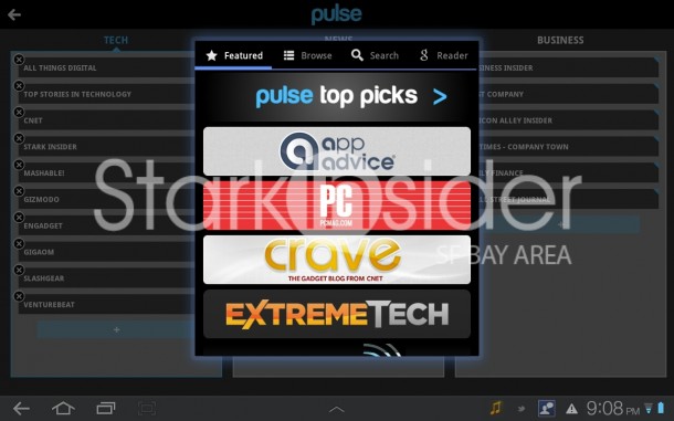
Google Reader integration is here … what’s that I hear? … oh yeah, Google, not so happy about all this Flipboard, Zite action. Seems like that might cut into online ad revenue (just a crazy, wild guess there). Rumor has it Propeller is coming, their answer to Flipboard. It makes sense. And probably overdue already. Google Reader is great, Fast Flip not so much. So it’s high time they get on it. And don’t you dare, Google, bring it to iPad first (ahem, Google Catalogs).
Okay, back on point.
Swiping the Android grid…
Whereas apps like Zite, Flipboard and AOL Editions look like magazines, Pulse looks more like a stock ticker you might see on CNN. It’s not a bad thing, necessarily, just different. If you don’t like lots of squares, you might get somewhat nauseous, but I think it works perfectly fine. Although, I do wish it would run just a little faster on the Samsung Tab 10. Then again, no app on it seems quite as fast as the iPad.
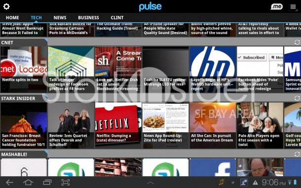
Scanning headlines is as simple as swiping across the various swim lanes. Under Tech these days that means a lot of Netflix talk. And, in the world of news, Ralph Nader praises Sarah Palin? Okay, maybe not so surprising.
Reading articles…
… is a snap. I really like what Pulse has done here.
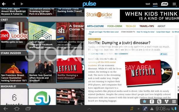
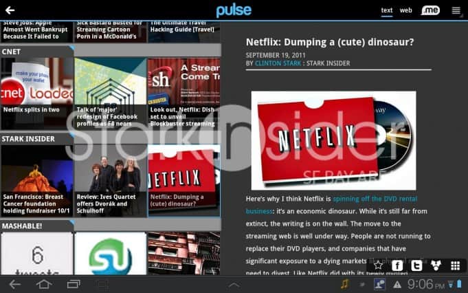
When you tap a headline, the story overlays on the right sight of the screen (defaults to “text” but available too in original “web” mode with the tap of a button at the top). It’s quick too. And there’s no disruption to the rest of the interface. Power RSS readers are going to like this. Sure others may have page curls, and cute effects. Pulse, though, gets it done el pronto. On the Tab words were in a white font against a dark grey background. All good there, I say.
You RT, I RT, We all RT…
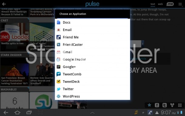
And yes, so it goes with Pulse. At your disposal: dedicated Twitter and Facebook sharing buttons, plus the option to share it on just about any other app running on your Android tablet or iPad.
Read It Later…
I actually don’t use this feature. Some swear by it, and they’ll appreciate that Pulse lets you save stories via four services: Pulse.me, Read It later, Instapaper and Evernote. I’m more of a read-it-now kind of guy, so choose your poison. This feature I did not test. If you have, let me know if it’s working well for you – plus, why you do it to begin with?!
The scoop…
Pulse is the biz. Pure and simple, it gets the job done, reliably. One feature I’d like to see is a one-click off-line mode. Say I’m about to board a flight from SFO-NYC, wouldn’t it be nice if I can grab all of the top 3-4 stories and have them available locally at 30K feet sans wi-fi? It could very well exist in the current version of Pulse and I just haven’t discovered it yet, but this is where downloadable apps like AOL Editions have an advantage. It’s a trade-off I gather. What’s more important to you: the latest news feeds, or a wholly available snapshot in time? It probably depends on your mood and situation.
Net-net: the grid is in!
Download Pulse:
[Android]
[iTunes]
Alphonso Labs:
[Pulse.me]
Part 3 of the 5-part news-app round-up is coming tomorrow. Plus, stay tuned for a big news discovery app related announcement coming up next Monday!

