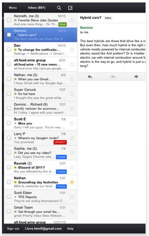
UPDATE: Apparently the app has been pulled from the store. Reportedly, a notification bug causes an error message to display when first loaded (I saw it and closed it, thinking it was an anomaly… oops). When you clear the message, and login, all should work fine. Per Google’s Dave Girouard on G+: “Googla culpa! Sorry but we pushed a bad version of our iOS app for Gmail. More info shortly – we’re working on it.”
Finally, a native Gmail app has arrived for iPad and iPhone. And wouldn’t you know it, the first place I heard about it? Via Robert Scobble on Facebook (though he was pushing the conversation to Google+) – is this guy a one man CNN Tech newsroom or what?!
I’m a huge fan of the Google cloud. We use many of the apps–Docs, Calendar, Reader, Checkout, etc.–for our online businesses. But out of all of them it’s Gmail I wouldn’t want to go a day without. I’ve never been happy with its non-Android incarnation. Using the built-in email app on iPad or iPhone is a decent experience, granted, but it lacks many of the features on Gmail so great in the first place.
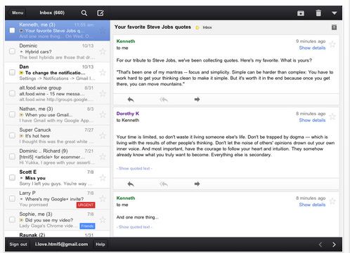
I gave the new app (designed for speed, efficiency and touch) a spin on an iPad 2 and here’s my first impressions.
First, I couldn’t find the app on iTunes. Possibly because it just launched today, and it takes time for new apps to appear in search — somehow I’m doubting Apple will feature the exciting, new Gmail app by Google. Instead I found it on iTunes on my Mac and downloaded it there and then synced it to the iPad 2.
Setup is as simple as entering your usual Google credentials.
Those who are familiar with the Gmail app on Android will feel right at home. There’s not a whole lot of difference, from what I can tell. Poor iOSers, though, no widgets for you!
The most significant difference using the native Gmail app vs. the stock iOS email app are labels. In my world, labels (what? folders, you say…? you talkin’ crazy fool!) makes everything sing. Being able to quickly sort my inbox across different parts of our business, or by function really helps me stay focused. Plus I’m able to easily separate business from personal.
Clicking menu on the top left of the app brings up a narrow menu with single click acccess to all of your email, sorted however you please: inbox, starred, everything, sent mail, labels, drafts.

Everything is fast, and in most cases renders near instantaneously.
Compared side-by-side with Gmail running on a Samsung Galaxy Tab 10.1 load times were neck-and-neck with a slight advantage to the iPad 2 when it came to loading emails.
One difference between the iOS and Android versions of Gmail are threaded conversations. You can navigate threads on both. On the iPad, though, I was able to see the tops of each of the emails in a conversation, making for an index card style browsing experience. It’s actually nearly identical to the traditional Gmail web equivalent. On the Android version, you need to first click “Previously read messages” to see the earlier parts of a conversation. Both work fine, it’s just a matter of preference- Android requires an extra click in exchange for a cleaner looking email view.
Another minor difference (though it might make a big difference to some) is the way the apps use screen real estate when in portrait mode. On the iPad the inbox disappears completely leaving the entire screen available to display an email. Depending on you like your clutter, or how you browse your inbox, you may or may not prefer it. On Android the inbox remains fixed on the left, so you have two panes, sharing the screen with emails on the right using about two-thirds. Again, personal preference.
And that’s that.
Not much more to say. If you love Gmail like I do then you’ve likely already downloaded the app to your iOS device, and made it your default.
However, some are complaining that this is merely a browser version accessible via an app icon, and that it’s neither a proper app, not up to par. There is merit to that as I discovered after spending more time comparing the two emails apps on an iPad. For example, the scrolling and navigation experience on the native Gmail app doesn’t feel as fluid or intuitive as the Apple email app.
Heard in Mountain View: ATTENTION! All Segway riders! Return to the QA Lab at once.
Oh, final thought: whoever said email was dead?


