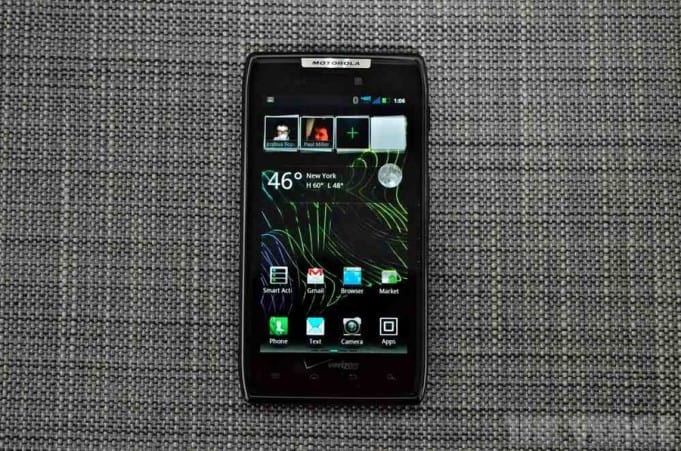
 The Motorola Droid RAZR reviews have landed (i.e. popping up on my Google Alerts), and one of the best (really in-depth!) comes via the new, feisty NY-based tech blog The Verge.
I continue to look for my next 2-year Android buddy. Look, trusty Moto Droid, you’re great and all, but you’re not quite as spry as you were in November 2009… remember the Baja?
On the short-list, as I’ve written about tirelessly: Motorola Droid RAZR, HTC Rezound (what’s with that name?), and the much-discussed and anticipated Samsung Google Nexus.
When it comes to smartphones I say: Anything but iPhone. My world is not black and white. But one thing I’ve discovered about Team Android is that, unlike Apple, there is massive confusion about the simplest of things. Like display specs. Trying to get a straight answer–Super AMOLED?, Super AMOLED Plus?–is akin to deciphering Mulholland Drive.
About that RAZR review then. Net-net is The Verge gave it a 7 out of 10 score. Somewhat disappointing really. If you’re going to sign-on with a new Android for another two years (and I’m guessing there are a LOT of us 1st gen Droids ready to do so in the coming weeks) then it better really bring the goods.
And would’t you know it, the main criticism according to Nilay Patel is, you guessed it: the display. He calls it “a major disappointment.” Uh-oh.
More: “Not only are individual pixels readily apparent, but text looks jaggy, there’s red fringing around vertical lines, and images seem to de-res when scrolling in the browser.” Ouch. Damnation. This alone is reason enough for me to remove RAZR from my short list. Screen quality to me is really, really (really) important. I use my Droid for navigation all the time, and would like the sharpest, brightest display I can find. I’m not really excited about a smartphone that has a display that’s considered “pretty bad” by one of the leading authorities on the matter.
Patel signs-off with this:
“The upcoming Samsung Galaxy Nexus is nearly as thin, offers a larger 4.65-inch display with higher 720p resolution, and will ship with stock Android 4.0 as a Google-blessed device that’s first to get software updates. I’m concerned that the Galaxy Nexus also has a PenTile Super AMOLED display, but all things being equal the RAZR appears to be just one step behind.”
Yep. I’m thinking Nexus is still my top pick (see RAZR vs. Rezound vs. Nexus) to replace my aging Droid. RAZR is off the list. It’s a two horse race: Nexus vs. Rezound.
UPDATE:
Hold the (smart)phones – and thanks to KSDroid01 for pointing out my ineptitude (not the first or last time if I were a betting man)…
Others aren’t quite in agreement that the Droid RAZR display is all that bad. In fact quite the opposite. Here’s what Slashgear had to say:
“Still, the panel itself goes a long way in making up for that: it’s an amazing screen, white is white and black is black, and it shows off photos, webpages and video brilliantly.”
Also another vote of confidence comes from CNET who calls the Super AMOLED advanced display “fantastic” and awarded the phone 4.5 out of 5 stars “Outstanding” – rare by their standards.
MSNBC was generally positive on the RAZR, and regarding the display said:
“Some may want to wait for the sharper and bigger 4.7-inch 720p screen on the Samsung Galaxy Nexus, but the Droid RAZR’s display is certainly one of the best that Motorola has ever put in a phone.”
BGR had mixed things to say about the display, but ultimately in the wrap-up called it “amazing.”
“While the display on the DROID RAZR is a 4.3-inch qHD Super AMOLED screen, it still isn’t perfect. It does look better to me than the displays used on the Motorola DROID BIONIC and Motorola DROID 3, but it’s still a PenTile display, and that means that it still has a grainy look no matter how high the resolution is. Colors look very good and are reasonably bright and vivid, though the screen doesn’t compare to the likes of Samsung’s Super AMOLED Plus displays.”
Video Review of the Motorola Droid RAZR (via Mobileburn)
[Photo: The Verge]


