6. That TV power off effect – Hey, it’s retro cool!

It’s hard to capture in a photo. Remember when an old TV set powered down? The picture would zap down into a horizontal line before fading away. Well, get your retro on… every time Nexus goes to sleep you’ll get a bit of throwback.
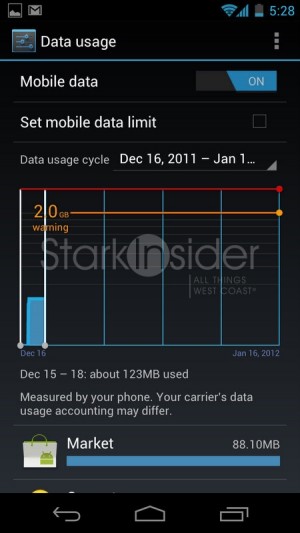
7. Data usage report – Okay so it’s not all fun and games
One of my biggest concerns upgrading from my trusty OG 3G AA !! Moto Droid to 4G Nexus was my unlimited data plan on Verizon. Yes, it was grandfathered. Relief. For those that are capped (and it’s probably not a big deal if you don’t suck down videos or torents on the road), you can monitor your useage, with this helpful report in the settings menu. It likely gives you a good idea of your blood pressure too.
8. Those three little dots…
… are obviously some type of data interface. Way, way better than using a micro-USB port to dock–car mount, charging cradle, etc. One concern I have though is none of the accessories I’ve seen so far utilize it. Why?!
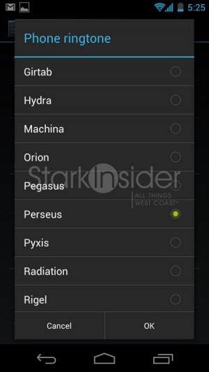
9. Usable ringtones – With apologies to Robbie Williams
Nexus may well be the first phone I’ve used in recent memory where I haven’t felt the need to immediately go to some strange, ad-sense infested web site in Russia to download better ring tones, like Robbie William’s Millennium.
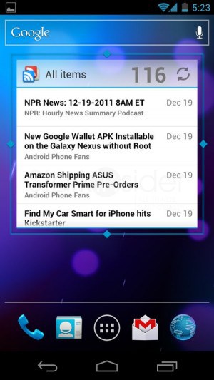
10. Customizable home screens – Order to size
Nobody does it better. In fact, nobody does it, except Android (quick prediction: that will change in 2012 with big-time iOS updates). Customizable home screens have been a long time calling card for Android, and the tradition continues. With ICS you can still drop on widgets, but now–like we saw on Honeycomb–they can be resized to your heart’s content. Swiping across the 5 default home screens is bliss; there is no lag, and everything is lickety-split quick.
Bonus: Soft keys – Future design, here and now
We first saw them on Honeycomb, Google’s tablet edition of Android, and now soft keys have made their way to the phone as well. Expect this to be the norm. Not just for Android smartphones but all smartphones. Instead of hardware buttons, Nexus has three icons–back, home, switcher–at the bottom of the screen. The implementation on ICS is not perfect. Sometimes a soft menu key will be at the top of the screen, other times at the bottom. Other inconsistencies abound, possibly confusing new users. This is a feature in transition; as physical buttons go the way of the dodo this will only get better with age. Note: that’s the family friendly “Elf Advent(ure)” app.
… And about that Twist I mentioned earlier…
So why then am I thinking of not making Nexus my go-to Android phone? For a few reasons: battery life is not great (true of all 4G LTE), the camera is poor, and I still prefer the thin design of the RAZR when all is said and done. But here’s the biggest reason I might wait it out: I have this sinking suspicion we will see at least one or two killer quad-core Android phones announced a CES in just a matter of weeks. But, you might say, the waiting game in tech is impossible to win. Yes, but if this Android is going to stick with me for 2 years, I want it to have as much horsepower as possible. Dual-core is on the way out. Quad-core is just around the corner… or so I’m guessing.
UPDATE 12/20/2011: Why I returned the Samsung Galaxy Nexus


