First, if there’s any concern our there still: Yes, your unlimited Verizon data plan will be grandfathered to 4G. Rest easy friends.
Secondly, the upgrade process is absolutely seamless. Easy peasy. This is what I love about the cloud, and Google especially. The rep put in a new sim card into a Nexus ($289 with two year contract) and minutes later: Voila! All contacts, email, calendar, even settings such as wi-fi and apps synced (except, bah humbug: why didn’t the humorous “Christmas Countdown Calendar” sync?). Now I know, I know. We’ve been doing this for years now. But it just works so darn well, it bears repeating. Long gone are the days of exporting contacts and then re-importing. Instead I was out the door in a matter of about 20 minutes (when you buy at a Costco wireless kiosk you need to take a tour over to the special pick-up room where they keep all the expensive stuff, like $200 scary giant Nutcracker Soldiers.
With Nexus, of course, it’s two upgrade experiences in one.
There’s Android 4.0, aka Ice Cream Sandwich, and then there’s the hardware itself, in this case designed by Samsung.
First Impressions
I’ll have the full review up tomorrow, but for now here’s the 60 second version of my initial experience.
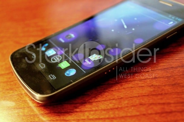
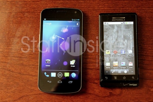
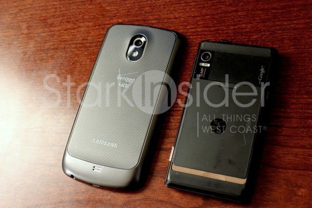
- Hardware wise I’m mixed. It’s just OK. I like the soft keys. That’s a plus. But next to the Motorola Droid RAZR, it doesn’t look nearly as slick.
- In the hand Nexus is comfortable. I like the rounded edges. Some complain about the plastic-y construction. No concern here. In fact, I’m of the view plastic is actually better than metal, which can really get banged up when dropped.
- After activation, the first thing that happened was an Android upgrade that took about 5 minutes and updated over 60 components.
- Wake-up button: hard to press easily. It’s located on top right edge, and it’s a pain in the butt to hunt down (though OG Droid faced the same issue). I’d prefer a nicer design that fall naturally onto a finger.
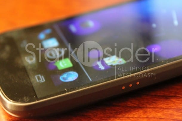
- There’s three conductor elements on the side which I’m assuming will be used to power the Nexus when docked – that’s far better than phones that require a physical push into a micro-USB port.
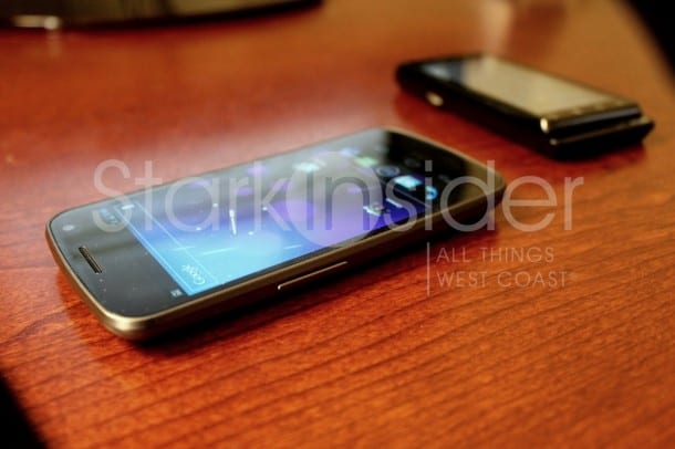
- The screen: gorgeous.
- Speed: yessirree.
- ICS: better, but still has room for improvements (more on that in my full review tomorrow). The new OS is not as big a deal as some are making it out to be–that’s not a good thing or a bad thing.
- Androids will feel right at home with ICS, and be going at it in a matter of about 60 seconds.
- Loving the new Roboto font. Easy to read, classy, clean. Nice job. Ditto the blue font/color in notification bar (and btw- no one, I mean no one, does notifications better than Android).
- I’m having a hard time adjusting to the lack of a dedicated menu button.
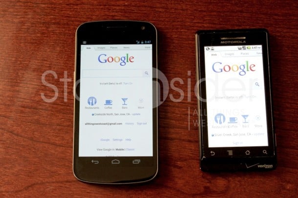
- Side-by-side web browsing: Nexus vs. OG Droid. As expected, it’s not even close. 4G is fantastic so far in my limited testing. Better still, I’m getting 3 bars where Droid is only getting 1.
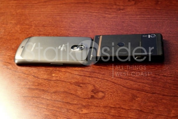
- Nexus is still thicker then I’d like it to be.
- New Gmail message preview. Thank you! Finally. But how do I adjust it so it shows more of the message? And also, ditch the refresh button and replace it with pull-down gesture (come on now, this is the norm).
- If you buy the phone from Costco you’ll get an accessory pack (protector, nice zip bag, car charger…)
- If you’re into thin (and don’t mind that the battery is not replaceable as it is on Nexus), you should definitely consider the RAZR; once it gets ICS it’ll be pretty sweet too.
That’s all for now. More testing to go.
I’m still concerned about: lack of Google Wallet (that’s going to be so convenient!) and the fact that quad-core Androids are just around the corner. We just the first quad-core tablet hit the market in the form of the fantastic Asus Transformer Prime. Phones are just around the corner. While there’ll always be something faster, better coming in just a month or two (especially the case with Android phone releases) I’d like to be on the leading edge of CPU/GPU so the phone doesn’t start chugging deep into contract (i.e. in 2013).

