Adobe’s beta of Lightroom 4 is now available for download (it expires March 31), and if you’re into photography, as a pro or hobbyist, I highly recommend you take a look. Here are some of my test results after a few weeks of testing the software.
First, a confession.
I’ve never been a big fan of Lightroom. The interface is cumbersome, non-intuitive and getting simple things done, like re-sizing a photo for example, requires too many steps. For daily stuff I instead count on Picasa. It’s fast, and a quick and dirty way to get results without jumping through hoops. I realize the comparison is unfair. Lightroom is a full-blown digital darkroom. And with this version 4 my opinion is rapidly changing and now it has joined my regular go-to roster of must-have software which also includes Premiere Pro (Stark Insider TV), After Effects (for image stabilization), Photoshop, Illustrator and Audition.
The results I’ve been able to achieve with Lightroom 4 in just a few weeks of casual testing have, for lack of a better expression, blown me away. Granted, I’m not looking to land the next American Photo or Life magazine cover. All of our photos and videos are processed for use on Stark Insider, for sharing on social media, or for publishing to places like Flickr, Vimeo and YouTube. I like to correct color where possible, increase contrast, and generally give photos “more pop.” Interface caveats aside, Lightroom succeeds on all accounts so far.
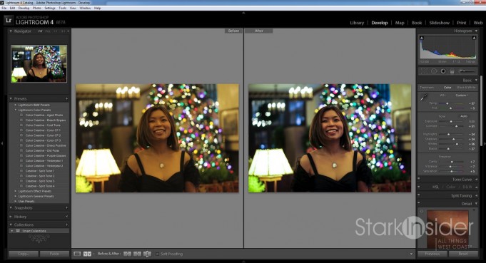
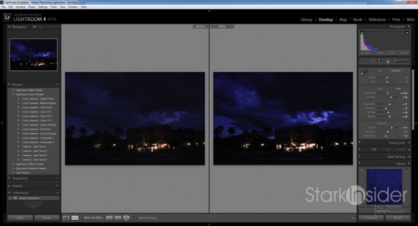
Lightroom is organized into 7 modules: Library, Develop, Map, Book, Slideshow, Print, Web. So far I’ve only used the first two. More testing will come later, but for now I was most interested in importing my photos and building a LR library, and then getting to the juicy stuff — mucking with sliders! — which is what the Develop module is all about. Here’s 4 test photos processed using the Lightroom Develop module.
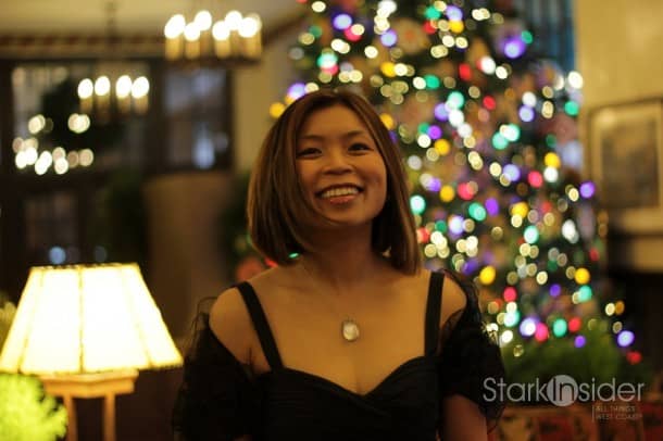
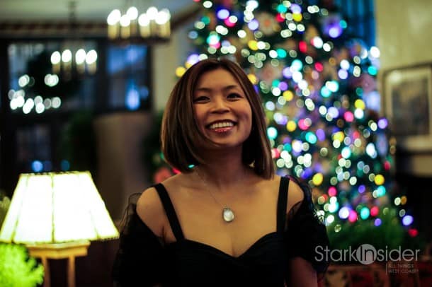
Test #1 – Color Correction, and Saturation (Loni at the Ahwahnee)
I took this at the beautiful Ahwahnee hotel in Yosemite. Some of you may know that this location inspired the set design for the Overlook in The Shining. When you walk the halls here you’ll definitely get that redrum feeling- it’s spot on creepy. Well, except at Christmas when they host a fabulous annual Bracebridge dinner-theater event. This was taken with a Canon 50mm. It’s great for portraits; a fast lens, perfectly suited for bursting like I did here asking Loni to bounce around while I shot continuously shots. Later I pulled my favorite. I thought it was great. Yet processing it later in Lightroom I realized there was a yellow tinge that didn’t look so great after all. I cooled the color, dialed up the contrast a bit, and tweaked some other settings. I like the result. There’s more separation after between the subject, and the Christmas tree in the background. Also, there’s more interesting colors/detail in the background in the top left (the lights and glass). Maybe I’ve taken too much warmth out of this shot, but I like the modern, magazine-like aesthetic of the result.
BEFORE
AFTER
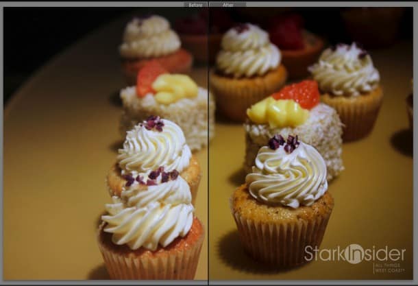
Test #2 – Shadows, Contrast and Post-Crop Vignetting (Yigit Pura’s cupcakes)
I find myself shooting food from time to time. We cover a fair number of foodie events in San Francisco, Napa and Carmel. This is one of Yigit Pura’s creations. He won the first ever Top Chef Just Desserts (watch the dramatic winning moment and interview). He’s a great guy, and a wonderful role model for the city of SF. Earlier in the season we were invited to join in the fun at an episode party where a bunch of us would get together and watch the show on the big screen. His pastries, of course, were also a star attraction. Cupcakes, for reasons beyond me, are in vogue, and so I thought it fitting to apply some Lightroom processing to this shot. Nothing too dramatic really. I just added some contrast, and minor vignetting to give it more artistic flair.
BEFORE
AFTER
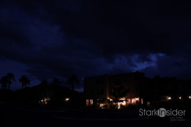
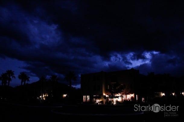
Test #3 – Low Light (Storm clouds over wine bar, Loreto Bay)
Categorize this one as experimental failure. As Tom Cruise said in Jerry Maguire, ” it’s like popcorn in the pan. Some pop
BEFORE
AFTER
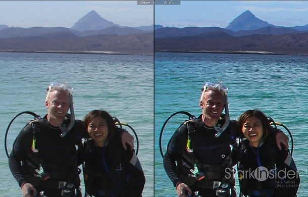
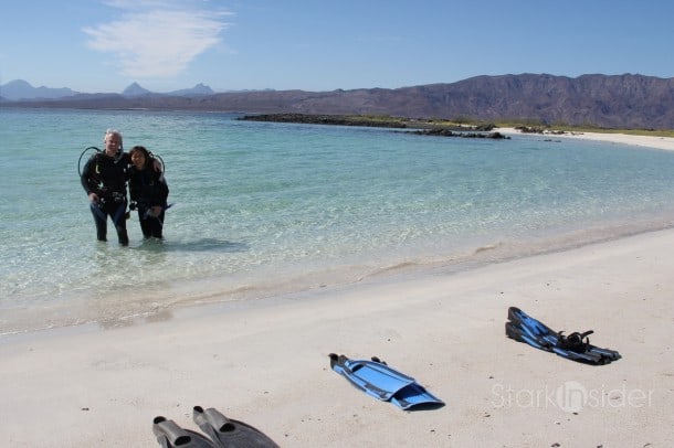
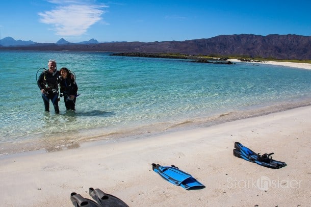
Test #4 – Landscape (Coronado Island, Baja California Sur)
Yes, Baja California Sur again (From the Field: Canon T2i shots from Loreto, Baja). This time, doing what you must do if you visit the area: diving. Look at those waters of the Sea of Cortez: Crystal blue, and even more stunning in person. Jacques Cousteau famously called this area the world’s aquarium. There’s an astonishing variety of beautiful life below the surface.
With this one I simply wanted to enhance the contrast and bring out the colors. One neat thing I used here was Lightroom’s adjustment brush. With that tool you can selectively highlight specific areas on a photo to adjust. For example, when I increased contrast and reduced overall exposure on this shot our faces (my wife and yours truly) became too dark. So I used the brush to isolate our faces, and increased exposure. The result is perhaps more extreme than I’d normally go for, but I wanted something – again, I know- with pop.
LIGHTROOM PROCESSING
BEFORE
AFTER
Clearly, these examples merely scratch the surface of what’s possible with Lightroom. This was just my early tests, and I didn’t spend inordinate amount of time chasing Valhalla. I was extremely impressed with the results. I also used LR for some of our Detroit auto show coverage as well. More to come soon. Happy shooting (and processing)!

