If someone asked my why Android tablets have failed to catch on, I’d cite price as the number one reason. Why on earth Samsung, Motorola and others charge the same or more as the base $499 Apple iPad defies conventional pricing logic.
Apple deservedly commands a premium for a premium design. Consumers will pay more for a product or service when they feel like they’re buying the best in any given market. Think BMW, Harman Kardon, The Bellagio. But unlike Apple and the iPad, Android tablets don’t exhibit the elegant design nor the end-to-end hardware/software integration that results in a seamless user experience. Oddly, the lemming march continues. After being pummeled in 2011 with the Xoom, Motorola bounced right back and released the too similar (and also poorly named) Xyboard. Amazingly, it was masochistic priced (ie- again too high). It’s cringeworthy, and (as much as I hate to say it) a flop in the making.
Price is just one of four ideas raised in a TechRepublic “post-mortem” that contemplates the sore spots for Android tablets and got me thinking about the topic. I think author Jason Hinder’s logic is spot on, with one exception I’ll point out in a moment.

The 16×9 curiosity
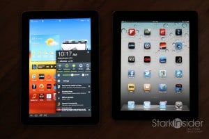
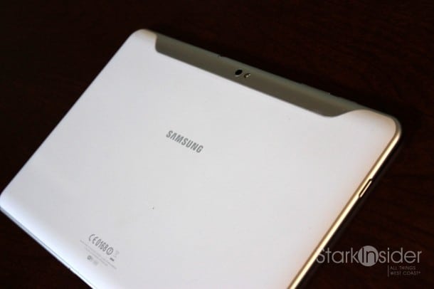
Another is the decision to go with a 16×9 display instead of 4×3 as found on the iPad. If you’ve ever picked up an Android tablet such as the well made Samsung Galaxy Tab 10.1 for instance, you’ll know it right away. As I’ve written before it feels like holding a piece of A4 European paper. It’s long, narrow, and doesn’t feel as comfortable as the iPad, until you rotate it into landscape mode that is. The difference exposes a fundamental difference in design philosophy. Apple sees iPad as first and foremost a replacement for magazines, newspapers and books. Google sees Android tablets as powerful multimedia machines, hence the widescreen, movie-friendly aspect ratio.
I’ve been toting a Galaxy Tab 10.1 and iPad 2 together for about 4 months now. I’m surprised how many times I reach for the Android. I do miss Flipboard greatly, and find magazines–Popular Photography, Wired, BusinessWeek–to be far, far superior on the iPad. Still, there are some occasions where apps work well in landscape. Gmail allows me to use my thumbs to navigate my folders (left) and delete messages (right) without much hand movement. That’s definitely convenient.
Apps
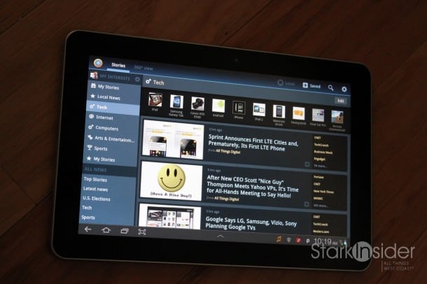
Apps is another problem area. This is the most well known issue raised in the post-mortem. We know this. Oh, boy, do we know this. The Android Market did reach the 400K app market recently, which is good news. But I find just about every single app that exists on both platforms looks better on the iPad. And they function better too. Take News360 (review), a terrific news aggregator. It’s a rare example of an app that looks near identical on both. But beauty is skin deep. Start scrolling, touching and surging the headlines and you’ll find frustrating lag on the Galaxy Tab 10.1. Touching and scrolling in general on Android tablets is best described as mushy. Or reluctant. Touch the iPad 2 and it’s pure, instantaneous- like paddling a kayak on beautifully still morning water.
Don’t underestimate the power of…
I’m less convinced with his choice for #3 as to why Android tablets are failing: “The enterprise doesn’t trust Android”
That may be true. I’d argue that there is a more important problem that Google needs to address:
Marketing.
Apple markets the iPad as a lifestyle.
Google markets the Android tablet as a machine.
There is a huge difference. As a result, the techset and geek squads alike naturally really dig Android. Count me as one of them.
But the mass market buys appliances, shops at Target, and loves Oprah. Impute already!
Price redux
Back to price then. The end of 2011 saw the introduction of the Amazon Kindle Fire. Despite a bumpy launch (there were bugs), the tablet has several things going for it that could turn the corner and finally decode the secret to competing against the iPad:
Price: $199 is 60% less than an entry iPad and opens the door to mainstream buyers.
Size: 7-inches was a wise choice. More portable, the smaller screen differentiates it from the iPad, and is the ideal size for reading.
Content: While Android may lag in apps, with Amazon there is no shortage of content. Seamless integration for buying things like books, movies, music and magazines results in a simple user experience.
What’s next?
We’ll find out soon enough when CES 2012 kicks off next week in Vegas.


