As late as they are to the mobile and tablet party, if Microsoft gets Windows 8 right they could be the first company to seamlessly converge the user experience across multiple devices. Apple can’t do it. It has iOS for iPad/iPhone and OS X Lion for Macbooks. Google can’t do it. It only has a mobile OS, and uses Chrome as a trojan horse to sneak its way into the world of desktop apps. Only Microsoft, at this point, looks to be on track for providing a seamless user experience across smartphones, tablets, desktops and laptops… among other custom devices.
I downloaded the Windows 8 Consumer Preview onto an old ThinkPad and was surprised to find an entirely new and yet entirely familiar operating system.
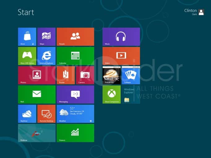
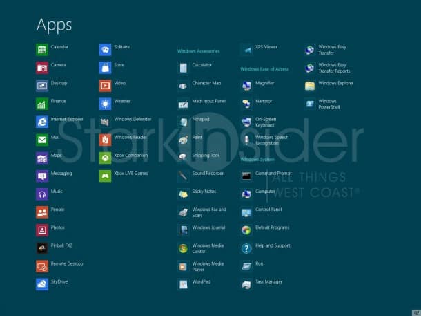
The new part of course is Metro, that multi-colored, gesture-friendly cluster of tiles that sit as a layer on top of the traditional Windows desktop we all know, but not all love (I think Win 7 is great, better even than Mac OS X Lion).
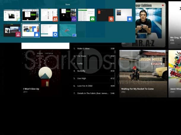
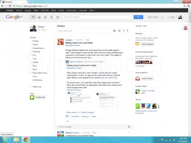
And the familiarity comes from… well, the Windows OS that still lurks underneath replete with everything we’ve come to know over the past quarter century: alt-tab shortcuts, windows explorer, control panel, right click menus. It’s all there. To my eyes, at least, it doesn’t look like much has changed. That’s not a bad thing. I rather like the Win 7 / Google Chrome computing experience, and wouldn’t mind if that progressed relatively unscathed.
What Metro brings, however, is ease of use.
If Microsoft has its way it will also bring consistency. The way Windows looks on a desktop should look familiar when switching to a mobile device, and vice-versa. Apple and Google both ask us to think different in that regard.
After spending a few hours with Windows 8 here’s my initial impressions. I’m not doing an exhaustive feature-function breakdown. There’s no shortage of that out there today. Note that I was able to install Google Chrome, and Dropbox without issue on the Consumer Preview.
WINDOWS 8 Consumer Preview – First Impressions
Microsoft is doing a mondo job of giving the OS a tablet/mobile ready makeover while not completely unearthing the core.
I tested the consumer preview on an older ThinkPad and it ran surprisingly well.
Like:
Contact integration “People” – superb, pulling in FB, Twitter, etc.
Mail – synced up my Gmail in a minute, nice simple interface (but I still couldn’t find a way to set Gmail as the default mail app).
Overall Metro tile UI – colorful, fun, fast.
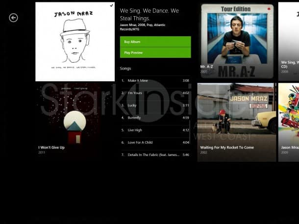
Music app – very Zune-like, which is a good thing.
Looks promising:
SkyDrive, but I’m already a Dropbox nut.
Downside:
The plain old desktop is still there… still too early to tell how stable Win 8 will be. It feels like Microsoft has just applied a slick overlay on top of old school Windows – that might bot be a bad thing necessarily.
Net-net:
Early impression is Win 8 looks like a hit, and could integrate smartphones, tablets, laptops and desktops beautifully. No doubt it’s late, but it might just be worth the wait.

