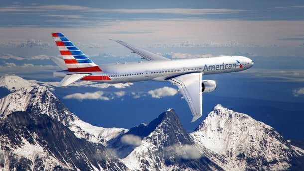
For the first time in 40 years, American Airlines planes will have a new look.
In conjunction with a completed deal with the pilots union and the opening of a new livery, the country’s largest operator has also taken the opportunity to freshen up the paint job of its fleet, and also to unveil a new logo:

The new logo, management notes, features the eagle, the star, the “A.”
American’s new color scheme features silver mica (body) which “honors our silverbirds,” and red, white and blue stripes (tail):

AA says the new look, which has been in the works since 2011, “symbolizes our passion for progress and the spirit that is uniquely American.
“Our new logo and the refreshed exterior of our planes represent more than a change of symbol, but a symbol of change in our path to modernize and innovate.” said Tom Horton, CEO of American’s parent company AMR Corp.
The refreshed design is part of the company’s “Becoming a new American” campaign.
Not everyone thinks a fresh coat of paint will solve the airline’s problems.
“A new paint job is fine but it does not fix American’s network deficiencies and toxic culture,” said Dennis Tajer, a spokesman for the Allied Pilots Association.
Design-wise, is the new look a success?
In some ways it reminds me of what Microsoft did last year when it introduced a new corporate font and graphic for its Windows 8 operating system. The goal there, as it appears here as well with the AA logo, was to appear clean, modern.
At least one commenter on the airline’s Google+ page noted that the red and blue logo looks like a pair of 3D glasses. Or is it a bus:
New @americanair #LameLogo. AA’s logos were always distinctive.Looks more like Greyhound Bus logo. #newAmerican twitter.com/CigarDaveShow/…
— Cigar Dave (@CigarDaveShow) January 17, 2013
To me these planes now look even more like flying American flags… which sort of makes sense given their name don’t you think?


