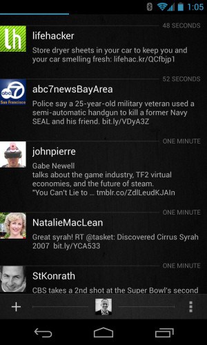
Every so often I go on a Twitter app bender. I download, fiddle, and test every single Android Twitter app that I can find on the Google Play Store. Who knows why, but I find it almost cathartic – by checking out the latest designs, features, and extras across all of these apps I began to discover differences, and a few that I write about here have clearly bubbled to the top of my favorites list.
One size does not necessarily fit all. Power users will likely want to gravitate to something like Falcon Pro, while those who prefer a visual, fun app that integrates several social networks might gravitate towards the nifty Scope Beta. If you juggle multiple accounts, UberSocial could be a good choice. TweetCaster, meanwhile, goes for the gusto, and throws everything, but the kitchen sink in a feature-packed app. It’s very personal, and, no doubt, one or more of your picks are not included in this list.
If you haven’t been to the Play Store recently, and are still stuck on TweetDeck, or have yet to venture away from the official Twitter app, you may be surprised to discover all sorts of good things awaiting.
Here’s a run down of my favorite Android Twitter Apps (as tested on a Nexus 4).
1. Falcon Pro
This is my top choice, and daily runner. It’s fast, the interface is clean and smooth, and notifications (timeline, mentions, directs) are clearly displayed at the top. The compose menu is straightforward, though there’s no scheduling if that sort of thing matters to you. Falcon Pro includes an integrated browser which means I don’t need to exit the app to view a link. For me, that’s extremely important – apps that don’t have this feature generally fall off my list, unless they bring some other compelling capability to the table. One difference with Falcon Pro is the swiping. Go left and you get access to your profile, and one touch access to standard Twitter views (Timeline, Mentions, DM, Retweets, Favorites) plus search and settings. Go to the right and you get access to lists, starred users, saved searches and trends. Normally I’m accustomed to swiping to change Twitter views, like TweetDeck and Uber Social for instance, so Falcon Pro took some getting used to. But it didn’t take long, and now I absolutely love the interface. Falcon Pro is only 99 cents. It’s a screaming bargain, and imho is the top Twitter app for Android.
2. UberSocial
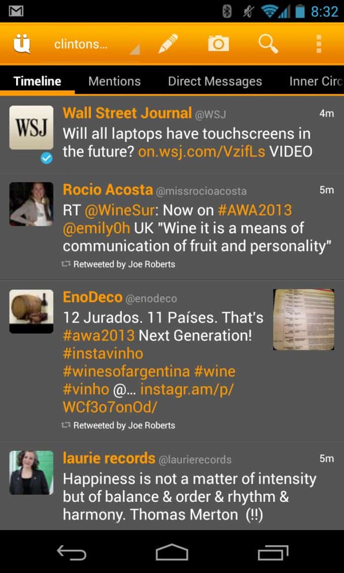
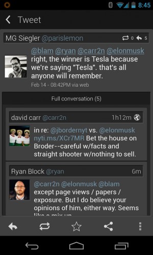
Also the cream of the crop. If you manage multiple accounts, then you should definitely consider UberSocial (Falcon Pro as I mentioned doesn’t yet manage more than a single Twitter account). Also, you can include your Facebook feed, which appears as a column. The user interface is instantly familiar. Swiping brings you across the standard Twitter fare: timeline, mentions, direct messages. UberSocial adds a cool feature called “Inner Circle” that allows you to add specific users to the column, essentially creating a filter. There’s a healthy amount of customization here including themes, font sizes, update intervals, alerts, and on and on. Jumping to the top is less convenient than I’d like. You need to pull up the menu and choose “Jump to the top”. Others are more efficient. With Falcon Pro I just tap the timeline notification icon and I’m instantly brought to the top. Carbon (a downright sexy new Twitter app) uses a two finger gesture to get to the top that I really like. UberSocial also has an integrated browser that works very well. I also like that you can click on a Tweet to bring up a separate screen with details, or, alternatively if you prefer, long press to bring up a menu with different actions. Well done!
Android Twitter App Rankings
1. Falcon Pro
2. UberSocial
3. TweetCaster
4. Scope
5. HootSuite.
One to watch: Carbon.
3. TweetCaster
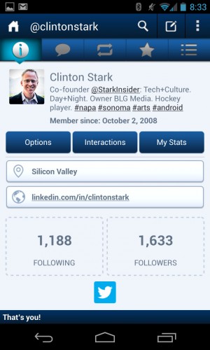
TweetCaster is one heavy duty Twitter app. Like I mentioned earlier this is one is feature laden and goes to eleven. Click a link, though, and it can be overwhelming when the menu pops up with 12 choices. There’s so much depth here it’s no wonder this is one of the highest scoring apps (Twitter or otherwise) on the Google Play Store. Fun, and useful extras abound. A “Smart Filter” allows you to filter the timeline based on Tweet type (image, video, link) or to create your own custom filter. “My Stats” pulls up an impressive three panel view into various metrics, related to your timeline, tweets, and others. If you like the idea of discovery, then TweetCaster should be high on your list. There’s two reason why it doesn’t rank higher for me: 1. the UI is a little busy, and crowded; and 2. there’s no gesture support. Still, an incredibly powerful Twitter app!
ALSO: Chromebook Pixel: A pretty expensive dumb terminal
4. Scope Beta
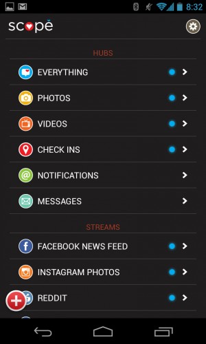
Hubs and Streams.
Scope takes a different approach. Yes, it can handle your Twitter account. But it aims to for something more – at least so far as I can tell after testing the app for a few weeks. In addition to integrating various social networks (Facebook, Instagram, Foursquare, Tumblr) Scope also features content-driven feeds, much like you’d see on something like Flipboard. Out of the box, default “streams” include Reddit, Slickdeals, and by clicking “Add Stream” you can add a bunch of others including Bureau of Trade (I have no idea why they opted to include this one), Levi’s, an assortment of Reddit channels (fantastic!). Beyond the streams, which I think have a ton of potential (I’d like to be able to add custom RSS feeds), the interface is striking in its simplicity and beauty. This is one pretty user interface! It reminds me of Google+, which is a very good thing in terms of design aesthetic. Power users will likely steer away, however. Twitter functionality is basic. There’s no search (that I could find), and no integrated browser. But casual, visual-oriented users will definitely want to take a look. I suspect the developers are a few updates away from creating a killer social media app.
5. HootSuite
What’s there to say about the owl that you don’t already know? If you’re a Twitter guru, then you’re already familiar with this power app. If you schedule apps, manage multiple accounts, and like to monitor Twitter like nobody’s business, then this is likely your app of choice, and you’re probably already using it. The UI is a little kludgy, and I’m not enthralled by its performance, but the trade off is a deep, professional feature set that, of course, syncs with the web, and other HootSuite clients.
One to Watch: Carbon
There was a lot of hype and expectation around Carbon. The much-loved Twitter app for WebOS has finally made it to Android. Design-wise it’s a knock-out. If you want a peak into the future of app design, check out Carbon. Dare I say it reminds me of the Zune back in the day (don’t knock it, the Zune UI was a step ahead). Scrolling is super fluid. Numbers (new tweets for example) float momentarily before fading away. The profile view is gorgeous, easy to read. It’s absolute eye candy. Carbon is all about gestures; in particular I like that a two finger scroll will jump to the top of the timeline. But I’m not quite ready to give it a full ranking yet. It’s clearly a step or two behind the more established players such as UberSocial, TweetCaster, and Falcon Pro. Font size can’t be adjusted, there’s no integrated browser (I miss that a lot!), and I wish I didn’t need to click on the small menu button to pull up search. Carbon, though, is definitely one to watch. If you appreciate beautiful design, you’re going to love it.
Which Type of Twitter User are You?
Power user:
Falcon ProCasual user who appreciates visuals, managing entire socia life in one app:
Scope BetaWants the most features possible:
TweetCasterReads Architectural Digest:
CarbonOld school:
TweetDeckNew old school:
UberSocial“Don’t rock the boat!”:
Official Twitter app


