You know an app is good when after only ten minutes of using it you wonder how you ever got along with it. Such is the case with Cover. The new Android app is getting a lot of buzz. And for good reason. Cover takes one of the most viewed screens on our phones (the lock screen) and gives it smarts. Now when you unlock your Android, you can be more efficient and jump directly to the app that makes the most sense at that particular time and place.
Though Cover is still in beta I recommend every Android user give it a spin. Chances are, you’ll also marvel at the beauty of its design and elegance of its operation.
Here’s how it works.
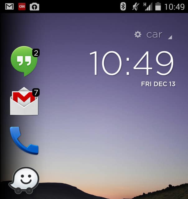
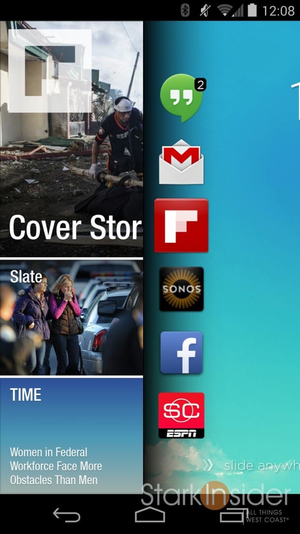
When you wake your phone, Cover presents you with six app icons (in a tidy vertical column) on the left side. You can choose to swipe along the bottom to unlock your phone as normal. Or, you can swipe to uncover one of the recommended apps to jump directly to it. For example, I might want to send an email. With Cover I can swipe across the Gmail and jump right into the app; that saves me the step of unlocking the phone, and then clicking Gmail. You can scroll vertically to reveal more apps. You can also “peak” to see the underlying app and then drag back to the home screen. Pretty nifty.
It gets even better.
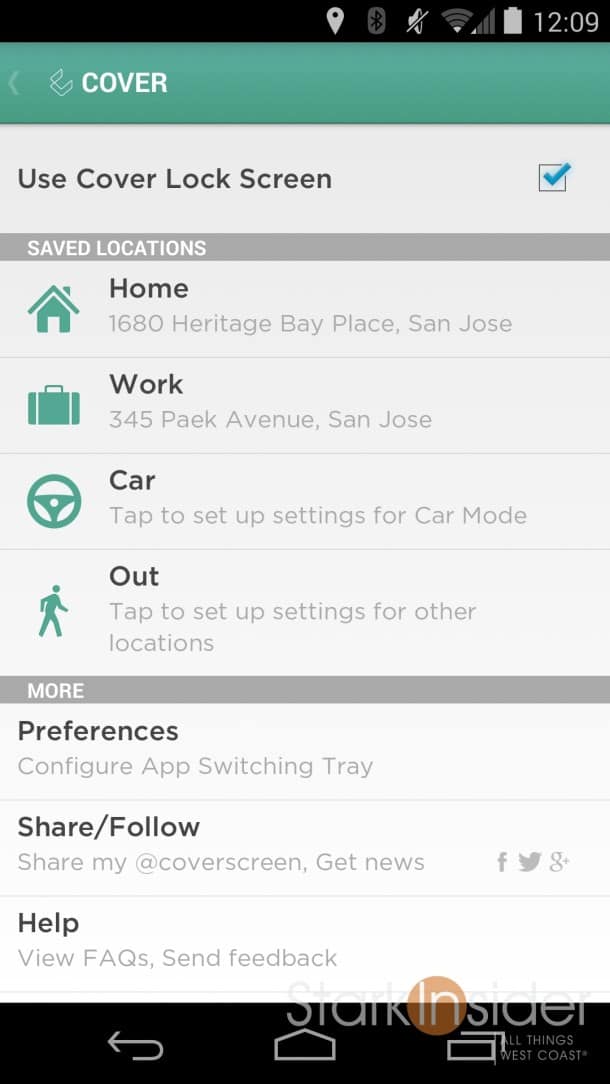
Cover is smart enough to about your location and offers up apps based on the tasks you routinely perform there.
At home Cover knows I use Flipboard a lot. So it didn’t take long for that app to make it to the lockscreen shortcut list. Same with my XBMC remote app. At work it learned that I used a different set of apps: LinkedIn, Gmail, and Dropbox.
When I’m in the car, the lockscreen was populated with things like Google Maps, and Pandora.
You can download Cover here – for now it’s free. The setup screens walk you through a short tutorial. And you’ll need to enter your home and work addresses (I wonder if there is way for the app to automatically pull this information from Google Now?).
If there’s one slight convenience it’s that to enter your PIN or password or pattern, you’ll need to first to swipe past the Cover screen. So although the app saves time in most situations, you will need to do a two-step unlock once the password is in effect. For me, that’s not often – since I’m using my Nexus 5 constantly throughout the work day.
The three devs behind Cover obviously have a penchant for slick design. This is a gorgeous app. It perhaps portends what we’re going to see in the coming years when it comes to app user interfaces — it’s silky smooth and eschews conventional thinking for something that truly personalizes the smartphone experience.


