LG strikes again!
With the Nexus 4, LG took a risk and went with a glass back. It was quite pretty, even channeling Matrix-like aesthetic with shimmering small flecks, reminiscent of the indelible columns of green typeface from the film’s credits. In reality, however, it proved to be a decision that favored style over function. The back cracked easily. Given that this is a tossable mobile device that was not a good thing. Apple’s iPhone, by contrast, is made of a rugged aluminum unibody. Samsung is a fan of plastics, but they are high quality, and resilient.
Hats off. LG got the Nexus 5 right. Even almost perfect. Almost.
This time around the back and sides are made of a rubberized plastic. It might very well be the best feeling device I’ve held in quite some time, iPhone included. Thanks to the friction the material provides the Nexus 5 feels comfortable; sitting on a desk it’s highly unlikely to slip and slide onto the floor.
Other design wins for LG this time around include: small and tidy bezels (the sides are particularly svelte), a sharp and bright display, better battery life (the Nexus 4 was woeful), and tactile buttons that feel oh-so-right (power, volume up/down).
Meanwhile Google’s KitKat (Android 4.4) runs like a dream on this hardware. Everything is fluid and fast. Although I miss the ice blue holo font, I’ve come accustomed to the all white icons, and the (disturbing) fact that Google ripped a page out of the Apple design playbook on this choice. My wife chides me, “Poor you! You miss the geeky blue!”
I particularly like that Google Now is a one swipe away (to the left). And, of course, the voice activation “Ok, Google” is pretty sweet. I really believe that Google Now is one of the biggest innovations of 2013 – odd that it doesn’t receive more attention. Time and time again I find its predictive abilities mind-blowing… and always convenient. It knows I routinely drive to SFO. But it knows (scarily perhaps) that I also like reading about Elon Musk, and following certain stocks. Sure, it’s not the stuff of SpaceX or delivery drones, but sometimes it’s the small stuff that makes everyday living that much better. And, after all, isn’t that the ultimate promise of computers, robots, and technology in general?
Back to LG and the Nexus 5 then.
Yes, LG pretty much nailed it this time around. And I was just about to get down on my knees and apologize profusely to the Korean Giant: how did I doubt you? how on earth could I suggest that Sony, HTC, or even Lenovo would be a better build partner for the Nexus program?
But…
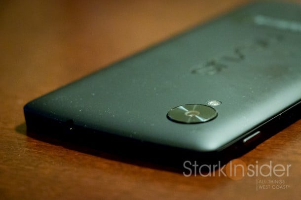
I noticed my Nexus 5 wobbled when placed on a flat surface. As I typed, the phone bounced around. I checked underneath. There was nothing blocking it. Well, upon further inspection, there is something causing the wobble. And that would be the raised camera lens. It protrudes, annoyingly, beyond the back surface… hence, the Nexus 5 does not sit flat. Doesn’t sound like a big deal, until you realize that (almost) every other mobile device sits flat, well-behaved, sans wobble. That includes the Nexus 4, glass back and all. Which begs the question…
Why LG?
Why LG?!
Curse you LG!
You make a nearly perfect phone (it is very very good) and then you go and decide to get lazy on one little detail.

The solution is easy actually. Put a case on the thing. But this time around, because I like the feel of the rubberized case and believe it to be robustly manufactured (with Gorilla Glass 3 no less protecting the screen), for the first time since OG Droid (2009) I’m going without a case.
I guess nothing is perfect. Plus, there has to be at least something to want for in the Nexus 6. But wait. Will Google call it the Nexus 6? That would mean a 6-inch screen based on current naming convention. Ah, a different rant for a different day.
Huge thumbs up to LG and the design of the Nexus 5. Think of as a beautiful model with a defining bump on her nose. Milla Jovovich. That’s the one. So, there you have it. The Nexus 5 is the Milla of smartphones. Not too bad if you ask me.


