Twitter apps are an interesting beast. A few years ago it seemed like Android and iOS users were being swamped with them. Choice aplenty. Then, Twitter reined in its API (the interface that allows third party apps to connect to its services). In a bid to monetize their platform, Twitter at once alienated its users while pleasing investors. Things since have stabilized somewhat. But the wild west days of Twitter apps has slowed. That’s not necessarily a bad thing. Stable, feature-rich clients now populate the Apple App Store and Google Play. Choice picks for Android include Plume, TweetCaster, UberSocial (similar to the classic TweetDeck mobile app), Seesmic, and, of course, the official Twitter app itself (hugely improved over the past 18 months).
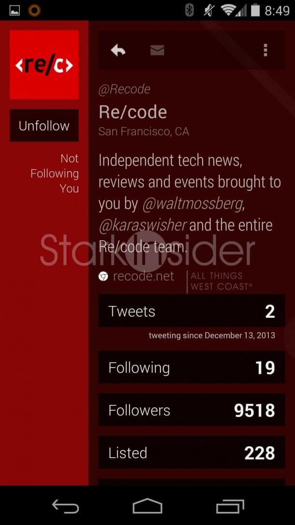
I’ve found that Twitter apps typically fall into one of two camps: (1) Those with deep functionality targeted at power users; and (2) Those with pretty interfaces aimed at casual users. The refreshed Carbon (v2) Twitter app for Android falls into the latter camp. It emphasizes aesthetics over functionality. Remember Microsoft Word? We typically used, what, maybe 10% of its features? So then, why overload us with unnecessary bloat? So goes the thinking in this post-PC world – witness the stripped down, but highly useful Google Drive apps. Carbon follows in those footsteps. The basics of Twitter are here, but not a whole lot more. Those who prefer every option under the sun will likely stick with something like TweetCaster or Plume. But, again, those who value a bit of pretty design should give Carbon a quick look (it’s free).
Gesture Fest
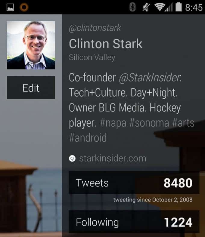
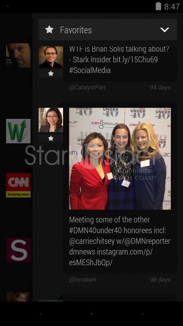
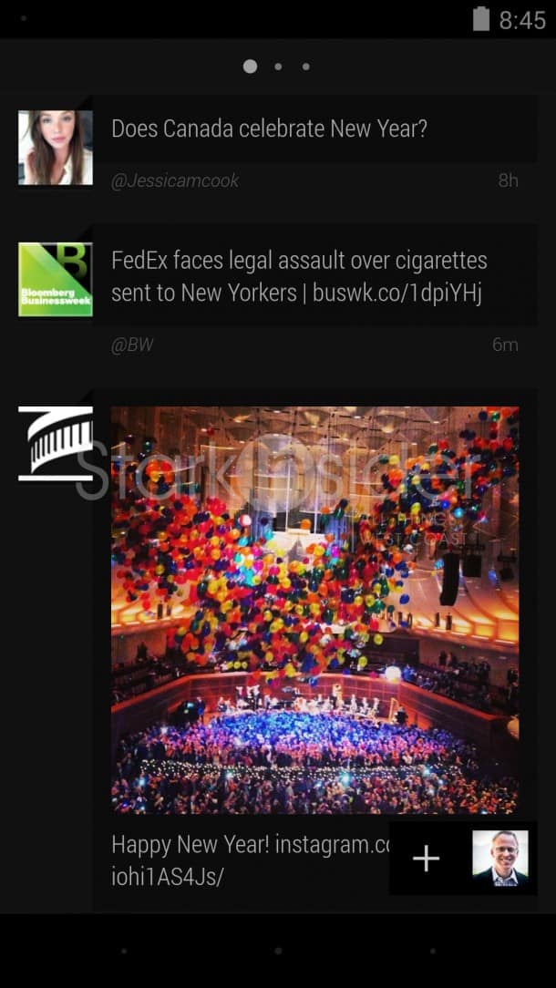
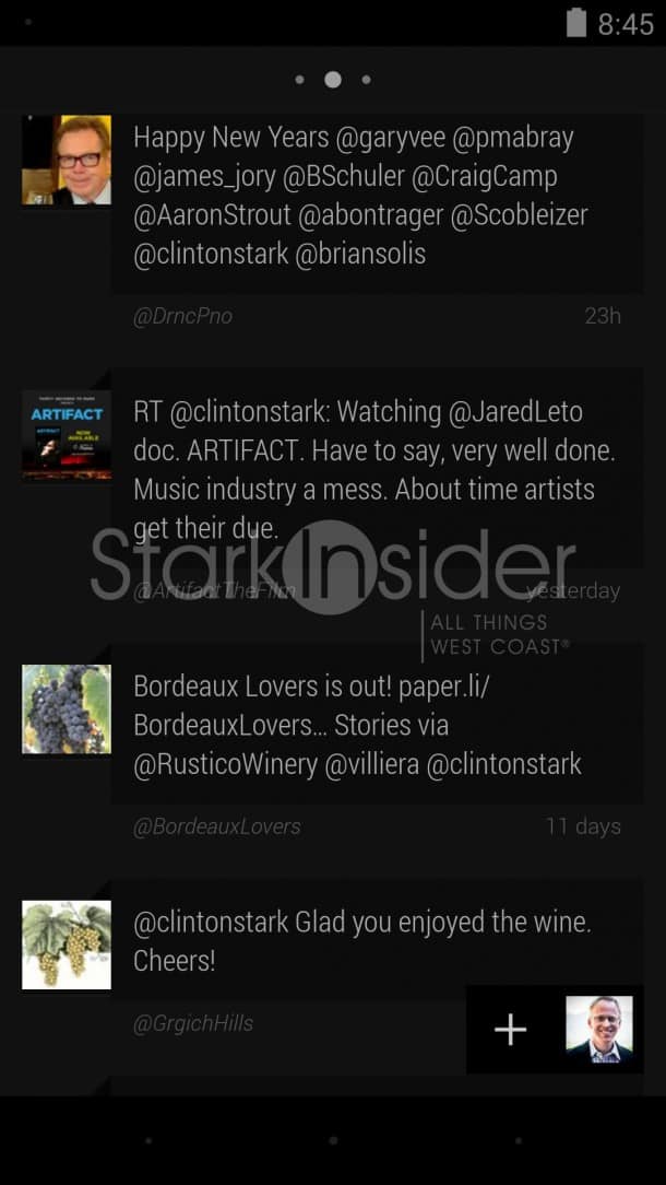
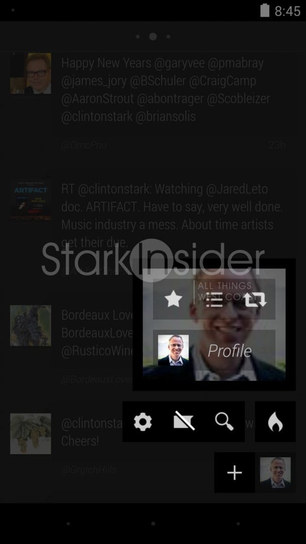
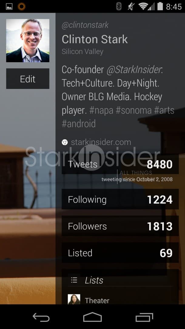
Carbon loves gestures. A quick tutorial when you start the app for the first time will give you the basics. Swipe left to access mentions, direct messages. Two finger scroll to jump to top of feed. Tap with two fingers for quick RT – or tap once to bring up Tweet menu. Swipe in from the right brings up favorites, retweets, saves searches and lists. Your Twitter avatar floats along bottom right and enables access to your profile, settings, and Twitter search. Overall, it’s an uncluttered, clean approach. Very slick. Performance-wise, everything is extremely fluid (I tested Carbon on a Nexus 5). Tugging down refreshes the timeline quickly with a large number indicating number of new tweets briefly appearing along the top.
Designers went with a dark theme. It’s contrast-y – in a way that reminds me of the Zune days (remember that?). Unfortunately there’s no way to change it. Like a Model T, you can have it in any color as long as it’s Black.
You can, however, chose the Tweet size (medium, large, x-large), opt to include media previews or not, chose quote style, and frequency of updates, among other sparse option settings. Like any good Twitter client, an integrated browser is included.
When it comes to Twitter I’m more of a lurker than anything. I appreciate being able to check in on the latest in Android, wine, and news. No question, social networks facilitate rapid sharing of interesting, informative information (so long as you manage who you follow). More often than not when I view my Twitter profile I lament how few followers I have – but what quality, pretty people!
I’m not sure Carbon will replace my Twitter Android app du jour–Falcon Pro–but it’s such a pretty looking thing it may just end up becoming the darling of my Nexus 5.
Download: Carbon Twitter App for Android (free)

