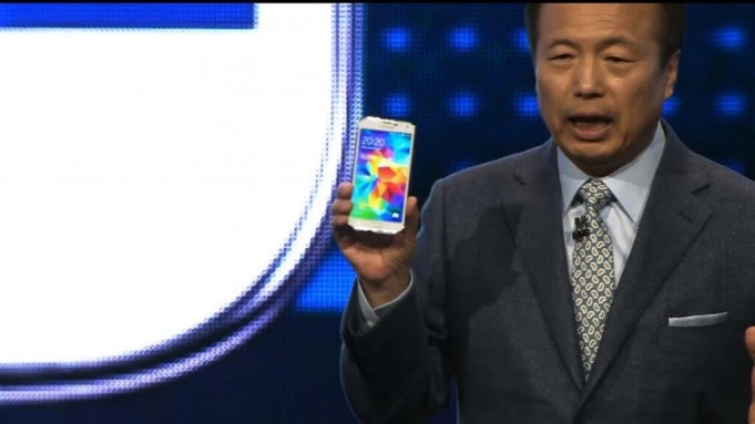
Samsung took the wraps off its flagship phone today at the Mobile World Conference in Barcelona. The Galaxy S5 (no surprise in the naming, why mess with a good thing?!) features mostly what we were expecting. It’s faster, features a slightly larger display, water resistant design, and the same old capacitive buttons we’re accustomed to seeing on many Android handsets.
My early verdict: evolutionary.
And one particularly annoying design decision. More on that in a sec.
Nothing here with the new S5 screams wowza. There are no quantum steps. Nor does there appear to be any radical shift in thinking regarding smartphone design, something we might expect to happen given the hype surrounding wearable tech like Google Glass and smartwatches such as the Galaxy Gear (a refresh was also announced at MWC).
SAMSUNG GALAXY S5
Specs:
5.1″ 1080p AMOLED display
2.5GHz quad-core processor
2GB RAM
16MP camera with 4K video
Android 4.4.2 KitKat
USB 3.0 charging port
Plastic casing is similar to S4, though less glossy (thankfully)
IP76-rated water resistance (good for up to 30 minutes in 3 feet of water)
Integrated fingerprint scanner (home key)
Four colors: black, white, blue and gold
The S5 will be available in April. Pricing hasn’t been announced. But a fair guess would be $199 on contract, and $599 unlocked. Or somewhere thereabouts.
In addition to the S5, the new Galaxy Gear 2, and Gear Fit are all headed to AT&T, and were shown during the ‘Unpacked’ press event. The Gear 2 looks much improved, though I agree with Clinton Stark who says Google Now could be the killer smartwatch app.
ALSO SEE: 5 great watchfaces for Pebble
All told I’m slightly underwhelmed with what Samsung has done here. Then again, I don’t really blame them. This is the safe play. Don’t rock the boat, must be the thinking. Given the sales success of the S4 (and the S3 before that) it’s hard to find fault in a strategy that favors incremental improvements over moon shots.
I have to say, though: Why on earth is the back button still on the right side? Should that not be on the left side?! Metaphorically back is to the left. If we go back a page in a book we flip from the left. If we swipe “back” a photo on an iPad we swipe from the left. I just don’t understand why the usability team at Samsung insists on putting the back button on the intuitively wrong side of the device. And it drives me nuts.
To these eyes, HTC easily retains the design crown. Apple might have a stunner later this year if it does, as many are reporting, do away completely with the bezel (about time no?). By the time Q4 rolls around, though, I’m guessing the Galaxy S5 is going to be looking a little long in the tooth. If I were Apple I wouldn’t be worrying too much at this point.


