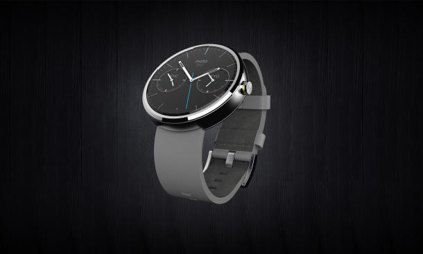
Moto 360 isn’t yet in our hands, but between Motorola’s preview announcement for developers and the Google Hangout yesterday, we’re getting a pretty good idea of how it will work. How does it compare against, the incumbent Pebble? More on that in a sec.
Android Wear is clearly a big part of Google’s 2014 strategy. Like Android for smartwatches and tablets, if the strategy pays off as planned, developers and manufacturers will go gangbusters using it to build all sorts of wearables. Smartwatches look to be first out of the Android Wear chute.
Familiar partners are lined up and merely months away from releasing Android Wear-powered smartwatches.

LG has announced–predictably enough–the “G Watch”. We don’t know too much about that one yet. As we know LG has made the last two Nexus phones for Google, including the superb, if not slightly fragile and occasionally battery-challenged, Nexus 5 (2013). Some are saying this will be the Nexus of smartwatches. Expect a reference-like design approach. Google has made available two supported form factors for Android Wear watches: square and round. Early word says the G Watch will look along the lines of Pebble, adopting a square-ish design.
Motorola stole the Android Wear show – at least this week’s edition. Sexy. Elegant. Classy. Polished. Slick. All words that could be used to describe the Moto 360. Scanning opinions across the Web I don’t recall finding a single complaint regarding the Moto 360 design. Motorola has been judicious in providing early photos of the device, and yesterday gave us even more about the design process with an interesting Google Hangout that lasted about 30 minutes (once it finally got going… and as the Motorola team likes to jokingly remind us the people who scheduled the time and coordinated the Hangout were not the same ones actually working on the Moto 360 watch).
ALSO SEE: Android Wear: Uphill battle for smartwatch start-up Pebble?
Obviously we can’t do a formal review of the Moto 360 yet. But given the amount of information we have about it, both from Motorola regarding the device itself and from Google regarding the Android Wear platform, we can at least informally compare it to the class-leading (at the moment) Pebble.
Pebble surprised me when I reviewed it last month. I find it well made and practical. Best of all, there’s a lot of apps and watchfaces in the new Pebble App Store. After wearing Pebble for a few months, there’s no going back – notifications on the wrist are handier than I could have ever predicted.
Okay, then, let’s do a quick comparo between the Moto 360 and Pebble smartwatches.
Moto 360 vs. Pebble
DESIGN

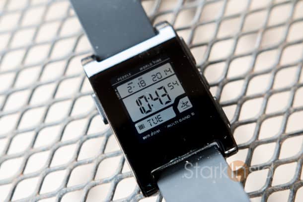
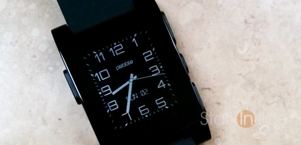
Pebble is a geek’s delight. And it looks the part. The original Pebble, which famously came to fruition as the result of a very successful Kickstarter campaign, is square, plasticy. Buttons (3 on right, 1 on left) look like spares from a Radio Shack electronics kit. Pebble announced Steel at CES. For $249 you can now buy a smartwatch that looks almost normal. The reviews were positive. In the end–maybe it’s my Silicon Valley early adopter demons–I still prefer the original Pebble. It’s robust, and just fantastic.
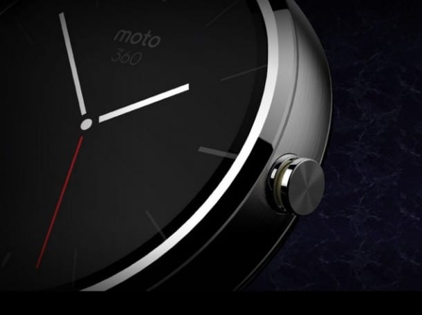
Moto 360 emotes craftsmanship. As lead designer Jim Wicks noted yesterday during a Hangout, Motorola has a pedigree in quality design (think RAZR). If they’re goal was to hit the “Whoa!” mark consider it a success. Sleek aluminum surrounds the circular watchface. There’s only one button, on the right and reminiscent of a classic watch. Those perhaps turned off by Pebble’s geek-factor will find no such fault with the Moto 360.
SCREEN
Pebble chose a e-paper for its smartwatch. That was a somewhat controversial decision. In this day and age of high ppi, 4K, and OLED wasn’t this a step backwards? Oh, yes, it’s also only black and white. After using Pebble for a month or so, I can attest that the Pebble team got it right. This is a watch that’s easy to read in bright sunlight. Battery life is great thanks to the e-paper’s energy efficient ways.

We don’t know the nitty-gritty specs, but we do know the Moto 360 features a round 1.8-inch color screen. Google’s guidelines say images should be at least 320 x 320 pixels so that gives us a clue. We do know the Moto 360 can sense orientation (left or right hand) and flip accordingly. If the actual screen is anything like the screen shots Motorola has provided it’s going to be good. Motorola assures us that you’ll always be able to get the time – meaning, the screen will have some form of low energy always-on mode, much like Pebble.
BATTERY LIFE
Pebble lasts me about 4-5 days with normal use (I turn off Gmail alerts, and only get certain Twitter, SMS and Facebook alerts). That easily beats out the current crop of competitors.
We have no idea how well the Moto 360 will fare. But, Motorola has a history of making mobile phones with exemplary battery life (again, RAZR). Wicks pointed out during the design Hangout that battery life was a key priority for the team. At this point, I believe the expectation for a smartwatch battery life in 2014 is about a week of normal use.
WATCH: Android Wear Preview
CHARGING
Pebble uses a proprietary charger that attaches via a magnet to the left of the watch. Though I wish it were micro-USB I appreciate that this design choice allows it to be water proof (you can use it in the shower and pool). It works well enough, and charging only takes about an hour or so.
Many of us noticed that the Moto 360 lacked a charge port. Motorola yesterday praised our incredibly savvy attention to detail. Expect some form of wireless charging system when the 360 arrives this summer.
PEBBLE OS VS. ANDROID WEAR
This is the really important stuff.
Pebble runs its own operating system. Using Pebble OS developers can build either a standard app (such as Yelp, Foursquare) or a watch face app (some of my favorites here).
MORE ON STARK INSIDER: Moto 360 could be first elegant Android Wear smartwatch (Video)
Moto 360, of course, runs Android Wear. Google Now will be a huge part of the experience. Cards will display information and can be dismissed with a swipe or acted upon with a touch. Contextual (suggestive) information will appear similar to the way it does for Google Now on Android phones. You’ll get cards with useful tidbits of info that Google thinks you need to know at any given time: weather, sports scores, travel times, flight status, etc. You’ll also be able to issue the seemingly ubiquitous “OK Google” command to “demand” specific actions: set an alarm, show calendar, play music, navigate, etc (the initial Android Wear SDK supports 8 commands; that should grow quickly). Using a clever mix of “Notification Stacks” and “Pages,” Google has designed what appears to be a simple, yet powerful system.
Here we begin to see a difference in design philosophy.
Pebble is a smart watch. But, in reality, it’s not that smart. It really is just relaying notifications, via Bluetooth, from your smartphone to your wrist. That’s incredibly useful stuff, though far from the Dick Tracy watch many envision.
Moto 360, thanks to Android Wear, has voice recognition. And it has a not-so-secret weapon: Google’s cloud services. Since Google knows and sees all, it has a huge advantage when it comes to context. It knows, for example, that I searched earlier today for “Napa wine events” and is automatically suggesting articles based on my interest in that topic.
CAMERAS
No cameras on Pebble. No cameras on Moto 360.
Thank you. That’s the way it should be in a ridiculous-free zone.
PRICE AND MARKET POSITIONING
Pebble retails for $149. Pebble Steel for $249.
Neither Motorola nor LG has tipped its hand when it comes to pricing. My guess is $199-249. I can’t fathom many ponying up, say, $299+ when an unlocked smartphone such as the Nexus 5 can be had for that amount.
In order to survive, Pebble will likely need to position itself as a basic smartwatch. A great one, yes. But one that can be had for, say, $79 or $99 by late 2014 or early 2015.
Moto 360 is a premium smartwatch, with voice recognition and Google Now. That’s worth a price premium.
It’s going to get really tough for Pebble, the company. LG, HTC, Samsung and Motorola are all charging into the wearables space. With Android, Google has proven it can absolutely crush markets (smartphones/tablets). Apple should enter the race soon (where on earth are they? where are the new post-era Jobs products and innovations we keep hearing about?). For tiny Pebble this is the come-to-Jesus moment. Positioning and focus will be tantamount to survival.


