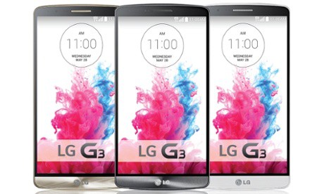
Whether you like a 5.5-inch phone or something smaller is a matter of personal preference. Only you can decide. So when it comes to the new LG G3 (my first take), with it’s large screen (though not as massive as the Samsung Note 3!), it’s foolhardy to presume that I, or anyone, can tell you it’s the ideal size.
The answer is, of course, it depends.
It depends on if you like using your phone with one hand. Or if you use nav a lot, and value a big screen for all the map information. Or maybe you’re like millions of us, and use your phone to regularly surf the web, and read articles.
But, there’s no thing that’s perhaps less debatable. And that’s the…
Bezel.
While the early days of smartphones, circa 2007-2010, saw companies such as Apple and Google focus mostly on apps and in recent years on web services such as Siri and Google Now, today the battle appears to me more about refinement. iOS designers are paying a lot of attention to things like fonts, white space, and killing of dated concepts such as skeuomorphism. The Android camp similarly has streamlined the look and feel of its market-leading mobile OS, and pushed hard on voice recognition.
Part of today’s thinking has a lot to do with not only how a phone looks (metallic-looking plastic is a popular trend), but also how it feels in the hand. LG talks a lot these days about “grip-ability” – yet oddly doesn’t define how the G3, for example, is more grippable than the competition. One thing that we who follow new smartphone and tablet releases have observed is the incredibly shrinking bezel. As manufacturers seek to cram more capability into our hands it only makes sense that they look to maximize things like screen real estate.
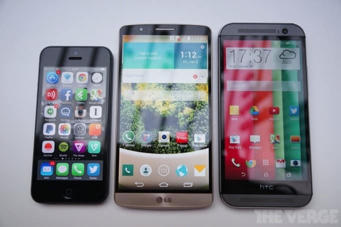
Case in point: the new LG G3. Look at this photo courtesy of The Verge:

That’s the iPhone 5 on left, followed by the LG G3, and HTC One. Respective screen sizes: 4.0″, 5.5″ and 5.0″.
One thing is obvious. In the world of Android, bigger is better. Not that you can’t find small Android phones, you can, but it seems that there is a healthy appetite for phones with screens 5-inches and larger. Apple is missing out. I’d be shocked if we don’t see larger iPhone offerings at some point this year. Smartphones, as mentioned in the outset, are about personal preference, and one size does not fit all.
Look at the design of those three flagship devices above and it becomes evident that Apple’s (albeit elegant, robust) design is aging – the bezels surrounding that small, narrow 4-inch screen are large by comparison… even by iPad Mini standards it would seem.
Then look at what LG has done with its monster of an Android. According to the company, about 77% of the front of the G3 is allocated to the screen. Thank the incredibly shrinking bezels for that. Note how even the mighty HTC One (M8) can’t keep up in that regard – the HTC logo at the bottom and slightly larger bezels result in a package that isn’t as compact as it could be. LG is able to pack a 5.5″ screen into a body that’s the same length, yet only slightly wider as the HTC One. Well done!
The other design facet worth noting is what Google has done with Android KitKat. By allowing transparency across the bottom nav bars (back, home, apps), users have more screen space to enjoy without sacrificing usability. It’s a detail, yes. But spend time with apps such as Talon (a slick Android Twitter app) that take advantage of this Android feature and it’s hard to imagine it designed any other way.
It’s encouraging to see LG make Android inroads. The company needs a hit. Brand recognition when it comes to the smartphone market is a challenge for the fridge, and television maker. It’s nice to see alternatives to the Apples and Samsungs of the world. I’m hankering to replace my Nexus 5 (already) – it’s fragile design resulted in a hairline crack, and it’s battery life is woeful. It would appear both of these issues have been rectified with the G3 and I’m hoping the phone, as history informs us, becomes the basis for the Nexus 6 (or Android Silver flagship). Or, maybe we’ll see a GPE version in the Play Store this summer. Either way, I like LG’s design direction. And special thanks for removing that pesky camera bump on the rearside of the phone- a quirky design seen on the Nexus 5 that prevents it from sitting flat on a desk without wobbling.


