Google today gave a preview of the next version of Android at its I/O developer conference in San Francisco. Dubbed Android M, the next version is, from what I could see, not so much a feature-rich release overflowing with ooohs-and-aaahs, as one focused on bug fixes, and subtle refinements designed to improve the overall user experience.
The flat, modern aesthetic we saw introduced with Lollipop continues — that’s a good thing, it’s a clean look that values readability and ease-of-use.
“We made a conscious decision to focus on quality end-to-end,” said David Burke, head of Android engineering.
Here’s some of the top features and improvements we can expect to see when Android M arrives later this year (Google says to look for it in Q3).
1. PERMISSIONS WALL BE GONE

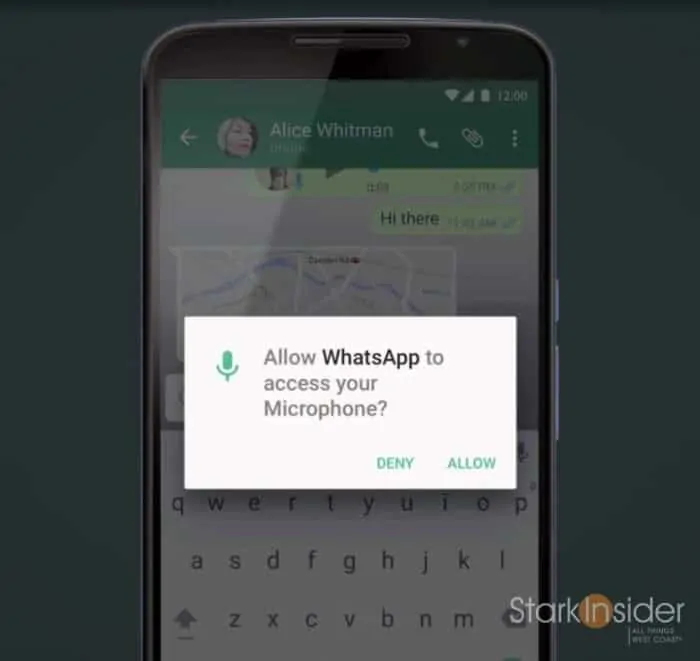
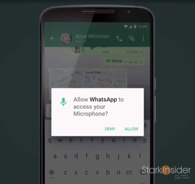
One of the most frustrating things about installing apps on Android is the “permissions wall” that confronts you before the install begins. Understandably, Google wants users to be aware of what features any given app is accessing on your phone. After using Android for so many years, though, I’ve become accustomed to just blindly (dangerously?) accepting whatever permissions wall appears. If the app is a less-known dev, I might take caution, but for the most part, I want the app installed pronto so I can get on with it. Apple takes a different approach. When an app wants to access, say, your camera, an alert comes up to ask for your permission. This makes more sense as the permission request happens in context of the feature use. Google seems to have borrowed this design. Android M will have 8 permissions including contacts, phone, camera, location, microphone, GPS, calendar and SMS.
2. WEB EXPERIENCE VIA CHROME
Have you ever been using an app, and then, unceremoniously found yourself thrown into a new, completely different looking web page? Typically that happens when an app needs to do something through the mobile browser. For instance, I use the Fenix app for Twitter on my Android phone. When I click a link, Chrome typically comes up, and the Fenix Twitter app closes (but remains running in background). The user experience when this happens can be disruptive. The interface completely changes. It can be jarring, and confusing. Google’s answer is Chrome Custom Tabs. Scheduled for Q3 it allows developers to tap into native Chrome functionality (sign in, saved passwords, autofill, multi-process security) from within their apps. The end result will be a more streamlined user experience, with less (or no) window switching that can disrupt the user experience.
3. APP LINKS
Android M may well be the “most polished Android release to date.” It may also be the most boring.
If you’ve used Android for some time, you’ve likely become accustomed to setting default apps. When I click a photo, for instance, I like Photoshop Express to be the app that automatically opens it. Same too for Fenix for Twitter links. Chrome for web links, etc. Google calls this the “intent system”. Now apps can verify this up-front. So, presumably, when I install a video app, I can set it up front (not later) to open everytime I click on a video. Big deal? Quite a minor thing, and evidence again Android M is all about refinement.
4. ANDROID PAY
Apple and Google continue to battle for the mobile wallet. Neither has broken through. Android Pay is Google’s approach. It’s based on NFC. Currently 700,000 stores support the standard. Soon you will be able to use your fingerprint to authenticate at POS. Google didn’t say much more about how they intend to expand the Android Pay ecosystem, or how it will get more stores to participate.
5. BETTER BATTERY LIFE
Okay, to me this is the big one. Battery life is slowly–slowly–getting better. Each Android release seems to be better at power conservation. I say seems, because we’ve seen Google trump up battery life improvements in the past, only to realize that new Android features actually conspired to do the opposite, and hurt endurance. “Doze” in Android M will shutdown apps based on motion detection of your phone/tablet, with alarms and notifications still available. Sounds, again, like a minor improvement.
AND THERE’S MORE (MINOR STUFF)
Android M will support the new USB-C standard. Copy and paste and word selection are improved. Volume controls now gets its own drop down menu with individual sliders (thank you!).
That was it.
No mind-blowing demos. No feature that made us leap out of our seats. No futuristic virtual reality stuff.
True, Android M may well be the “most polished Android release to date.” It may also be the most boring.
But, that’s a good thing. Mobile is maturing. In September, Android will celebrate its 7th birthday. Back in the early days, each Android release was a major step forward. Now it’s all about incrementalism. Fine tuning existing features, and making the user experience as seamless as possible. Look over at Cupertino, and the drumbeat is similar, with each release of iOS focusing on the little stuff.
At I/O Android used to be a really big deal. It still, of course, is the core of what Google does (and it was the lead at today’s presentation), but the emphasis has shifted: to Android Wear, Android Auto, Google Now. This shift suggests that, yes, mobile has matured, and the market opportunities going forward are in extending the existing ecosystem.


