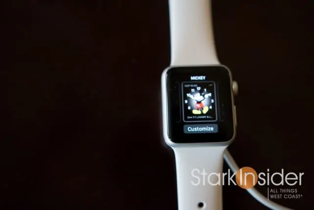
The Apple Watch is here, and the response has been mixed. Some love its power, simple outward appearance, and variety of gesture and button controls. And, others, well… others are not so enamored with it for those very same reasons.
I’ve spent some time with one recently (38mm – my wrists are small at only 6-inches), and while I don’t have enough time yet to make a long-term prognosis (I’m on Android so that will be difficult), I can say that I’m reasonably impressed with the Apple Watch. Not full-on impressed. Just a tad so more than I thought before picking up the relatively tiny watch. I’ve spent a lot of time with Android Wear since it was announced last year, and also with Pebble since it was launched. So when it comes to testing smartwatches, everything is relative. In the case of Wear, Google released it far too early in my estimation. In an effort to get to market first (or at least, before Apple) it gave us a half-baked experience. It’s much better now. And I can say Wear is quite slick. Publicity damage, however, already done.
Relatively then, the Apple Watch feels far more complete and polished than Wear 1.0 did in 2014. While learning the ins-and-outs takes time (there touch, force press, gestures, a crown that also serves as a button, and a normal button below that), setup is a breeze. The display is sharp, colors pop. It looks decent too — though I wouldn’t go so far as to call it a fashionable by any means, as much as Apple is marketing that hype.
Apple Watch also feels comparatively tiny. At least to the current crop of watches running Wear, the likes of the Moto 360, Asus Zenwwatch and LG Urbane. I do miss the larger screens of those devices. Come from a 1.25-inch Pebble, though, and you’re likely to feel absolutely fine with the 1.3-inch Apple Watch display.
After about a week with Apple Watch, here’s three things I believe Apple needs to fix.
1. Give us Custom Third Party Watch Faces!
Tim Cook said that the Apple Watch was its “most personal” product yet. And they’ve done Yeoman’s work giving us all sorts of choice: watchbands, case finishes, price points. So it’s somewhat surprising that we can’t (yet) install third party, or even Apple made, watchfaces. The ones that come with the Apple Watch are generally more functional than they are inspiring or interesting or creative. Customizable “complications” are decent enough, if basic. Check out FaceRepo or the Play Store, though, and you quickly realize that the sky’s the glorious limit when it comes to what developers are designing for Android Wear faces. For a company known for design (and creating the concept of micro-sized app store transactions), there is much wasted potential here.
2. Calm the Notification Firehose
When you first set up the Apple Watch, all notification are set to stun. Worse still, a ping notification is also on by default (tip: here’s how to turn if off, via The Verge), along with the expected vibration. If you get lots of emails, social media updates, texts and so forth, be ready for your wrist to dance non-stop. Since smartwatches are primarily about notifications, I’d like to see Apple add a simple choice at set-up to let just the stuff that matters to us get through. It could be as simple as:
1. Nothing
2. Emails only
3. Emails, texts only
4. Emails, texts, social media updates only
5. Everything (currently the default)
3. An Apple Watch with a Circular Face
Okay, this one’s not really a fix, more of an “add.” After re-visiting Android Wear, I fell hard for the circular based models, specifically the Moto 360 and LG Urbane. Granted it’s a personal choice, and many will feel exactly the opposite — square is better because you can (in theory) display more information. Again, since this is Apple’s highly personable tech product I feel the team at Cupertino should offer it in a square and circular form factor. Interestingly, spending time with the Moto 360 not only made me appreciate its larger screen, but also made me realize that in actuality information is not compromised, and in many cases, the 360 would display more information than its square-based brethren.
Overall, the Apple Watch impresses. It’s far more polished at launch than Android Wear, and those who like to briefly check sports scores, stock prices, or the latest texts, I’m guessing will come to adore its convenience. I did with the Moto 360 (and Pebble Time, and its stellar battery life and outdoor readability). Like Android Wear watches, I’d like to see better battery life. I’m sure that will come with time (Pebble Time?). For now, know you’ll need to charge it at your bedside alongside your phone.
One question yet to be answered remains…
Is the Apple Watch and wearables an entirely new market (and category) or merely a far smaller, accessory-sized attachment opportunity?
I’m leaning towards the latter. But we should have a better read on the answer when we see how the Apple Watch sells through 2015 … using Android Wear as a sales barometer should make investors slightly nervous that the upside may not in fact be as monumental as we were led to believe.

