Could combining the best of Apple Watch with the best of Android Wear result in the perfect wearable?
Android Wear has come a long way since its somewhat shaky start in early 2014. The UI is streamlined, battery life is (marginally) improved, and wi-fi is a neat trick that allows you to receive notifications when not within bluetooth range of your phone.
Meanwhile, the Apple Watch is here. It too is a handy — if not at all fashionable as Apple would have you believe — way to receive notifications, and do simple tasks without needing to pull out your iPhone.
After spending time re-visiting Wear, and using the Apple Watch for a week, though, I realized that each is the perfect complement to the other. Together they could make a beautiful wearable sandwich.
Let me (try to) explain.
Single Serve Information
Beyond notifications, which both Android Wear and the Apple Watch (and Pebble) handle with ease, the next big thing to provide users are (1) apps, and (2) “single serve” information. Today, I’m tackling the latter. Apps are a whole different ball game.
What is single serve information?
Things like: the weather, stock price, sports score, flight status, step counter. Simple everyday bits of information that are helpful.
Google and Apple take markedly different tacts when it comes to single serve information on smartwatches.
Google Cards
Google is all about context. As we know all too well Google knows a lot about us — what we do with the Google search engine, what ads we react to and click on, and, of course, what we like emailing about. Yes, let’s table privacy concerns for now.
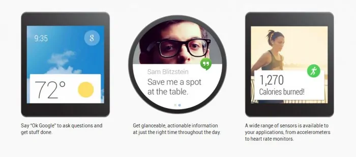
Cards are the way that Google presents single serve information on its Android Wear operating system. They’re pretty little bits that appear on the lower half of the watch face. Swipe up and you can see more detail — say the weather. Swiping left and you can often reveal more detailed information (extended weather forecast), and, eventually reveal actions (open weather web site on your phone).
The nice thing about Google Cards is that they often present the right information at the perfect time. When it gets it right it can be a wonderfully convenient thing. Like, for example, when Google predicts I want to go to the gym, and pulls up a “time to place” card with navigation option. Nice! Or when the SF Giants are playing, and Google pulls up the score.
The downside with Google Cards: once you dismiss them they are gone forever. Unlike the Apple Watch, there’s no way to pull up a Card at will. Google presents it at the appropriate time (and would prefer you use “Okay, Google” to request information on demand). You read it. Dismiss it. Poof, done. Back to looking at the watch face, waiting for what’s next.
Apple Glances
The Apple Watch experience, at least when it comes to single serve information, is almost the polar opposite of Google.
For the most part, it’s manual.
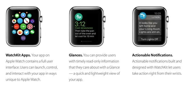
Here, a row of “Glances” sit below the watchface on the Apple Watch. Swipe up, and you can reveal weather, stock prices, a fitness tracker, headline news, etc.
Unlike Android Wear, Apple does not surface these bits of information based on context. Rather, Apple’s approach is perhaps classified as non-intrusive. You, the user, decide when to access this additional information.
It’s worth noting that with WatchKit tools, third party app developers can surface information (“It looks like you left home and your Living Room Lights are still on.”). However, this approach obviously does not include core Apple Glances, and, is more of a piece meal approach as opposed to a pure platform play that has context built-in to the core.
Google Cards + Apple Glances = Ideal Wearable Experience?
The thing is, both Google’s and Apple’s approaches have merit.
There are times you want an electronic device, such as your phone or a smartwatch, to sort of read your mind. Convenience is the order of the day. These are merely tools, and the better they can help us out day-to-day, the more efficient we can be, say, in the workplace, or in the midst of a busy commute.
On the other hand, if you want to know a stock price at a certain time of the day because you’re timing a sell order, then, wouldn’t it be nice to pull up a quote on demand? You can on Apple Watch, but not on Android Wear (again, not without using a cumbersome voice command).
So, my guess is that we will see both of these capabilities on future versions of Wear and WatchOS.
What Google Should Add: Persistent Google Cards
Google should add a UI screen to Wear that has a steady state – a persistent row (or column) of Google Cards, readily accessible by the user when needed.
Yes, I know, designers are constantly battling feature richness vs. ease-of-use; an especially important concept when dealing with screens under 2-inches in size. Still, not all of us have the patience to use “Okay, Google” to get information (nor does that work in the office or most other public setting). I would much prefer to swipe to see the GPRO or TWTR stock price.
What Apple Should Add: Contextual Glances
Glances are great, but they’re easy to forget about.
If a flight is arriving, Apple should surface that information, not require me to manually seek out a Glance (or app).
If I’m heading out the door at the end of the day, like Wear, the Apple Watch should pull up my commute information automatically.
In essence, Apple needs an analog to Google Now.
The Smartwatch Compromise
For now, smartwatches are as equally amazing as they are frustrating.
I’ve been using OG Pebble since it came out, and there’s no going back. Notifications on the wrist are extremely handy. I often have my hands full, setting up camera gear for a Stark Insider video. It’s usually a time crunch. When a publicist texts me about a location change, or schedule update, it’s imminently helpful to quickly look at my watch, rather than dig into my pocket for the OnePlus One.
I’m sold on the idea of the smartwatch. But I’m not yet sold on its execution.
Android Wear is getting better. Battery life is still terrible (7 days needs to become the norm). And, as mentioned above, we need persistent Google Cards.
Apple Watch is new and without native apps is often an exercise in patience, as the watch receives code from the iPhone in agonizingly slow fashion. Still, I think it’s decent, if not way overpriced (and don’t dare try to sell me on the idea this is some sort of fashion piece!).
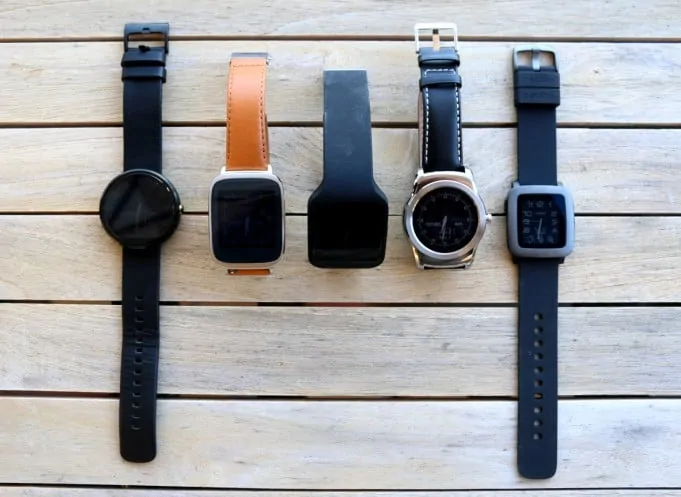
Pebble is the king of outdoor readability. And, in my experience, stability. You can miss a notification from time to time on Android Wear. Why, I have no idea. Never on Pebble. Physical buttons as found on Pebbles can be ideal — driving in the car, controlling music at the gym. You don’t miss touch on those occasions. Funny, though, that a major selling point of a new watch — Pebble Time — is… color. Color! Yes, color! I have a Pebble Time, it’s nice, but I’ve started to get more attached to the richness of the experience on Android Wear and the Apple Watch…
Google and Apple: Your Move
Google just released Wear 5.1.1. It adds wi-fi and a (ridiculous) wrist-flicking gesture for scrolling, and some other minor enhancements. Apple says it will add native apps to WatchOS later this year. That should be a significant improvement in user experience.
Wearables are slightly half baked at this point. I wear either the Moto 360 or Pebble Time, but have learned to deal with the idiosyncrasies of each platform.
Where — wear? — the smartwatch goes next will be interesting to see.
No doubt, Apple will incorporate Google Now-like features over time and bolster its contextual smarts.
Meantime, Google I’m quite confident will capitulate and add an extra interface for persistent Google Cards.
Either way, I wonder if sales will really take off (my guess is prices need to fall to $149 and below to attract mainstream buyers).
Are smartwatches an entirely new market segment, or merely an accessory? The next six months should tell us a lot about the answer.


