NOTE: This review is based on an early “Kickstarter Backer” version of Pebble Time. Some (or all) of the issues pointed out may (or may not) be resolved by the time it reaches mass production.
UPDATE 7.22.2015 – Bumping up stars from 2 to 3.5 out of 5. I’ve now tested the Pebble Time with other phones, including the Nexus 6 (beautiful screen, poor battery) and Asus Zenfone 2 (solid bargain, dim screen) and did not experience Bluetooth connection drops. With that and the charger working, things are obviously much improved. I still find the color screen less contrasty and at times harder to read in certain angles when there is less available light. Regardless, outdoors Pebble Time is superb, beats anything on the market. Also, the Pebble Time app is vastly improved from the OG app from a year or so ago.
UPDATE 7.11.2015 – Pebble sent me a replacement charging cable, and it works perfectly fine. Meanwhile I’ve got a Nexus 6 on the way to see if that solves the Bluetooth/disconnect issues I’ve been having with the OnePlus One. I’ll keep the updates coming!
UPDATE 7.7.2015 – I received an email (and Tweet) from Pebble Support this morning. A new charging cable is on the way, so hopefully that will resolve one of the issues. Being able to charge a device is a good thing!
On paper the new Pebble Time smartwatch looks better than the original in every way possible. For the first time, a Pebble watch comes with a color display. It has a more compact design, with buttons that are svelte, better integrated into the overall design. Battery life reigns supreme (up to 7 days, per the company), especially when compared to the Apple Watch and Android Wear devices, almost all of which require a daily charge.
So what’s the problem?
Quite a bit actually.
Quick caveat first. I’m a huge Pebble fan, and I am willing to admit, a loyalist. The reason? The OG Pebble was the bomb. Geeky to be sure, but it was my first experience (with a smartwatch) and as I wrote in my 2014 review there was no looking back. I just loved being able to quickly glance at my wrist to see notifications. This was especially handy when I was on location shooting video for Stark Insider, when my hands were occupied with camera gear and cables, and such. Very convenient. Plus Pebble’s battery life was amazing, I didn’t need to worry about it, and, because I didn’t need to charge it over night, I could wear it in bed, and get handy sleep monitoring info from a great little built-in app called Misfit. At the end of the year, I said that Pebble had won the 2014 smartwatch crown.
So, backing Pebble Time on Kickstarter was the proverbial no-brainer.
When I first received the watch a few weeks ago, all looked good. It had cute new animations, everything ran quickly. Then I tried to charge the Pebble Time. And that’s when the problems started (more on that below).
Again, I don’t want to rant here. And again, I love my OG Pebble, and vastly respect the Pebble team for what they’ve done in a David vs. Goliath situation (going toe-to-toe against Apple, and Google and its Wear manufacturing partners like Sony, LG and Motorola). But like Tony Montana, I’m just trying to speak from the heart and go about my business.
Also, it could be that my Pebble Time is part of an early batch that are possibly partially defective. So, yes, take that into account when reading this.
Okay, I’ll break this into two parts. The first is my thoughts on the new design. Then, I’ll get into the annoying stuff … all the issues I’m having with my Time.
Pebble Time – Design

It should be better in every way. But it isn’t.
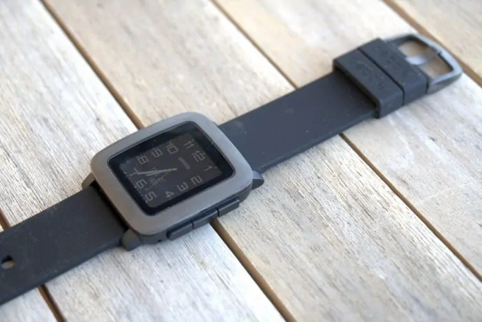
First, the bezel. It’s large. Though it may be the same as the OG Pebble, the two-tone color scheme (grey and black) ensures that the large bezel is noticed. On the other hand, the original was solid black, and it blended in seamlessly with the screen, thus creating the illusion of a larger watch face.
The display. It’s color. I like that. But I don’t like that there seems to be less contrast. Everything just feels less contrast-y. Not scientific to be sure. I used to be able to read the settings screens and app screens (accessible by pushing the middle right button) without issue. Now, in certain lighting conditions that’s not always the case. The color screen may be partially to blame, as some of the fonts and backgrounds are not just black and white anymore (ideal for readibility). One thing’s for sure: outdoors the Pebble Time display is awesome. It loves light, and legibility gets better the more you throw at it.
In my first few weeks with Time, battery life doesn’t seem as good as the original either, which is a shame given this is a next generation iteration. Still, I must say getting about 3 days per charge is perfectly fine for me — the “up to 7 days” claim seems a tad optimistic.
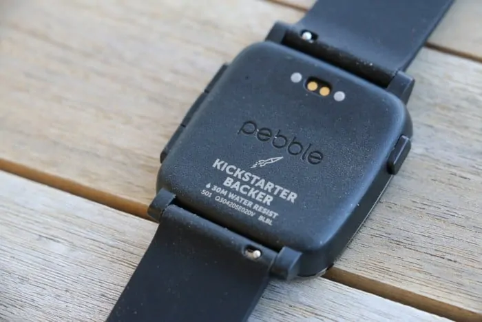
The charging connectors have been moved to the back of the watch. That’s both a good thing and a bad thing.
On the plus side, Pebble looks (slightly less) geeky, now that the gold connectors are not visible on the left exterior of the watch as they were previously. However, attaching the charging connector doesn’t latch as easily or solidly as before, which leads me to the first of several (unfortunate) problems with Pebble Time…
Pebble Time – Problems
Charging Cable Doesn’t Stay Connected
Google this and you’ll see I’m not alone. When I tried to charge my Time for the first… time, I attached the connector to the rear of the watch and set it on a table. For a moment I saw the (cheerful) charging icon, which is a coffee cup being filled (cute). Then that disappeared, and I saw a 20% battery life warning (in red, less cute). Some research led me to forums where others experienced the same problem. Turns out the two center pins in the charging connector are spring loaded. Occasionally — or in my case, always — the pins get stuck, and won’t release, meaning they don’t extend far enough to make contact with the watch. Net-net: the watch won’t charge. Okay, not a big deal, right, just ask Pebble for replacement? Well, yes and no — more on that below where I talk about customer service.
UPDATE: Pebble sent replacement. Required more emails and follow-up then I would have preferred. Still, problem solved.
Bezel Scratches Far Too Easily
I never saw nary a scratch on my original Pebble. Within a few days I had several on my Time. And I’m one of those guys who treats his gear with ridiculous, silly amounts of care. Pebble Time it seems is quite a fragile one. Again, check the forums. I’m not alone. Too bad about that. If you get one, be sure to get a protector that not only covers the screen, but the entire face of the watch, including that large, delicate bezel.
Bluetooth Disconnects Daily
Almost daily, I’ve noticed the Pebble Time disconnecting from my phone (OnePlus One). That’s not good. I rely on receiving texts on my watch, and responding to urgent stuff. Last year when I tested the first batch of Android Wear watches I noticed the same thing (it’s much improved with Wear 5.1.1). Reliability was one of Pebble’s strengths, and now, that was even up for grabs. The solution I discovered is not clear, nor repeatable. It involves a combination of rebooting my phone, the watch, and switching Bluetooth off, then on again (on the phone). This takes an appreciable amount of time of course. I hope this is a firmware or app issue that the Pebble team can fix. Either that, or, again, my watch is part of a faulty first batch — keep that in mind, as all of this might be early QC issues, and I don’t want to make broad statements about ALL Pebble Time shipments.
UPDATE: Seemed to be an issue not related to the Pebble Time. Tested connectivity with Nexus 6 and Asus Zenfone 2 without any disconnect problems.
Battery Life Not as Good as Advertised
“Up to 7 days.” For me, more like 3, maybe 4. Still plenty fine. I’m not sure how someone could get a whole week unless they don’t receive any notifications. Regardless of the marketing hype, it blows away the competition. Fair enough.
Customer Service Slow to Respond
I get that Pebble is a start-up in Palo Alto. I get they don’t have the budgets of Apple and Google. And I get that there’s a community spirit around Pebble and its products, a sort of “let’s all work together” kind of vibe.
Still, I expect professional courtesy when it comes to addressing product defects — especially since I (along with many others) quickly ponied up the $169 Kickstarter pledge. That Pebble raised $20 million surely demonstrates they are doing something right.
When I emailed Pebble asking for a charging cable replacement, it took 7 days before I heard back. I was in the midst of testing the latest crop of, vastly improved, Android Wear watches so no matter I just kept wearing a gorgeous Moto 360 in the meantime.
The agent wrote, “Let’s get you a new charging cable right away”
Great!
They suggested I try a few things to solve the issue (which I had already tried, such as using a credit card to loosen the stuck pins) to no avail, and then asked for shipping info and — oddly I thought — to include a few photos. So I did.
That was 11 days ago.
I still haven’t heard back, even after a polite follow-up.
Maybe a new cable is on the way. I’m not sure.
Anyways, enough ranting, etc. Even though Pebble is a small company it seems they may need to evolve some of their customer service processes. Again, check the forums. There are similar stories (and, yes I know, first world problems indeed).
I found a tentative solution to charging the Time (I really ought to post a photo). It involves placing it on a copy of a magazine just thick enough (Wine Spectator!) to allow for the connector to sit flush on a surface, while then putting a heavy object (large book) on top of the Pebble – the pressure from the book ensures the pins make proper contact. A pain. Oh, well, it works!
Still – I Like Pebble Time

I’m scoring Pebble Time 2 out of 5 stars. To be fair, that’s conditional.
If it turns out my watch (or the firmware) is a dud, and things improve, I’d give it 3.5 out of 5 stars.
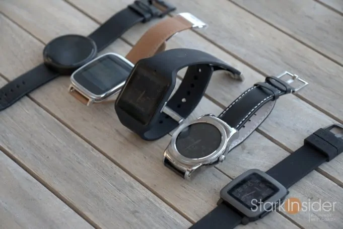
The competition is getting tougher. The Apple Watch, while more expensive, does much more, and has a vibrant screen (but it isn’t always on). Android Wear is more polished now, and some watches, like the Moto 360 ($149), are even cheaper than the Pebble Time, making them appealing alternatives. I’m a sucker for cool watch faces, and none are better than on Android Wear.
Would I recommend Pebble Time?
Tough call.
Given my experience I might instead suggest the Pebble Steel. It has a nice finish, and band, and can be found on the Web for a song. You’ll forgo color, but in my experience the original display was potentially easier to read.
At this point, the way the market is moving, you may want to consider a nextgen Android Wear device like the ones from LG (G Watch R, Urbane), or a trick, discounted Moto 360 (bad battery life though), or the sporty Sony SmartWatch 3.
Pebble had the early lead in the smartwatch market. They’re hanging tough, and continue to innovate. I just hope they can correct some of these issues (none are earth shattering to be sure) and restore confidence in their brand.
Pebble Time
3.5 out of 5 stars
Get One (Amazon):


