WatchOS 2 is here, and improves significantly upon the Apple Watch, a wearable that if not necessarily a smash hit, at least gets the idea of a smartwatch mostly right. There’s a lot to like with WatchOS 2, especially native apps, and I’ll have more soon after I’ve spent more time with the update.
For now, after having tested the Apple Watch on and off since its launch (Pebble Time and LG G Watch alternate as my daily drivers — depending how much time I’ll be spending outdoors) and I’ve come away with some things that I much prefer on it over its Android Wear-based competition.
Here are 5 things I believe Google (Android Wear) can learn from Apple (WatchOS).
5 things Android Wear can learn from Apple WatchOS
1. A Dark Theme Works Better
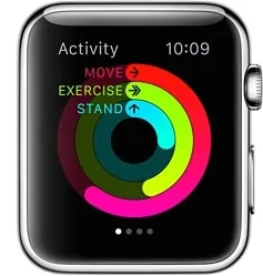
Spend some time with Android Wear, dismissing notification cards, swiping through emails and adjusting settings. Now, switch to the Apple Watch. It takes but a second to realize that a dark background works far better than the white one found on the Wear watches. Contrast is better. Fonts are easier to read. Plus, the darker background blends nicely into the bezel. I don’t necessarily dislike the white styling that Google uses for Wear, but I think at the very least it should give us a choice of a dark theme.
2. Glances: On Demand Information is Awesome
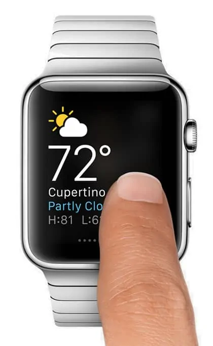
WatchOS has on demand information. Android Wear does not. That means if you want to look up the price of a stock, for example, you can swipe to what Apple calls “Glances” and see the tidbit of info in question. Wear offers no comparable way of swiping through nuggets of on demand information. You can use “Ok, Google” (and Google really loves to push its voice recognition on Wear, something that has thankfully been toned down in later releases) but that’s cumbersome when all you want to do is see something simple like the weather, heartrate, or a sports score. I hope Google adds something similar in a future release of Wear. Yes, Google Now is great. You get contextual cards, often a the perfect time (commute ETAs are a good example). But there should be a complementary way to access valuable information on our wrists on demand just like… Apple Watch.
3. More and Better Interactivity
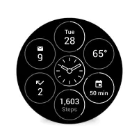
In its latest release of Wear, Google added interactive watchfaces. This is a good start. Now you can touch areas of the face and have various information appear (again, weather is the common example). But Apple is a step ahead. With WatchOS 2 third party developers will be able to display helpful information on the watchface itself. So you might be able to see your flight status, or a news headline, or maybe a button for turning on an appliance, all displayed within the face itself. Handy stuff.
4. Nightstand Mode
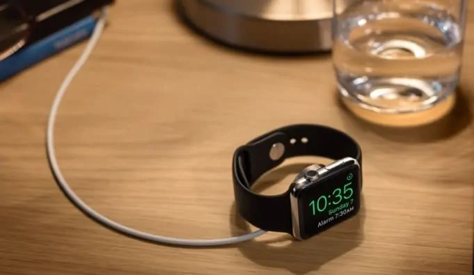
WatchOS 2 also introduces something called Nightstand mode. It works exactly as expected. Put your Apple Watch on a charging stand (and turn on its side) and it automatically turns into a bedside alarm clock. Displayed on screen automatically: the time, date, alarm clock setting, and battery life (and charging status). Makes sense, and should be standard on Android Wear too. The Moto 360 comes close. When you put that (gorgeous) smartwatch into its wireless charger, the face does switch to a special mode that puts the time front and center in a large font, with charging status around the circumference.
5. Apple Pay is Magic
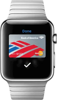
Pay at a store with your watch and you’ll never go back. Sounds insignificant, but not having to fumble with a wallet and credit card at your local coffee joint first thing in the morning while blurry eyed is just one more little thing that tech does to make our lives more enjoyable. Apple Pay is extremely easy to set-up. Once you’ve entered a credit card, you merely double tap the right button, place the watch near the terminal, wait for the beep, and — boom — in the words of Ricky Gervais, Bob’s your uncle. Your move, Google.
This is a two way street, of course. Android Wear gets a lot right too. I’ll soon look at some of the things I think the Apple Watch can learn from Wear — Google Now and context is one area where Wear watches win. For now, we should be thankful for the high level competition in the smartwatch space. The level of innovation I’ve seen in just the last twelve months of wearables is astounding.

