The verdict is in.
Is the Samsung Gear S2 an Apple Watch killer?
Answer: probably not.
Reviews so far are mixed. Some love the rotating bezel, while others believe it’s just a different way of interacting with a smartwatch, but not necessarily a better way.
I spent a few days testing the Gear S2 and came away somewhat impressed with what Samsung has done with the Tizen operating system. The circular design will be a plus for some, but I found the display cramped, almost like peering through a tiny portal, especially when I went back to an Android Wear device like the LG G Watch, or gorgeous Moto 360 (gen 1).
That S2 bezel?
It’s a mixed blessing as I discovered. More on that in a second.
Samsung Gear S2: What the tech press are saying
First, here’s a roundup of what others around town are saying about the hotshot smartwatch known as the Samsung Gear S2:
Gizmag nails it with their headline, “awesome potential, incomplete experience” and cited (as many others have) Samsung S Voice as clunky, and (again, as others have) the absence of decent third party apps.
“The Samsung Gear S2 is easily the company’s best-realized smartwatch to date.” That’s trusty source TechRadar in their hands-on review. They called the bezel innovative, and said they’d be surprised if rivals did not “respond in kind.”
Inquisitr calls the S2 a disappointment, and, even, a failure. “The failure of the Gear S2 is good news for the Apple Watch, since it shows how much better than the competition the Apple Watch really is.” Hmm, a bit harsh and early I’d say. Though, if you comb Reddit, you’ll find many complaining about S-Voice. It seems as though there’s no substitute for Google Search/Now, and that certainly gives the Android Wear platform a leg up.
“The smartwatch game has really heated up.” That’s Android Authority in their Gear S2 unboxing and first impressions video (these guys do a good job of covering the Android scene). Watch it here:
Digital Trends says the Gear S2 is Samsung’s “best product in years.” That’s really saying something given the plethora (never ending!) flow of innovative phones the company has produced (e.g. S6 Edge). For now, they say in the review, the S2 is the “best reason yet” to consider a smartwatch.
My Thoughts: Samsung Gear S2
First off, I had low expectations for the S2. Tizen? No way. Slow. Bloated. Non-intuitive. Based on Tizen’s shaky past those were just some of my initial reactions when Samsung announced the S2 — at a presentation that looked like a (campy) sci-fi pilot for a Netflix series.
Forget about what you know about Tizen, at least until you’ve tried the S2 watch. The user experience is fast, and fluid. Everything works.
But forget about what you know about Tizen, at least until you’ve tried the S2 watch. The user experience is fast, and fluid. Everything works. There’s no lag. And my fears of this watch not being built on Android Wear eased… at least temporarily… ahem… S-Voice.
DESIGN
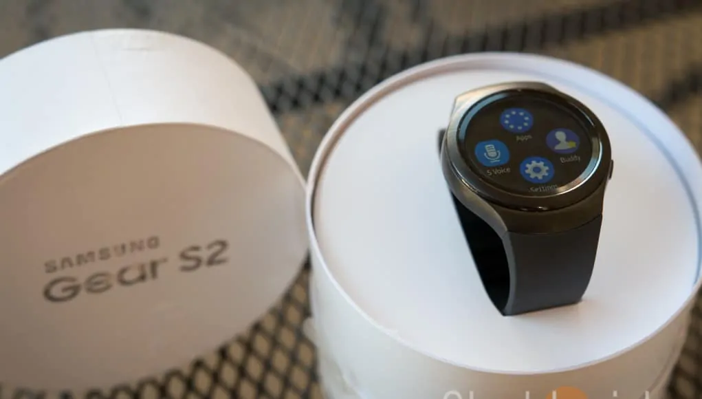
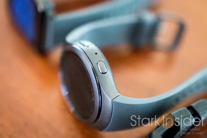
Solid design. I have small wrists (6-inch) so I appreciate that Samsung includes a smaller set of straps. The S2 feels comfortable on the wrist. The two buttons on the right (back on top, home on bottom) don’t excessively protrude. There’s a sporty class to the overall look that I find appealing and understated.
DISPLAY
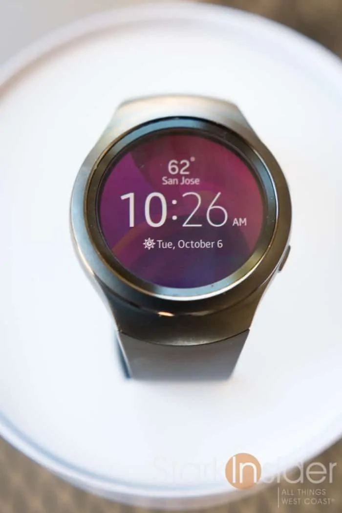
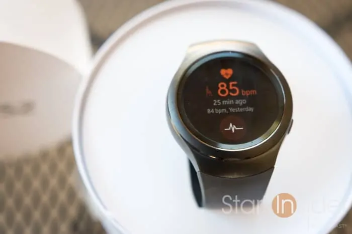
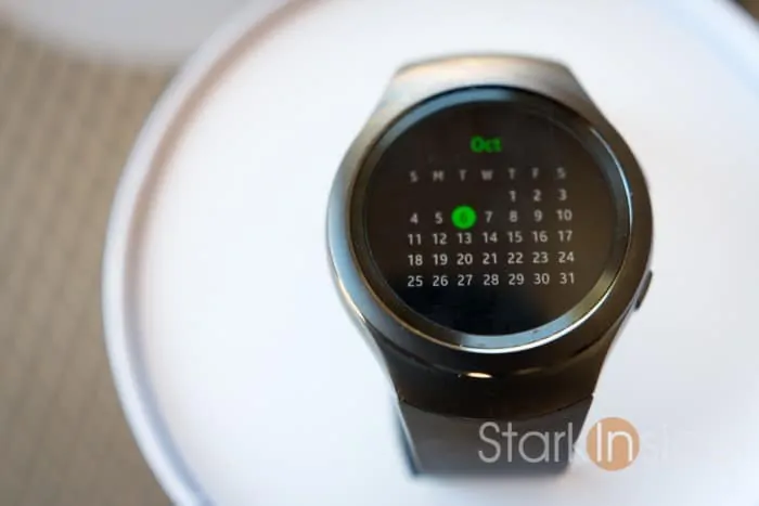
Spectacular. This is an amazing AMOLED screen (1.2-inch, 360 x 360). I don’t think I’ve seen any other smartwatch with as nice a display as the S2. Blacks are death black. Colors pop — and this is especially great because Tizen liberally uses color accents (fonts & icons) against dark backgrounds. I love that look. Hopefully Google will soon overhaul Wear and take a lesson here (and from the Apple Watch too).
With the S2 there is an option (not widely reported) for always-on. Just like most Wear watches, it will run in an energy efficient ambient mode, showing a simplified B/W watch face.
USER INTERFACE
The S2 is not as easy to use as, say, a Pebble, or even a basic Wear watch. That’s because there’s several ways to achieve any task, and, also because there’s a lot of customization that can be done. Icons can be ordered. Shortcuts can be added. But, you quickly get used to the navigation. Overall, Samsung has done a nice job with the UI, and, as mentioned earlier, it’s blazingly fast, and is easy on the eyes. Very pretty in fact.
THAT ROTATING BEZEL…
Okay, this is the marquee feature. That spaceship set that Samsung built — at what cost?! — to hype the S2 at the zany press conference punctuated the fact that the rotating bezel would be a key differentiator. That’s a smart move. After all, many smartwatches are beginning to look alike, and manufacturers need to stand out some how, some way in an increasingly crowded marketplace.
The bezel rotates with ease, and, as others have mentioned, has nice, subtle demarcation points that give you a satisfying reference point when being used. With that, you can almost develop a sort of muscle memory to hit certain screens.
The thing I don’t like about the rotating bezel is that it feels very plasticky.
I found that the bezel does work better when used with two fingers. I could use one, but often it would slip, and nothing would happen. Regardless, the bezel is clever because with that small 1.2-inch screen, swipe across and your finger will cover most of it. Browsing watch faces using the bezel, for example, is particularly handy. As is flipping across the various widgets (calendar, step counter, music player, etc.).
But…
The thing I don’t like about the rotating bezel is that it feels very plasticky, at least on the non-classic model. Tap it from above and there’s some clicket-y, wobbly stuff going on. Also, swipe the screen left or right and your finger will invariably strike the bezel resulting in a decidely cheap feeling plastic vibration. Ugh. Minor to be sure, but I don’t like it. If you like your watches robust — think Huawei — you’re probably not going to like that either. For others, it may not be a big deal at all. It did bother me.
VS. PEBBLE TIME
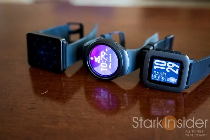
Full disclosure: I’m a huge Pebble fan. The original convinced me (Review: Life with Pebble – There’s no going back), with its long battery life, awesome e-paper display and fun, creative faces, that smartwatches were the real deal. Then I backed Pebble Time, and have been wearing that, alternatively with a Moto 360 and LG G Watch (yeah, I’m a smartwatch freak), ever since.
Indoors, there’s no comparison, the S2 screen is a brilliant, vibrant monster. Pebble? A little washed out, but generally OK. Outdoors, of course, the Pebble wins all comers.
Also, there’s a screen philosophy to consider when it comes to smartwatches…
… Pebble says I’m here 7/24 with an always on screen that doesn’t distract. If you need to see me in the dark, shake you wrist, or push a button for some backlight.
… Tizen on S2, and Google Wear says that I’m also here 7/24 (for most watches), but I glow, so that in dark rooms I could be annoying. Your option is to deactivate always-on mode, and then rely on arm movement to light me up… hmmm… not so great.
There’s something about having old school buttons too that I appreciate. When controlling music, I know on Pebble (using the awesome Music Boss app) that volume is mapped to up and down keys. And long presses go back/forward a track. I don’t need to look at my watch, I can reach for it while on an eliptical and not give it a second thought. Not so with the S2. For some odd reason, when I select the music player — which is decent enough, with background art and the controls needed — the watch defaults to the time screen after a short while. So, then, I need to use the bezel to select it again. BTW- this is an issue with Wear too. We need persistent apps!
The S2 does a whole lot more. Or it promises too. Yes, it’s cool to have CNN, Bloomberg, ESPN (needs 3 separate apps to run on the S2!), and others, but, truth be told, I’ll never use them.
As sexy as the S2 appears at first blush, push come to shove, I’d take my $199 Pebble Time with me 7 days a week.
S2 ISSUES
I did have trouble getting priority Gmails to vibrate on the S2. In fact I could NEVER get the S2 to vibrate for those. Strange that. I noticed others have reported similar issues. For me, that’s a deal breaker — I use priority inbox to respond to important stuff for Stark Insider.
Battery life seems OK. Maybe not the 3 days Samsung promises. But easily a full, active day.
In the charging cradle, the S2 did not switch to a nightstand mode.
Text gets cut off on the sides in some situations because of the circular design. Again, I found the screen on the S2 too small.
SOS: BRILLIANT
SOS is a potentially live saving feature that all smartwatches should have.
You choose up to three contacts to notify in an emergency situation. Then, when something bad happens, triple-press the bottom (home) button. That will trigger a text alert to all your emergency contacts, including a maps link with your exact location.
Smart stuff.
IS THE GEAR S2 WORTH $299 (USD)?
Ah, price. Is the Gear S2 worth $299? Well it’s partly a matter of perspective. For those who have watch collections and spend hundreds, and thousands on amassing premium timepieces, well, $299 is a drop in the bucket. So too for those cross-shopping the Apple Watch, which starts at $50 more for the Sport Edition.
If you, like me, consider a smartwatch first and foremost as a basic smartphone accessory then you might feel, again like me, that the entire smartwatch market is out of whack when it comes to price. I really believe these things should be selling for about $99, maybe $199 for premium models. Apple, however, has other ideas, and has successfully pushed the entire segment up-market. Huawei is one of the first Wear makers to follow. I can’t see this lasting.
Apple be damned. I really believe these things should be selling for about $99, maybe $199 for premium models.
Consider this.
Instead of an S2 you could buy a beautiful first-gen Moto 360 and an original Pebble.
Or you could buy the brand-spanking new, nextgen Asus Zenwatch 2 (wow, only $149 at Best Buy) which, to my eyes at least, looks pretty darn sweet, what with that gunmetal on brown color combo.
BOTTOM LINE
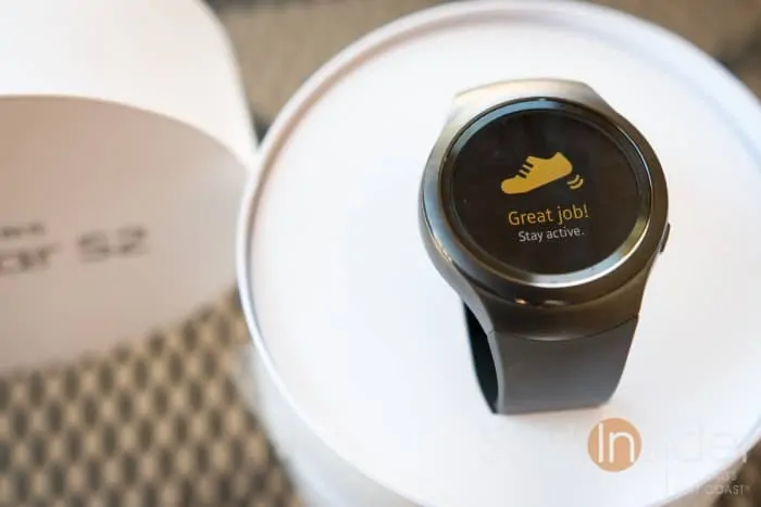
I’d score the Samsung Gear S2 smartwatch 6 out of 10.
It’s well made, Tizen runs smoothly, and the screen is stunning.
But the bezel feels cheep, there’s not many apps, and the watch faces are, for the most part, dreadful (Samsung should get some better designers on board). Wear and Pebble watchface geeks will miss their amazing face selections.
I enjoyed my time with the S2, but it didn’t blow me away.
Then there’s the price. $299. That’s hefty for a commodity accessory. I understand it’s less than an Apple Watch — but that smartwatch is better made and does a whole lot more, and the UI feels far more refined and functional. Meanwhile Wear watches — and all that Google Now goodness missing in the S2 — can be had for dirt cheap.
If you love the bezel, and the small circular design you’ll probably like the S2. But, for me, it’s still my faithful daily companions: Moto 360 (office) and Pebble Time (on the road).

