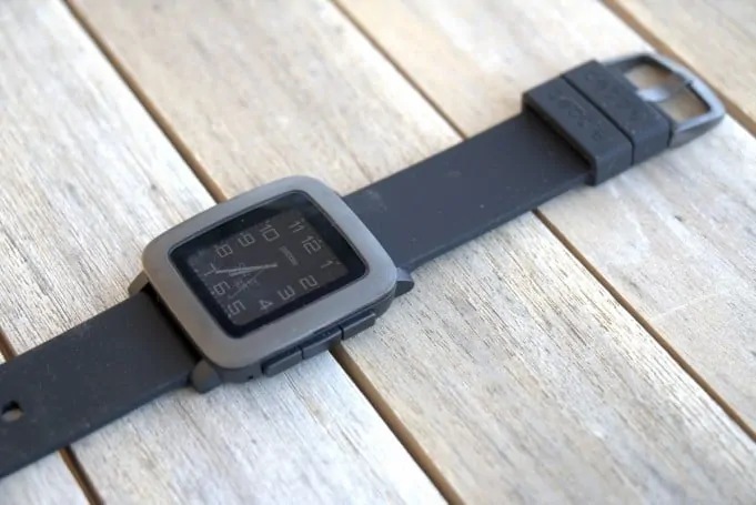
Fitbit is still the king of fitness wearables, but Pebble has been slowly, but surely inching its way up the health monitoring food chain. Today, the Palo Alto-based start-up announced an update to its software that helps users get more useful fitness data to their wrists. And hopefully, in the minds of management, help level the competitive playing field.
At the heart of the update is the ability to have watchfaces showing health activity. This is most welcome. Previously, to see number of steps, for instance, you had to go into a separate app. Not the most difficult thing in the world (on Pebble Time push right center button and scroll to the “Health” app), but other platforms like the Apple Watch and Google Android Wear already have faces that can integrate step counting, calories burned, among other fitness-related data. Given that fitness tracking is still a top of mind feature when it comes to wearables this update makes a lot of sense, not only for us end-users, but also for the company Pebble itself.
The update includes a new firmware (3.9) and updates to both apps for iOS (3.6) and Android (3.9). You should be able to manually initiate a firmware update.
Open your Pebble app and then do this:
- Select Menu (top right ellipses in Android) –> Support –> Update Your Pebble
The update process should then begin.
New Health-based Watchfaces for Pebble Time
Stride is the first officially announced watchface to incorporate the new health data directly on the face, like this:
I am initially underwhelmed by the new Stride watchface. There are no option settings. What you see is what you get. And, unfortunately, that means a default 24-hour mode for the time. Let’s hope they put more effort into future faces or give this one an update soon. Of course, third parties will really run with it…
Since Pebble has now opened up its Health API effective today, expect the developer community go bonkers. No doubt, based on my experience at least, Pebble has the most active developers of the majors — including Android Wear, and Apple WatchOS. Check out the watchface and app directories on the app, and you could be spending days and weeks checking out all the possibilities.
One limiting factor, though, could be the size of the Pebble watchface.
At just 1.25-inches, the display is relatively diminutive compared to other smartwatches. That could limit the amount of information that could be reasonably displayed — save for using microscopic fonts. Still, we will have to see. I’m sure the new watchfaces will be as imaginative and whimsical as we’ve come to expect from the talented dev community.
Pebble Time: More New Features
But, that’s not all…
No, no, no… Team Pebble likes to overachieve with updates. So, once again there’s more to the story.
— MMS messages will now include icons
— overall performance has been improved (I’m still testing this)
— watch-only mode: when your Pebble battery runs low, this new mode will shut down certain features to give you more juice
— the ability to start text conversations from your wrist (Android only)
A Scrappy Fighter Among Giants
Pebble continues to innovate. Given the giants with major skin in the game, notably Google and Apple and Fitbit, this is a commendable feat. My Pebble Time (review) currently shares time on my wrist with an Asus ZenWatch 2 (Asus ZenWatch 2: What’s not to like?). While I do miss the larger, brighter display on the Android Wear-based ZenWatch 2, the outdoor readability, long battery life, and … well, and the darn charm of the thing, keep me coming back to Pebble, time and time again. Pebblers unite!


