Ah, Google. As I’ve written before, we all love them and their abundance of — free, ad-driven — services. I’m a huge fan of Gmail, Calendar, Google Search, Google Now, and on and on it seems. All well and good. But every now and then you get the sense that the status quo is too boring for the likes of big G and Uber. It’s a company that likes to tinker. Fair enough, I say tinker, you say innovate. And with the latest update to Android Wear (1.4) we witness once again, flip-flopping, perhaps some innovation, and an amusing deployment of the ol’ double negative.
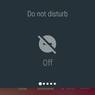
Data suggests that not many of us do own one — the Apple Watch takes the cake — but if you do own an Android Wear smartwatch, do this: swipe down, which will reveal the new version of the notification shade. It looks like this:
Android Wear 1.4: Do not Do not Disturb
Note something?
There’s a stroke across a small circle with a minus sign (another negative).
This symbol is telling Wear do not “Do not disturb” — in other words, work as normal and pass through notifications from email, social networking, etc.
Touching it turns off (or is that on?) the restriction, so that would be, yes, “Do not disturb.”
By comparison, Pebble does it differently, or, at least uses different nomenclature. When you want to temporarily silence notifications on your Pebble, you long-press the left button. This enables “Quiet Time.” Long press again and it’s disabled, and sends a handy double vibration as confirmation.
Android Wear. Let’s be clear: it’s not because I don’t not like you.
Previously in Wear, we were given the option of three status modes: None, Priority, All. You simply tapped the mode you wanted and both your watch and phone would respond accordingly. I much preferred this approach.
Admittedly, Google’s new on/off, all-or-nothing system is easy to learn. And, once you realize (decode) how it all works you can enable and disable it just fine. Still, part of me wonders what goes behind closed doors in Mountain View when it comes to this feature. I’d imagine everyone has an opinion on how the Android notification system should and shouldn’t work. It’s also somewhat personal, and there’s not necessarily a right way.

Ugh: Monday Morning Notification Brainstorming Sessions at Google
I can just envision a Monday morning meeting, with about a dozen people around a large conference table, the white board bonkers full of drawings. It’s the weekly notifications update meeting and status check. And my bet is that these sessions get heated quickly. Evidently Google has flip-flopped in the past, and the design of how notifications works on Android handsets has changed throughout the years, and, recently, as we’ve seen above, on Android Wear smartwatches too.
And, just as you might be getting accustomed to how notifications work on Marshmallow (6.0), expect a raft of changes in Android N. Though, these updates that we’re seeing in the N developer preview do look like they’re pushing notifications — finally — in the right direction.
Android Wear Soldiers On
Fair to say, Android Wear has come a long way since its introduction in 2014. Handy new gestures, though some tricky to master, mean you can dismiss notification and scroll without swiping — convenient when your hands are full. Extras like wi-fi so you can stay connected even out of Bluetooth range, emoji support, and speaker support (only on Huawei Watch and Asus ZenWatch 2 so far) make using it fun, and generally quite useful.
I still alternate between a Pebble Time (long battery, great for outdoor legibility) and an Asus ZenWatch 2 (beautiful AMOLED screen, Google voice recognition) on a daily basis. (Check out my ZenWatch 2 review “What’s not to like”)
Android Wear. Let’s be clear: it’s not because I don’t not like you.


