“Hey gang, it’s time to write the next chapter in wearables.”
Pebble continues to out-innovate its rivals. It’s much larger rivals; the Apples, Googles, and Samsungs.
Take heed, today the Redwood City-based (so long expensive Palo Alto office) start-up announced not one, not two, but three — count ’em — new wearables.
While we were all guessing yesterday that we might see an updated Pebble or a fitness Pebble or an updated OS, charismatic Pebble founder and CEO Eric Migicovsky was content to give us all of that and more. Next chapter, indeed.
3 New Pebbles
The 3 new Pebble models are:
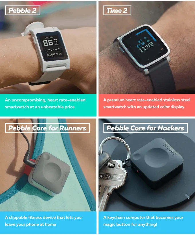
Pebble 2 ($99) – a second-gen Pebble smartwatch with a “high contrast screen” and 7-day battery life. Colors: Flame, Aqua, Black, White, Lime.
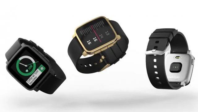
Pebble Time 2 ($169) – a second-gen Pebble smartwatch with a screen 50% larger than the original Time, improved color screen with 80% more pixels and 10-day battery. Colors: Black, Gold, Silver.
Pebble Core ($69) – a display-less device that you clip on to your clothes and wear will running. (reminds me of an iPod Shuffle)
Both Pebble 2 devices are heart-rate enabled, a nod to the fact that fitness continues to be the segment to go after among wearable makers. That Fitbit and Garmin lead the roost suggest that’s where the money is.
That two of the products are priced under $100 suggests that smartwatches and wearables are, indeed, accessories, and consumers are more willing to pay a price that doesn’t resemble that of a new smartphone.
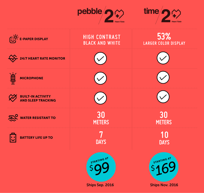
Next-gen Pebble 2 Feature Comparison
As expected, Pebble 2 and Time 2 are water resistant down to 30 meters, have the e-paper displays we’ve come to love for their outdoor legibility and always-on convenience, and will work with iOS and Android smartphones.
Also carried over from past models: a microphone, and built-in activity and sleep tracking (Pebble Health app).
My pledge is in for one Pebble Time 2. Though, I have to admit, there’s an ultra cool vibe that the Pebble 2 gives off. It resembles a slightly sleeker version of the Pebble OG — maybe a Geek in Armani? Maybe not. Maybe a Geek in a hoodie and Birkenstocks? Or something like that…
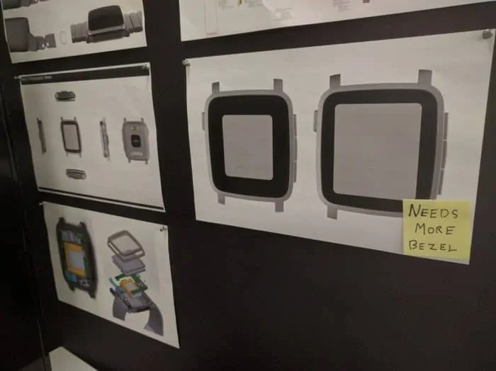
I’m sure I’m not alone when I say thank you Pebble. Thank you Pebble for (finally) coming to your Bezel senses. The new Pebble Time 2, at least in photos, appears to have a much improved screen-to-body ratio, thanks to smaller bezels. A very welcomed change.

Analysis
Pebble is putting the petal to the metal. It’s doing what it can to survive in a market led by five other companies much larger in size — Samsung, Apple, Google, Fitbit and Garmin.
That two of the products are priced under $100 suggests that smartwatches and wearables are, indeed, accessories, and consumers are more willing to pay a price that doesn’t resemble that of a new smartphone. So, the Pebble 2 is only $99 (I’ve long argued the sweet spot), and the runner-friendly Pebble Core is a mere $69, yet gives you a lot of capability for the money.
History of Pebble
2011 – Pebble founded by University of Waterloo alumn Eric Migicovsky.
2012 – First Kickstarter campaign, breaks record, raises $10 million.
2013 – First Pebble smartwatch (“Pebble Classic”) ships.
2014 – Pebble Steel ships. By year’s end Pebble sells its one millionth watch.
2015 – After breaking Kickstarter records again and raising over $20 million, Pebble launches its first watch with a color display (Pebble Time) and its first with a round display (Pebble Time Round). Prices are lowered. New Timeline OS ships.
2016 (May) – Pebble 2 Kickstarter campaign launched.
At the top end, the Pebble 2 Time at $169 impresses. Pebble did add several of the things I was hoping for when I wrote my wish list for a next-gen Pebble watch. That includes two things in particular: a larger screen with higher contrast, and longer battery life (us glorious and greedy Bastards). Eh, voila! Pebble arrives in style, answering the call. Amazing.
Pebble seems to be winning over wearable consumers for three key reasons:
- cost
- ease of use
- durability
Those are the exact three reasons why I think Google’s Android Wear platform is hurting. By comparison it exhibits the very opposite of those same traits: too expensive, hard to use, and not as robust.
This is a company that understands the customer experience.
When you take a Pebble out of the box for the first time, pair it with your phone, and finalize the set-up process, you quickly realize this is a company that understands the customer experience, from A to Z. It’s smooth with lots of help and (even entertaining) pointers along the way.
In addition when it comes to controlling notifications, Pebble destroys Wear.
Pebble automatically sends a notification for any icon that appears in your phone’s notification shade (that narrow bar at top). If you don’t want a particular notification, say from Yelp for instance, you go to the Pebble app and deselect Yelp. Easy-peasy.
“Make Wearables Great Again!”
From Pebble Kickstarter email project update.
Android Wear on the other hand is a convoluted, complex mess (at least in Android Marshmallow 6).
Notifications don’t automatically come through with a Wear-based watch. Rather, it’s a confusing mix of understanding the DND mode on Android, in addition to setting sound/vibrate for each individual app in each app’s particular setting screen. This sounds decent in theory. In practice it doesn’t work well. I’ve been using Wear for two years, and notifications on my watch — be it a Moto 360 or ZenWatch 2 or LG Urbane — are spotty at best. The vast number of options in Android overall, and myriad of setting screens across the Wear app, the Wear-based watch, and each app itself conspire to create a frustrating, unpredictable experience. One that I believe Google should be doing everything it can to fix.
Meanwhile, at the I/O developer conference last week, Google gave us a preview of Wear 2.0. There’s a lot to like there, including a darker theme with easier navigation. But I do wish Google would do away with that ridiculous, microscopic keyboard and other silly Dick Tracy do-hickeys, like the speaker, phone-calling, and outrageous, impractical arm-waving gestures. Who on earth wants these things?! Hint: Google on Wear 2.0: “We’re listening very closely to our developers” (and that’s the problem with Wear)
So Pebble continues to do what it does best. That is, to make simple, easy-to-use smartwatches (Pebble 2, Pebble 2 Time) and wearables (Pebble Core) that don’t break the bank.
By continuing to listen closely to its (rabid and loyal) fan base, the company has zeroed in on exactly what we want. Then, by prioritizing carefully and by managing limited resources and tapping into the crowd-funding model, Pebble has delivered a high value product while scaling R&D only as the demand seen on Kickstarter warrants its expansion.
Pebble 2 ships September. Pebble Time 2 November 2016. And the Pebble Core in early 2017.
Pebblers, unite!
Get backing right here on Kickstarter.


