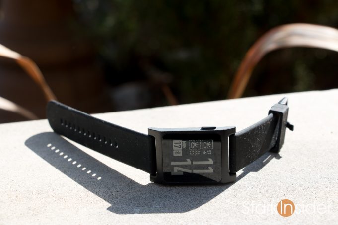
It’s here. And finally, I can happily say, this is the smartwatch perfected.
I’ve been wearing my black Pebble 2 for about a week, and have come away duly impressed.
Those looking for a smartwatch that just works, should look no further than this low-priced gem from original incubators of the concept. The battery seemingly goes forever as compared to the pricier competition (Android Wear devices and Apple Watches require nightly charges). Though only black and white, the display is sharp and viewing it outdoors, even under blinding sunlight, is not an issue. The UI is simple, and just plain works. And, those physical buttons! Yes, no touchscreen! What, in 2016?! Yes, and you know what? Once you get used to blindly dismissing notifications, changing tracks and volume on your Spotify or Google Play Music stations and playlists, there’s no going back to the fussy touchscreen equivalent.
Pebble 2: What’s New?
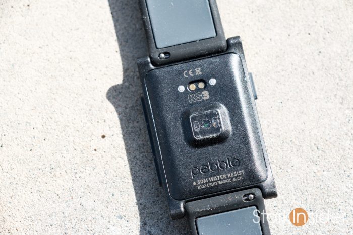
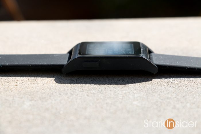
Think of the Pebble 2 as an evolution of the original. In fact it looks very much like the first Pebble “Classic” smartwatch released to market, thanks to Kickstarter and strong marketing from Best Buy, in 2013. It features a tall rectangular shape. Bezels are certainly prominent (though I didn’t notice them at all when using faces with black backgrounds). There’s a single button on the top left side (back) and three on the right (up, select, down).
The new part with Pebble 2 is largely its size. Take the original Pebble put it in the wash, and you’d end up with this shrunken look. I appreciate the smaller form as it fits easier on my (small) wrists, and doesn’t scream out Super Geek! as loudly as before. Maybe just super geek! I live in Silicon Valley, so it’s the norm anyways.
For the first time ever there’s a heart rate sensor, found on the back. When I funded the Pebble 2 and Pebble 2 Time Kickstarter (yes, I admit to my smartwatch addiction) earlier this year, I was concerned that bump caused by the sensor would lead to ill-fitting or discomfort. In my early experience this is, thankfully, not the case. The watch sits as you’d expect. It’s comfortable, and thanks to its light weight (31.7g), you quickly forget you’re even wearing a smartwatch.
Pebble 2: Behold, Contrast!
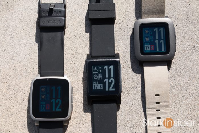
I’ve always liked Pebble’s philosophy in favoring e-paper displays. While others dazzle with fancy OLED and LCD designs, Pebble keeps it very basic, choosing to once again use a 1.26-inch always-on e-ink screen (with Gorilla Glass 3).
The benefit is loud and clear: battery life.
Pebble says it will last 7 days before needing a visit from the charging cable. In my testing, I found that I could get very close to that promise, about 5-6 days. Then again, I primarily use a fairly intensive watchface (DIN Time, superb!) that includes weather updates. I suspect if I used the stock face I could easily go a week. Regardless this result far surpasses others, and it’s the main reason — along with physical buttons — that a Pebble is on my wrist most days, and not my Wear-based Moto 360 sport.
Behold, contrast!
Coming from a Pebble Time Steel, the first thing I noticed when I unboxed Pebble 2 was the contrast of the text. Everything pops compared to the older model. I find it much easier to read in dim lighting conditions; there’s less strain on the eyes when trying, for example, to read a Gmail or calendar notification. Even reading tiny address information on an event alert is no problem, whereas I didn’t always feel that was the case in the past.
Pebble 2: Embrace Your Love for Old School B&W
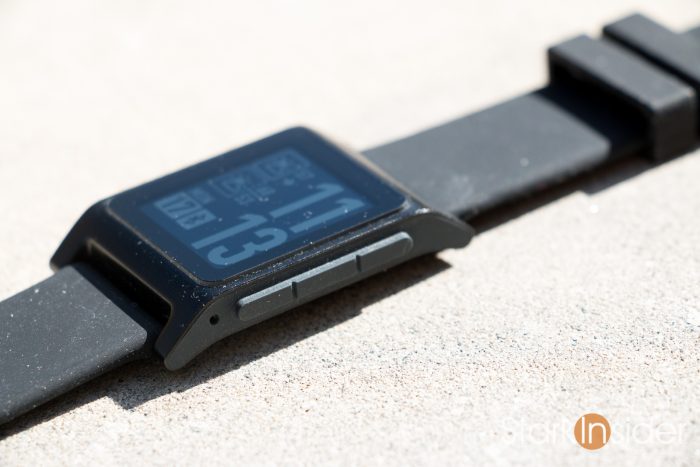
The superb contrast and low-low price ($129 USD), however, don’t come without a cost. The aforementioned e-paper display is, alas, plain old black and white. I’m sure that will turn off many. Go from looking at your whiz-bang iPhone 7 or Nexus 6P screen to the Pebble 2, and you can’t help but hear Lionel Richie dancing on the ceiling, and wonder where you put your beloved Nintendo Gameboy. Tetris!
One advantage of color is that at a glance you can differentiate from notification type. Blue for Twitter and darker blue for Facebook. Green for Google Hangouts. Red for Gmail. Etc. For now, though, I’ve adjusted (there’s worse things in this world), and prefer the higher contrast and improved legibility of the screen to the color. Sure, watch faces don’t look quite as retro-cool. In the end, though, I see a smartwatch as a utilitarian tool, not a high fashion statement (see Baume & Mercier, Tag Heuer, etc.).
Pebble 2: User Interface is a Dream
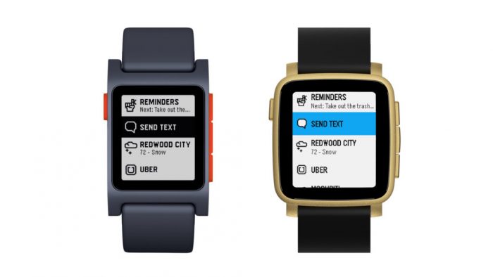
Want an Android Wear-powered smartwatch? Or an Apple Watch?
No problem. Just be prepared for a learning curve (and steeper price). That’s all well and good for many, but I suspect for the casual buyer looking for simplicity and a strap-and-go experience, the Pebble 2 will be just right.
As always, notifications pop up when they arrive — Facebook, Gmail, Instagram, Twitter, and any other app that you select via the Pebble App — and can be dismissed by clicking the back button on the top left.
Clicking up takes you through a series of useful screens in order: steps, heart rate, and sleep tracking.
The down button takes you to the Timeline where you’ll see things like the weather, sunrise/sunset, and any events scheduled on your calendar for the day.
Cliche I know, but the Pebble UI just works. Clearly, this is a team that puts an emphasis on ease-of-use and speed. Unlike Google’s ridiculously microscopic keyboard found on Android Wear, Pebble doesn’t expect you to hammer out emails on your wrist — or to make and receive phone calls for that matter. After all, that’s what the smartphone in our pocket or purse is for, no?!
Pebble 2: The Smartwatch for the Rest of Us
Granted, the Pebble 2 is not for everyone. Those that want advanced, touch-based apps, or tiny keyboards, or pretty looking screens, will certainly want to look elsewhere.
But for the rest of us, the Pebble 2 is perfect.
So long as you don’t mind a slight bit of that Chic Geek on your wrist, the Pebble 2 wins in so many ways:
— low cost: at only $129, a great value
— 7 day battery
— easy to read, high-contrast, outdoor friendly e-ink display
— tactile, physical buttons (helpful, for example, for distraction-free driving, or controlling your music at the gym)
— no fuss setup and support for both Android and iOS
— automatic sleep tracking (unavailable on Wear or Apple Watch)
— backlight activated with a shake of the wrist
— over 15,000+ apps (I really only use one mostly: the superb Music Boss)
— unobtrusive magnetic charger
In my books, Pebble nailed it.
If you’re looking for a smartwatch that truly functions like a smartwatch, but without all the added complexity and unnecessary frills, look no further. This is what three years of refinement looks like. No question, the Pebble team have listened very carefully to customer feedback. What we have here is a philosophy that eschews bling in favor of a delightful customer experience.
Until the Pebble 2 Time arrives, safe to say this is the best overall smartwatch on the market today.
Pebble 2 is available now for $129.99 (USD) in Black, White, Charcoal / Flame, Aqua / White, Charcoal / Lime.

