Android Wear 2.0 is here.
The big question, however, is if anybody really cares about Google’s second attempt to win over smartwatch customers.
By Google standards, the Wear 2.0 launch was surprisingly low key. No fancy presentations. No keynotes. No live singers. And certainly no daredevil like stunts featuring skydivers and extreme sports (see Google Glass, 2012, Brin et. al.).
 Instead, last week’s formal announcement came in a… blog post. By a VP of engineering.
It’s almost as if Google has its tail between its legs.
After all, Apple trounced all smartwatch makers with an outstanding holiday quarter of Apple Watch sales. At least, that’s according to analyst reports. Apple still doesn’t break out its wearable numbers.
As I recently wrote, Apple is the wearable market. According to Strategy Analytics, in Q4 2016, Apple took 63% share in global smartwatch shipments. Samsung came in a distant second at 16%. The rest — presumably including smartwatches from the likes of Motorola, LG, Huawei, Asus, Fossil, Fitbit, among others — tallied a combined total of 21% share.
So Google has its work cut out for it.
Despite having multiple vendors shipping multiple products built on Wear, consumers don’t appear convinced.
What’s the issue?
There’s several reasons that come to mind:
- Android Wear is too complex — consumers want something easy to use
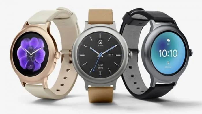
- Smartwatches running Wear have been too bulky, too masculine — best case they’re meh (LG Watch Sport), and in the worst case flat out ugly (LG Watch Style)
- Battery life is terrible — but it is getting better thanks to new wearable chips by Qualcom (Snapdragon 2100) seen in newer models
But those are just minor details.
My biggest complaint after having used, tested, and written about Wear since its inception in 2014 is:
Google is listening to the wrong people.
What would happen if you asked only engineers, early adopters and tech bloggers what they’d like to see in a smartwatch?
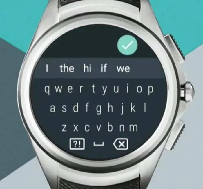
You’d likely hear that they want a keyboard, a speaker, and LTE connection (hey! another monthly carrier payment!). And lots of sensors. Or, yes, sensors! GPS, NFC, altimeter. We need sensors! Oh, also, please make it run standalone so that I don’t need to carry my smartphone everywhere — it’s a hassle having a device with a large screen that is easy to type on, that has tonnes of apps.

Sure, I get that there is a “use case” for this all-in-wonder standalone kind of watch. In fact, Google demonstrated it in its (underwhelming) Wear 2.0 launch video “Android Wear: Make the most of every step“. There we see a father wake up, go for a run, stop in to a store and pay for something, before returning home, all while not needing his smartphone.
My problem with this scenario is that it represents a tiny market. Simply, it’s a niche. If Google wants to grow its smartwatch share, it needs to head on over to mainstream. It’s not a sexy place. There are few early adopters there. It’s kind of boring because not everyone cares about Dick Tracy. But it’s the kind of place Apple has apparently discovered with its Apple Watch. My wife, not quite a Luddite to be sure, but far from an early adopter even wears one (best feature: Find my iPhone).
People don’t necessarily want every sensor under the sun (resulting in abysmal battery life), or a ridiculously microscopic keyboard, or a device that can replace their phones.
My theory is that the market wants something that is convenient. Useful. Helpful. And… easy to use.
Hint: let’s not turn the smartwatch into a phone.
By listening to engineers too often, and those that flock to its developer conferences, Google’s Wear team risks alienating the mainstream buyer.
And that brings us back to Android Wear 2.0.
About Android Wear 2.0
This was a quiet launch. That’s too bad. Wear 2.0 is quite good. It’s much more refined than 1.x.
Navigation is improved and easier. The user interface has a pretty aesthetic with a dark, colorful theme that is pleasing to use. Apps are decent, if sparse compared to the Apple Watch. But that never mattered much to me since all I primarily care about are notifications. If I’m going to call an Uber (rather, Lyft?), or get into a long texting session, or check out Google Maps, I’m pulling out my Nexus 6p every time. It’s right there in my pocket — all the time.
WATCH: Android Wear: Make the most of every step (Launch Video)
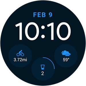
Also, in 2.0 watch faces are far more customizable. Wear’s new complications API means data from different apps can be easily shown on a face. For consumers it can make the watch more useful — for instance, having steps, weather, and next calendar appointment all available at a glance.
Google Fit has seen a big upgrade, and is now much better at tracking workouts and integrating all the information with the phone and app. Very nice.
One thing that I think still needs vast improvement is the actual Android Wear app you install on your phone.
Compared to Apple, Samsung and even the Pebble app, it doesn’t feel as cohesive.
The biggest issue: controlling notifications (imho, the killer app thus far for smartwatches).
With Apple, Samsung and Pebble, you can manage almost everything from within the phone app. For example, if you want to turn off those pesky Instagram alerts, you simple go into the respective smartwatch app, look under notifications, and turn it off for that specific app.
With Wear, you don’t go into the smartwatch app. Rather, you go into the specific app itself (e.g. Gmail, Facebook, Instagram, Twitter) to toggle notifications. What this means in practice is that you need to hunt and peck across several apps, each with their own look and feel and varying level of notification control. I get that Google wants to use its existing Android notification engine for all of this, but the result is an engineering prioritization over one that values the user experience. I would like to see Google integrate this into the Wear App itself, and give it an entire overhaul– Wear 3.0?
Still, after testing Wear 2.0 for several months on a Huawei Watch I like what I’m seeing.
However…
About the new LG Watch Sport and LG Watch Style

Holy. Ugh.
What on earth?!
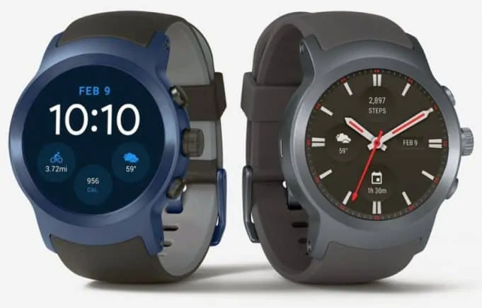
While Apple is appealing to style and giving buyers all sorts of choice for band styles, watch sizes and colors, Google gives us the behemoth that is the LG Watch Sport. It’s huge. And it has every sensor under the sun. Hence, battery life is terrible. I’m quite convinced this thing — along with the aesthetically challenged LG Watch Style — will flop.

Count me as one of those who implore Google to built its own “Pixel” branded smartwatch. Look at the runaway success that are the Pixel Android phones. What if. What if Google didn’t rely as much on partners, and took another page out of the Apple playbook and built not only the OS (Wear), but also the hardware? Surely, it would be better than the underwhelming stuff that LG has given us. Shame that. Google is placing its bets on two showcase watches that miss the mark so badly it’s not even funny.
Those of still looking for a Pebble replacement better hope the upcoming Huawei Watch 2 delivers.
About the Wearables Market: Will Android Wear 2.0 turn around Google’s smartwatch sales?
Sadly, from what I’ve seen so far in 2017, no, Android Wear 2.0 will do little, if anything, to turn the tide. I suspect Apple will continue to rule the smartwatch roost… for now.
Android Wear is still too cumbersome to use — though vastly improved. Notification control is de-centralized, as I wrote above, which is potentially good for fans of engineering simplicity, but a nightmare for the user experience. And, those new flagship LG watches… well, there’s not much to say other than: Google, please bring us a beautiful Pixel smartwatch asap.
Scoring Android Wear 2.0
Wear 2.0 Software: B+
Much improved navigation. Darker theme is easier on battery life and aesthetically pleasing (note, for instance, how notifications are color-coded to match their corresponding apps). Fitness tracking (Google Fit) is much improved with ability to track more activities, and more detailed reporting. Google Assistant and voice recognition is top notch. But setting up notifications is more complicated than what Apple, Samsung or Pebble offer with their centralized apps.
Wear 2.0 Hardware: F
LG. Google. I’m not sure who to blame. Probably Google, as this is their platform after all. There’s no way around it, these two new LG watches — flagship examples of the potential of Wear 2.0 — dramatically miss the mark. Poor battery life. Ugly. In the case of the LG Watch Sport, bulky, and in the case of the LG Watch Style, not stylish. Plus, why not offer a rectangular watch for those who prefer that form? It seems to work well enough for Apple.
Wear 2.0 Launch: C
Ask a random person on the street what they think about Android Wear 2.0, and, unless you’re in Silicon Valley (though even then…), you’ll likely be met with a blank stare. It’s hard to evaluate the launch. Google kept it low key, announcing it merely through a brief post on its Blog (“Make the most of every minute“). Given the software is so far behind Apple, and the hardware is so very albatross, perhaps that’s by design. Understandable. Best to keep this launch pretty quiet, re-group, and re-strategize. Wear 3.0?
One other nit about the Wear 2.0 launch is Google’s confusing message around availability dates. When will I get the new OS on my Huawei Watch? When will it be available for the Moto 360 2nd gen? Or Asus Zenwatch 2 and 3? And so forth. Only Google knows. That’s disappointing and concerting especially given the original 2.0 launch date was delayed (originally planned for Q4 2016). Apple, by contrast, typically makes new OS versions available to all on launch day. I believe this to be a simple model that clearly sets expectations with customers. Perhaps this is a symptom of Google’s open platform/OEM model.
Android Wear or Apple Watch or Samsung Tizen?
I’m still wearing my Pebble for now. Fitbit, though, says it will support it only through to the end of 2017. Then, who knows. There’s been hints we’ll see a new Fitbit watch that incorporates Pebble DNA. One can hope. Meantime, that leaves either Android Wear or the Apple Watch or Samsung Tizen for those looking for a replacement. Wear 2.0 is not the slam dunk I was hoping for. I’ll give my Huawei Watch another go when the final Wear 2.0 image is released this week, but it’s hard not to look at my wife’s Apple Watch and wonder what life over there is like…


