Asus is out. If reports are true the company will no longer make smartwatches that run the Android Wear operating system.
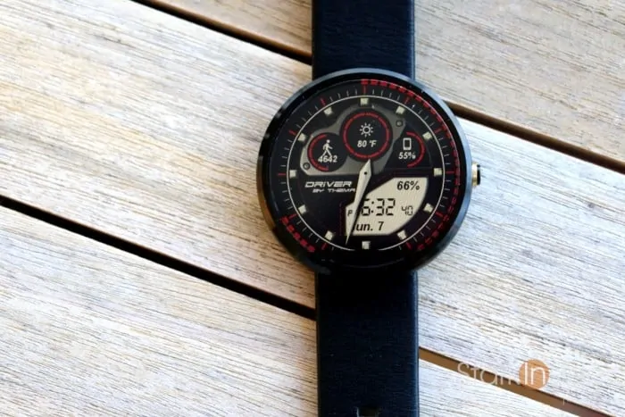
Officially last year Motorola also bowed out — especially surprising given it was the first, and much hyped, manufacturer to hit the Wear market with the (quite beautiful) Moto 360.
Then there were the delays for Wear 2.0.
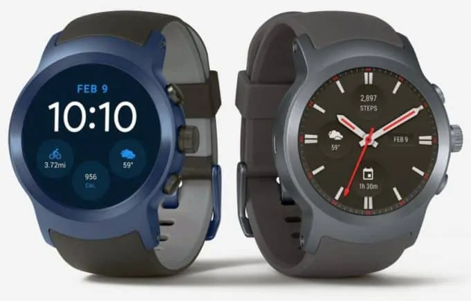
Google promised the update in 2016. It never landed. Eventually it was slated for Q1 2017. That too didn’t happen. Aside from the Huawei Watch and the new LG watches that come off the shelf running 2.0, older smartwatches from the likes of Sony, Asus and LG (older models) are stuck on an antiquated edition of Android Wear (1.5) that’s almost a year old since the last major update. In the world of tech, that’s the equivalent of being buried alive.
Meanwhile, the Apple Watch continues to dominate the segment. Estimates peg sales of Apple’s well-reviewed wearable at about 5.1 million units in Q4 2016. That’s good enough for 55% share — a performance of Steph Curry proportion.
Android Wear: A Flop?

It’s looking more and more as if Android Wear is… a flop.
Whereas Apple positioned its Watch as a high-end luxury good (in keeping with all things Apple) with a premium design, Google seemed to court the technorati. Specifically: tech bloggers and developers. Consequently feature requests came in accordingly. Everyone wanted a Dick Tracy watch, one that could function on its own and (bizarrely) receive and make phone calls. A keyboard for typing too would be nice. As would an always-on display that would glow in low light and be sure to annoy co-workers and theater-goers alike. Google’s roadmap shifted accordingly. I still believe that the team was listening to the wrong folks. Mainstream buyers wanted simplicity and elegance. Android Wear gave us the exact opposite: complexity and klunkiness.
When fitness tracker Fitbit bought out the assets from upstart smartwatch indie Pebble and announced it would drop support for its cute and affordable watches at the end of 2017 my hunt, like so many others, began.
I loved the stellar battery life of Pebble, and it’s e-ink displays meant it never glowed and distracted others and could easily be read outdoors (in fact the more light you exposed the watchface to the easier it was to read). But the end was near. Poor little Pebble.
The choices came down to something running Android Wear or the Apple Watch. Being an Android guy (Nexus 6p) the latter was not a possibility. Apple hardware is famously closed. So, in the words of Messala from Ben-Hur (1959) you’re either for us or you’re against us. Therefore, in the words of Charlton Heston: Then, I’m against you! Android it was, and, hence, Android Wear it was.
Perhaps Google should do what Apple did, and tap some talent from luxury retailers like Burberry and Prada.
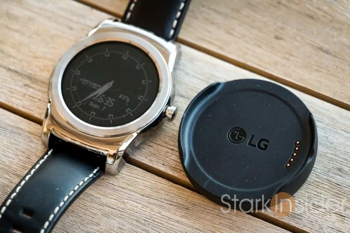
I tried various models. I already own a Huawei Watch (so that I could previews of upcoming versions of Android Wear). It’s classy, sporting a nice circular design, and channeling a traditional look found on tradition, analog watches. But… vibrations accompanying notifications were more loud than tingly, the screen glowed at night (though, this can be turned off), battery life was decent but not great, notifications didn’t always come through reliably, and fitness tracking was very basic and not accurate. Essentially, the Huawei Watch was, and still is, pretty hardware let down by poor software.
Others failed to measure up as well: Moto 360 Sport (non-replaceable strap), Asus Zenwatch (bulky), Sony Smartwatch 3 (quirky design).
Then… Target held a brief Apple Watch sales. So I jumped for a Series 1 42mm Apple Watch.
Problem was, of course, I ran an Android phone.
There was a simple, but very expensive remedy for that: the Apple Store.
Soon enough I found myself with an iPhone 7 Plus.
Turns out, I was for them!
And it turns out, at least in my experience, that the Apple Watch really is the best smartwatch. By far. The screen is stunning and easy to read, even outdoors. The digital crown really is useful for scrolling down emails, long lists, and texts. Fitness tracking is excellent, and integrates well into the Health app. Notifications always pop up. And it seems Apple has perfected the subtlety of the vibration — it’s strong enough to notice, but not loud enough to disturb others.
Notifications-wise, for whatever the reason (probably having to do with a history of aesthetics and design perfection) notifications always look better than their counterparts on Android Wear. Take “The Score.” I use it to track NHL scores, and occasionally other sports too. Notifications on Wear are decent enough. When there’s a goal you get a notification telling you the player that scored the goal, and the current score in the game. Simple enough. Though, I should point out that on Android Wear 2.0, for some reason the notification doesn’t visibly appear and, rather, sits (as it does for other notifications too) below the watchface. To see it you need to swipe up. Really odd. On the other hand, on Apple Watch the notification appears when you turn your wrist to look at it. Not only do you get the information you want, you also get a much crisper font, in addition to the team’s logos. Small detail, but it makes the overall experience that much better.
Should Google Kill Android Wear?

I think it’s time for a reboot. Google’s no stranger to kiboshing products. Google Glass. Google Wave. Google Lively. Google Reader (Why Google? Why?!). And so many others. But tears in the rain. Same is true, of course, for Apple, Microsoft and other tech companies. You pour money into R&D. Experiment. Take some chances. Some pan out, and others don’t. It’s just the way it goes.
Android Wear should probably join the list.
If anything, the entire project needs a re-brand.
Developers and us geeky folks get it. Wear can be fun to hack around with. It’s certainly not a necessity to wear a smartwatch, but they can be handy, and save us from (God forbid) having to pull the phones out of our pockets. But Google I’m guessing wants to win this market, or at least go toe-to-toe with Apple — not troll the dungeon with low margins and half-functioning product.
Perhaps Google should do what Apple did, and tap some talent from luxury retailers like Burberry and Prada. After all, watches are a personal thing. Apple did well to offer easily changeable straps, multiple colors and finishes, along with various price points. Love it or not, Apple seems to know how to milk aspiration and lust from potential buyers for its products.
The Pixel smartphone might be a good starting point. Google’s answer to the iPhone is slick. And, more importantly perhaps, well marketed. Maybe it’s time for a Pixel smartwatch. Give it some character. And give consumers lots of choice of styles. Just don’t call it Wear. And try not to let the tech bloggers influence its road map.
Given that Android runs on most smartphones, it would seem the market opportunity is still there. If Apple can grab over half the overall smartwatch market I just can’t see how it’s not possible for Google to match or beat it over the next few years. With the right strategy.


