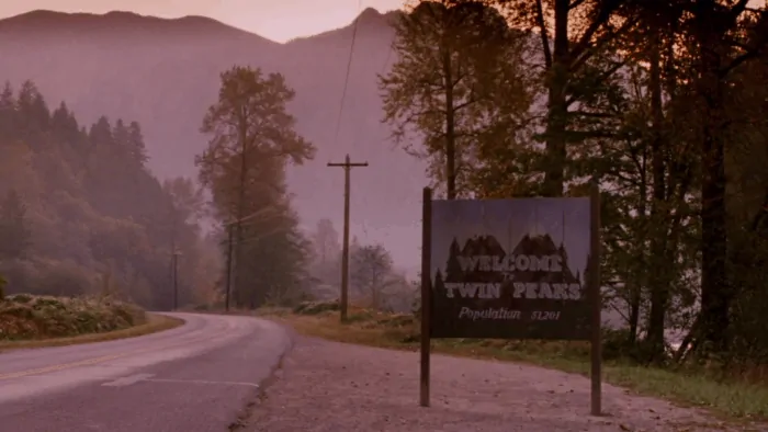
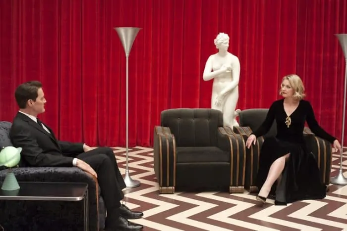
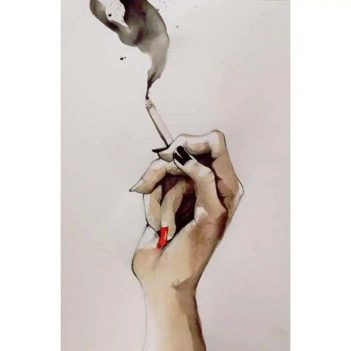
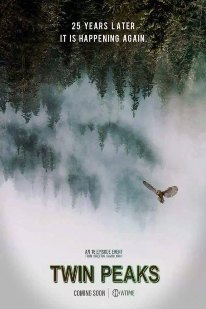
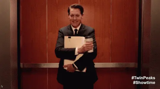
A look at some of the creative artwork being created for David Lynch and Mark Frost’s Twin Peaks The Return (aka Season 3) now playing on Showtime.
Twin Peaks has returned, some 25 years later, and that alone is cause for celebration. But there’s something else too.
As I’ve discovered there’s a very passionate fanbase that knows every little detail about the show. Well, almost. Since this is David Lynch (and collaborator Mark Frost) things are usually not so easily explained. And some details seem obvious, while others remain, well, Lynchian. Meaning, often obscure, surreal, inexplicable. And that’s exactly what all of us Lynch fans want and expected.
So far Twin Peaks the Return (aka Season 3) has dazzled.
I was never into the original series, instead I had to watch the Pilot episode 1 recently so I could have some groundwork for what was to come in Showtime’s reboot. It became immediately apparent why Twin Peaks and the murder of Laura Palmer so transfixed the nation in 1990, back when “Vogue” by Madonna ruled the charts and I was immediately drawn to the unusual setting and memorable characters.
Whereas the original, in my understanding, was more on the soapy side, with most of the storyline concerning Agent Cooper (Kyle MacLachlan) and the FBI’s investigation of homecoming queen Laura Palmer (known famously for her graduation photo that is briefly seen at the beginning of each episode) season 3 is far less Dallas, and definitely more, say, Blue Velvet.
There are quirks in the original series alright. Cooper or “Coop” loves coffee, and also enjoys tracking details of his investigation, and everyday life, into a tape recorder. The local Sheriff’s office doesn’t seem entirely well run, but somehow the staff are able to somehow, some way, if not entirely solve a case, at least inch closer. And the lumber town of Twin Peaks…? Well, all is peachy American on the outside. Simmering on the inside, though, we know things aren’t what they appear.
With The Return, however, Lynch and Frost, have shifted the formula, especially in the earlier episodes.
Surreal is in. Big time. And there’s less soapiness all around.
In my book that’s a great thing, or as David Lynch himself might say, “Beauuuutiful!”. As in that’s beautiful Naomi! (as heard directing Naomi Watts in his seminal Mulholland Drive).
Things really took an arthouse turn with the opening of episode 3. There Agent Cooper found himself in an alternate universe, falling. We can’t tell where he is. Then he lands in what can only be described as a box in a sea of purple. He then proceeds to encounter a mysterious eyeless Chinese woman. Everything is glitchy, almost as if film were running incorrectly through a projector; lots of stutter. Then, it gets even more Eraserhead on us, as Coop heads to the top of the box, and finds himself floating in outer space. Or something like that. Make of it what you will, but it is strikingly (hauntingly) beautiful. If Lynch’s goal is to treat film as a moving painting, then mission accomplished… yet again.
So as you can imagine, like a lot of shows, there’s a rabid community of loyal fans.
I find most of them on the Twin Peaks group on Reddit. There, conversation ensues Sunday night, following the release of a new episode. Someone even runs a poll, so we can all rate each one. Of course, much of the discussion centers around decoding the various clues. Theories are presented and debated. The biggest so far based on what I’ve seen is when (or if) agent Cooper will snap out of his infant mode. My guess? Episode 9… half way through the season. It would be nice to see Coop enjoying some black coffee (one hopefully made without a gold fish in the percolator!) and some good old cherry pie. We will see.
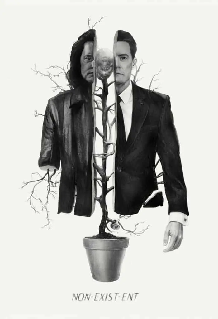
Meantime, one of my favorite aspects of the return of Twin Peaks — aside from the joy that comes from getting 18 hours of David Lynch… the gift that keeps on giving — is the fan artwork.
That the Twin Peaks fan artwork is so creative, so beautiful I think is a testament to the artistic types of viewers that are drawn (literally) to David Lynch’s work. Given Lynch himself is an avid painter, it would make sense that stylistic approach permeate his aesthetic, and that it would attract people with perhaps similar aspirations or those that appreciate the creative way he treats his films and TV projects.
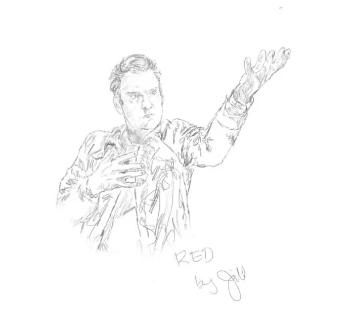
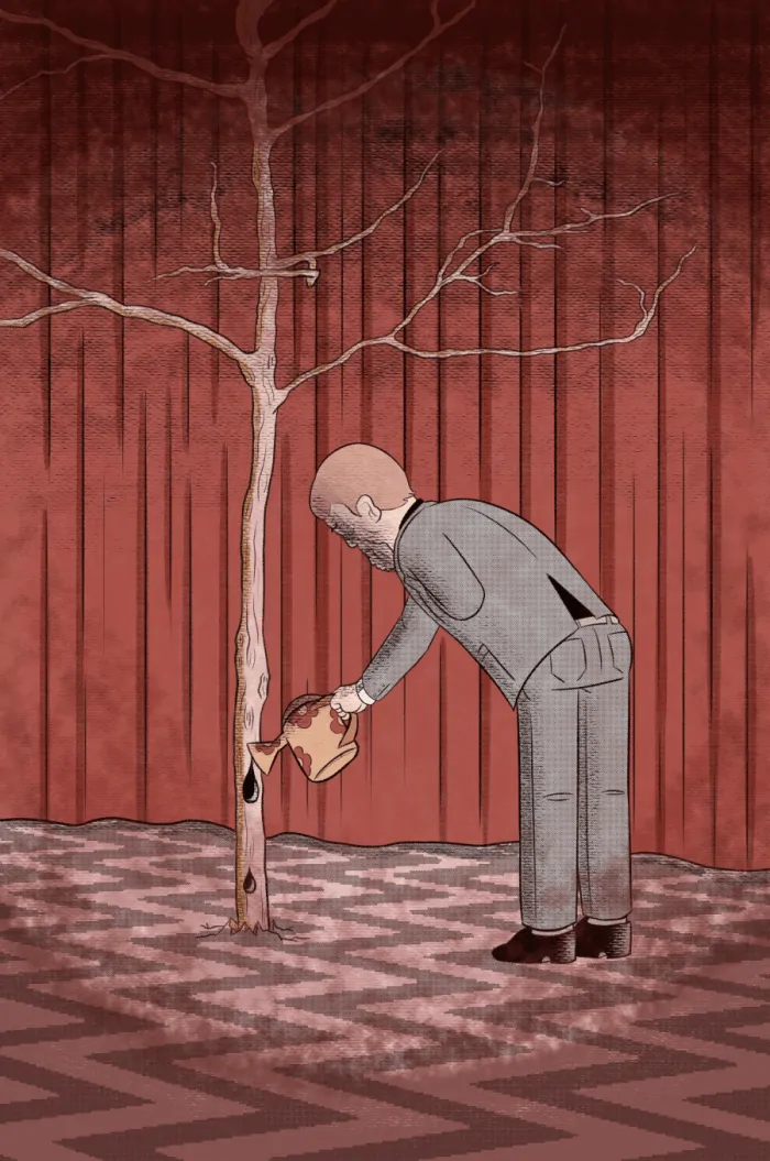
With that, here’s some of my favorite Twin Peaks artwork. I’m sharing here, but link back to the original posts where possible. I have no idea about the rights — I certainly don’t own any — and am merely showing them here for all to enjoy, and to, hopefully, give these creative people additional exposure.
Twin Peaks feels very much alive, a whole world waiting to experience. And back here, in reality, it’s pretty cool that fans are so engaged in the story and characters, and are so passionate about sharing that enthusiasm with others. David Lynch likes to expand his consciousness using a technique called Transcendental Meditation. Twice a day he seeks a private space, and spends 20 minutes diving deep… presumably in search of Big Fish (ideas). In closing his book, “Catching the Big Fish”, he wishes everyone “be happy, be free of disease,” and that “suffering belong to no one.” I look around this world today, and think that is a very timely message, from a national treasure.
Fan Artwork of Twin Peaks
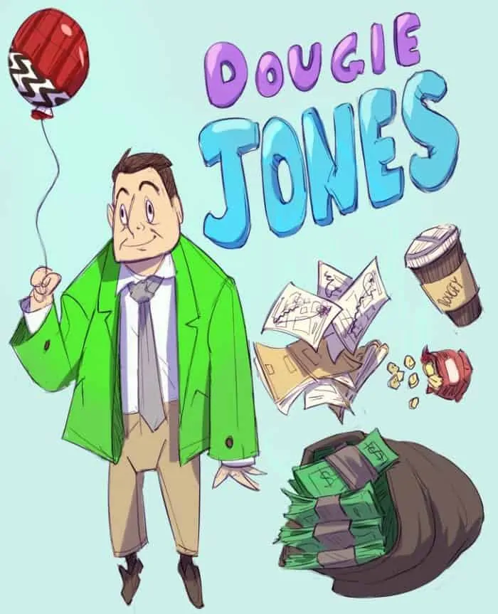
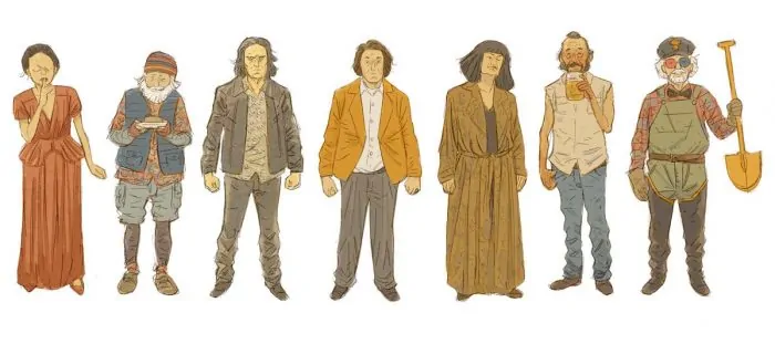

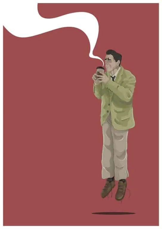
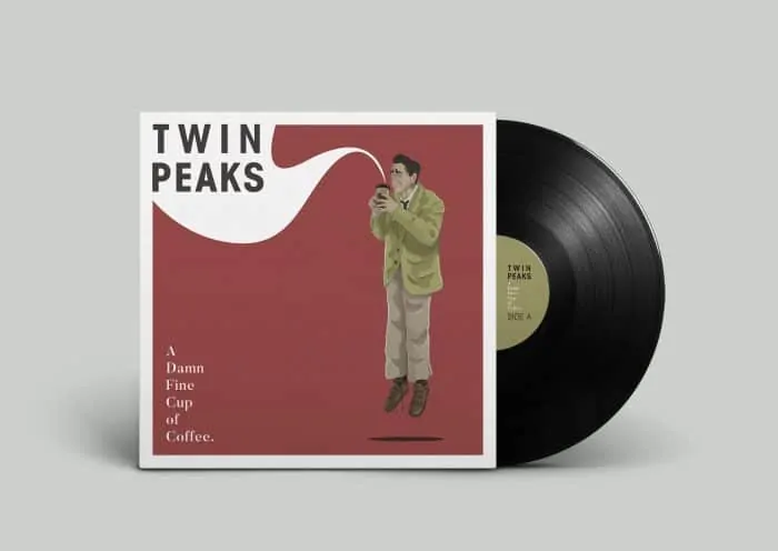
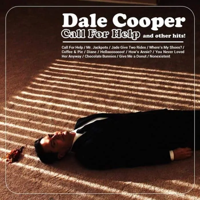
And the above fan even turned his beautiful illustration of Dougie Cooper (the good Copper) getting a nice coffee high into an album cover (creating Twin Peaks records with creative song titles seems to be a popular trend):
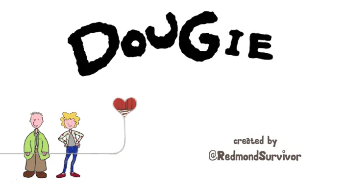
And because what is fan artwork and memes without an animated GIF …

