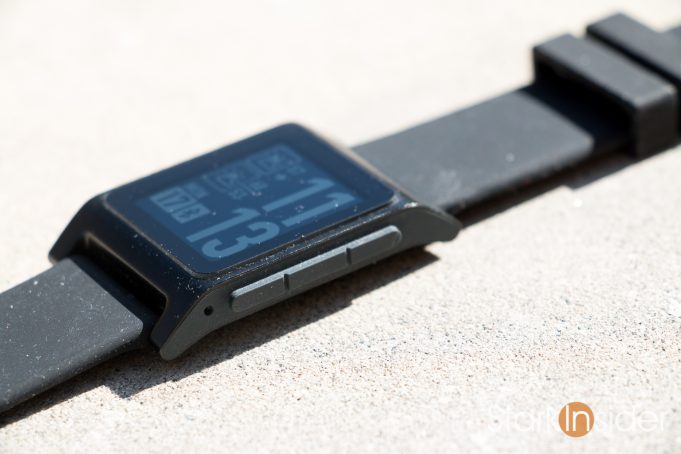
“Pebble is dead and hardware buttons are going with it”
So says The Verge. Normally I agree with what most of their writers have to say. In this case I politely beg to differ. Being Canadian and all it’s just not in my nature to not smile and say something like, “Yes, sorry, no, but okay thanks, good day!”
We can all agree that the first part of the above statement is true. Pebble is dead. Fact. Fitbit acquired the company’s assets in 2016, promised support until end of last year, before extending it through to summer of 2018. At which time we can expect the Pebble cloud servers — wherever they may live, poor things — to be pulled, and a chunk of functionality on our beloved retro smartwatches with their slightly Stranger Things-ish aesthetic will finally meets their makers.
But that second part, that hardware buttons are dying. I’m not so sure.
First, there’s a lot of smartwatches beyond Pebble that feature at least one hardware button. Several are available on the (aging) Android Wear platform, from the likes of Huawei (Huawei Watch 1 and 2), Asus (ZenWatch 3), Motorola, LG (LG Watch Style and Sport) as well as several from fashion labels like Fossil and Michael Kors, among others.
Samsung, too, with its Gear S3 running on the Tizen-based platform, also has two buttons. And, if we’re being precise, you can also count that trick rotating bezel as a physical input as well.
And Fitbit still loves hardware buttons, as seen on its decent new Ionic wearable.
So if hardware buttons are dying on smartwatches, then a lot of folks haven’t got the memo.
Practicality might be one reason why they live on in a world of touch.
Take cold weather. Ever tried operating your phone or watch in extreme temperatures in rain or snow while wearing a pair of gloves? Good luck with that. A physical button saves immeasurable frustration in these cases.
Then again, maybe The Verge is being futuristic. Buttons are current state. All touch is future state.
No denying that touch and voice and gestures will continue to play increasingly important roles in the ways in which we interact with smart devices and control our smart homes. Alexa: a smash hit. Echo speakers have blown open the smart home market thanks to ease of use — just speak your mind. I agree we can’t expect the status quo to last forever.
Tesla 3: Is austere design smart or dangerous?
Tesla Model 3 is a good example, albeit in a different category, of a company challenging the norm when it comes to user experience.
Gone are virtually all physical switches. The driver, instead, primarily controls the Model 3 using a large, centrally located screen. It’s a draconian departure (and likely one born from a cost measuring perspective) from the Tesla Model S which split the difference: offering a large, convenient touch screen, while still employing a traditional dashboard with gauges and steering wheel controls.
Like Steve Jobs, Elon Musk is challenging convention. In this case not by adding, but by subtracting, just as Jobs had done eons ago with the removal of the CD ROM drive on the original iMac … for starters.
However, the Tesla’s Model 3 is not a bonafide success yet. True, pre-orders are through the roof. But until these EVs ship in quantity and until drivers have a had a few years and few miles under their belts, we really don’t know for sure if this reductionist design approach will succeed. Many reviews already cite safety concerns. Physical controls take advantage of tactile feedback and muscle memory. There’s less chance you’ll need to take your eyes off the road in a car with a traditional physical/touch interior — say the Prius Prime — compared to a Model 3. Yes, the Tesla interior looks stark and cool, but at what cost in terms of practicality? Either this is the new-new, or cost-saving and design minimalism run amok. Time will tell.
Back to the smartwatch and the “death” of the hardware buttons (as an aside, I remember reading on The Verge several years ago that Facebook and Facebook Messaging would soon replace email, and life would be grand).
… and… something called the Apple Watch…
Who makes the #1 selling smartwatch in the world?
Apple.
Is it touch only?
No.
There are two physical buttons. Both are located on the right side of the Apple Watch: a rotatable and clickable crown atop with a clickable button right below it. If touch is all the biz, I wonder why exceptional designer Jony Ive and his team opted for physical buttons?
Can we meet in the middle?
Again, that Canadian thing. The solution is not a matter of extremes. Left or right. Yes or no. Touch or not. Boom or bam. Rather, it’s a hybrid approach:
Touchscreen + Buttons
In this world they can — and do! — live together. I can’t see that changing any time soon. Just as we’re still using email, despite the pronouncements that Facebook would replace it.
So poor Pebble is dead. Yet, I’m not yet convinced hardware controls on smart devices, be it phones, tablets, computers, smartwatches, or even automobiles, are going anywhere anytime soon.


