Like a little bit of dimensionality and gradient in your logos and icons?
Well, don’t look to Google Chrome to satiate your design affections of the past. There’s a new look in town.
And it’s flat. Very flat.
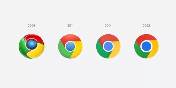
With its updated Chrome logo and icon Google has totally embraced a flat motif. Look closely and you may not immediately spot the difference from the most recent refresh in 2014. It’s subtle, but there:
Google Chrome Logo/Icon History 2008-2022:

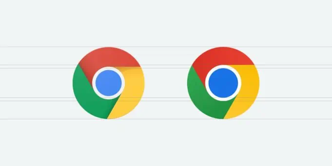
And zooming in for a comparison of Google Chrome logo 2014 vs 2022:

Particularly note the yellow portion in the old version (left, above) and how there’s an ever slight shadow effect at the top — a thin sliver of a darker shade of yellow. In the 2022 update that’s now gone. As are any other traces of shadows, gradients or dithering, or however you want to call these slight effects that provide dimensionality. All completely gone.
Study the 2022 logo more closely and may also note that the blue dot in the middle is now more colorful/saturated and even slightly larger. Overall, the look is brighter with increased contrast.
Google designer Elvin chimed in on Twitter about the changes with an interesting thread for those who enjoy studying these sorts of design processes:
Some of you might have noticed a new icon in Chrome’s Canary update today. Yes! we’re refreshing Chrome’s brand icons for the first time in 8 years. The new icons will start to appear across your devices soon. pic.twitter.com/aaaRRzFLI1
— Elvin 🌈 (@elvin_not_11) February 4, 2022
Most of us probably won’t notice these minor tweaks, but I think the overall look is clean, modern and, ultimately, successful.
Take a look back to 2008 and I’m guessing you should be able to spot at least a few differences in that logo compared to this new one?


