Peloton users may have noticed a pop up screen over the last few days announcing a new feature.
This one is called ‘Body Activity.’ and is available on the various Peloton apps as well as the web site where you’ll see it under your Overview section as well as related to various workouts.
Essentially the idea is to track what parts of your body you’ve been focusing on over the past week and month — that way you can ensure to “get a rounded full body routine.” It looks something like this:
![]()
You can see that the — rather futuristic — diagram indeed breaks down the various muscle groups and the attention they’ve received based on the various workouts you’ve taken. In this case in the last 30 days and last 7 days.
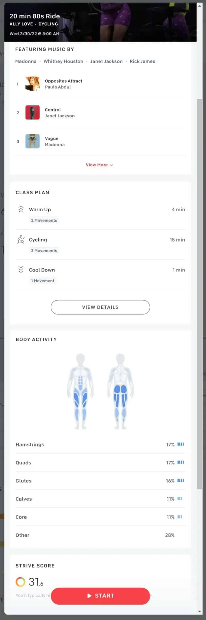
And here’s how Body Activity looks for a particular class:

Darker blues represent muscle receiving more attention. It’s a quick visual way to understand where you may need to adjust your workout routines so you don’t neglect areas.
Per Peloton:
With Body Activity, you can see which muscle groups you’ve already worked during the week and get personalized class recommendations to get a rounded full body routine. Members may feel challenged to fill in every muscle by strengthening their full body week to week. As you work a muscle more, the color on your Body Activity will change from clear to dark blue in relation to other muscle groups.
- Clearly see what muscles you’re working most after every Peloton workout.
- Track your progress from week to week, and how your activity strengthens your muscles.
- Body Activity is available for strength, running, and cycling.
You’ll find the Body Activity visuals across various places in the Peloton apps and web site including on class details, movements on a class plan and as shown in the image above in your profile.
![]()
Muscle groups tracked include the usual suspects including:
- Glutes
- Quads
- Hamstrings
- Calves
- Hips
- Core
- Obliques
- Triceps
- Biceps
Overall it’s hard to tell how useful this will be in managing workout and training plans. My initial impression is that it’s pretty cool. The team has done a really nice job visually representing this information and no doubt it can help provide a helpful snapshot in time in terms of how your body is being worked out, for better or worse.


