If there isn’t already there should be a sub-Reddit specifically for evaluating and discussing tech logos and the various iterations they embody over time. I’d join in a nano-second; too much fun armchair quarterbacking these design decisions.
The latest is from Google, and its refreshed Android logo.
Android is, along with Google Search, probably one of the tech giant’s biggest and most recognizable brands. I’d rank it right up there next to Apple iOS, Facebook, Microsoft Windows, Amazon Echo and others of that ilk that represent major consumer brands that we all interact with pretty much everyday. Android is definitely one of them.
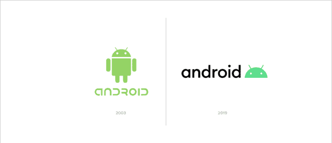
Here’s the evolution of the Android brand and logo over the past few decades:

You can see in the above comparison the logo, specifically the typeface, has become decidedly less futuristic/robotic and more, perhaps, approachable.
In 2003, things were looking pretty much like something out of Blade Runner. Back then, Google was a tech-forward company when it came to branding.
In 2019, we see the Google team choose a basic sans-serif font for the updated Android logo. Maybe in part that decision also lost some quirky personality?
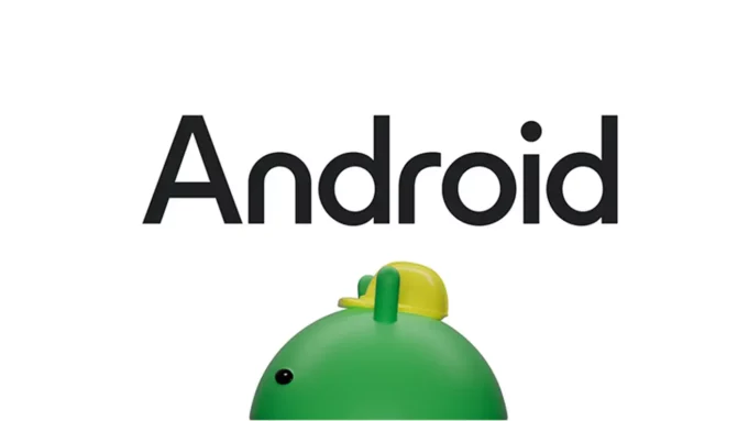
Just four years later comes yet another change to the Android logo:

Now, there’s a capitalized “A” and the kerning is tighter so the overall look is tighter.
Note that the “n” no longer has a handle and is a simple form, matching the “r” in style in that respect.
As for the robot, it’s still there! Albeit now the “bugdroid” is starting to get some shading — something that used to be passe in the world of branding as things moved flat in the last ten years or so. It also, curiously, is wearing what looks like a yellow construction hat. Maybe that’s a way to signify Android as a builder of the future? Or our cloud aspirations? Or AI dreams?
My guess is that giving the Green Robot a little more personality helps offset the sort of mature, serious nature of the updated Android typeface itself. So the brand is having it both ways: it’s grown up, but still a fun robot at heart.
Google says the new look draws inspiration from Material design.
Overall, I like it.
The 2023 logo carries on the tradition without completely obliterating the history before it. You know right away this is Android. There’s a familiarity. Yet, at the same time, the aesthetic does feel more modern and fresh.
I’m grading this one a solid (capitalized) A.

