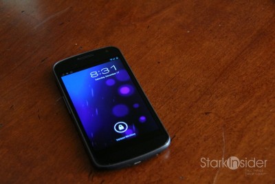
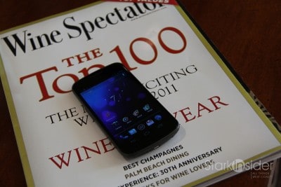
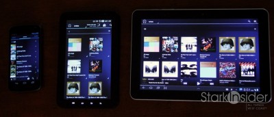
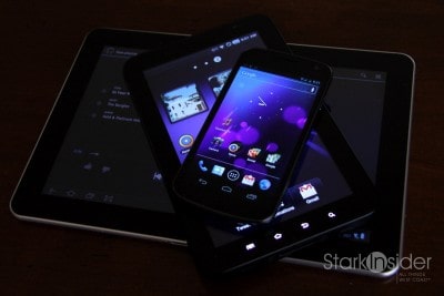
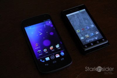
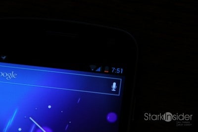
With the Samsung Galaxy Nexus, Google is proving that its upstart mobile OS — now dominating the market with 53% share – -can also dress the part. Android 4.0 (Ice Cream Sandwich) is pretty sweet stuff. While there are minor rough edges here and there, it speaks volumes to not only the here and now of Android, but also its future ability to go toe-to-toe with iOS and the Apple iPhone in terms of aesthetic appeal. ICS is gorgeous. Galaxy Nexus, the first handset to run the hot new OS is not too shabby either. I’ve been testing one for a few weeks now, despite my stubborn refusal to give up on my OG Motorola Droid (circa November 2009), and here’s my take on the Ferrari of Androids.
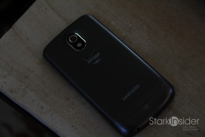
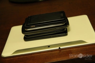
I’m a huge fan of larger displays. Nexus features a sharp Super AMOLED 4.65-inch display. While some may find it awkward to use the phone with one hand (reaching across the screen with a thumb is much harder, if not impossible, compared to a 4-inch iPhone for example), I found the trade-off worth it. Surfing the web on Nexus is surprisingly comfortable. The device slips into my pocket with no issue whatsoever, even though it’s markedly larger than my Droid. Design-wise there’s been a lot said about the curved glass. It’s OK. I didn’t notice any improvement in comfort when holding the phone to my ear. It looks nice, but there’s also a plasticy feeling to the rear of the phone that underwhelms. Here, the Motorola Droid RAZR takes top prize, easily. Its Kevlar backing and razor thin design are striking by comparison. Still, the Nexus is well built, easy to hold, and should withstand the day-to-day rigors of a two-year contract.
Related Android and Nexus Stories
Top 10 Tech Trends for 2012: Flexible displays, Tablet bonanza, Android crushes it
10 Things You’ll Love About Galaxy Nexus and Ice Cream Sandwich
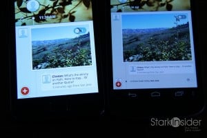
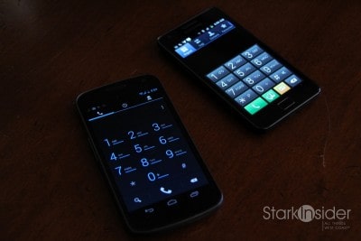
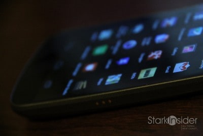
Samsung’s nextgen display supports 720p HD at a resolution of 720 x 1280. That’s quite impressive. With a pixel density of 316PPI fonts look smooth, crisp. One potential difficulty of working with such a hi-res display is that some apps aren’t properly tuned, and as a result show minuscule characters that can’t be sized. See photo to right of Path, for example. On the Samsung Galaxy S II I can easily read the timeline, whereas on the Nexus everything looks sharp, but tiny. To be fair, this is an app issue, not an issue with the handset itself – it just might take time for developers to adjust to the next generation of high resolution displays.
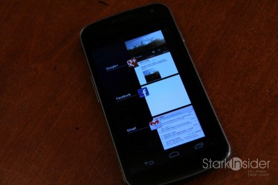
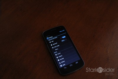
One design feature of Nexus I’m particularly keen on is the absence of physical buttons for navigation. While you still find a volume rocker, and power button on the sides, you won’t find the standard array of Android navigation (home, back, menu, search) buttons below the display. Instead, thanks to ICS, these are now virtual softkeys. This is a huge leap forward and an opportunity for context aware functionality – expect competitors to emulate Google’s approach. The downside is that most apps aren’t coded for the new setup, often requiring a stop gap extra softkey to be provided to access menu items. It’s not a big deal, and will improve over time. We’ve seen this design before on Honeycomb for Android tablets.

About ICS then. I love the new font. (Mr) Roboto was designed specifically for Android. It’s clean, modern. In tandem with Google’s emphasis on monochromatic (cool blue) icons and text, the whole aesthetic can be best described as Jazzy Neptune Hip. To boot, a dual-core processor 1.2GHz processor gives Nexus plenty of zip. I rarely noticed lag, and screens flew past just about as fast as I could swipe, touch, or pinch.
Welcome improvements have been made all around to stock apps such as Gmail, Calendar, Contacts and Settings. My favorite is the multi-line email preview. iPhone has employed this helpful feature for ages so it’s welcome relief to finally have it on Android.
Once again, Android is the kind of sync. After entering my Google credentials, Nexus synced with all my data in the cloud. The upgrade days of yore–manually backing up data, then taking hours to re-enter phone numbers–are so very done.
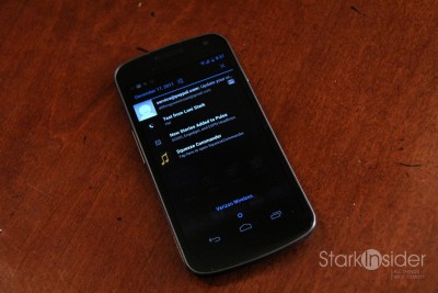
Another standout for Nexus and ICS is the notification system. Nexus review continued…
It was already best-in-class before (with Apple making a poor attempt to duplicate its success with iOS 5), and now it delivers extra sizzle. As before, pulling down on the top of the screen reveals notifications. Each can be dismissed with a single swipe to the side, or can be batch cleared with a single touch. Once again Google’s done great work with the look and feel here. The white and grey text on top of the dark background make for easy reading. With so much information coming at us from so many directions — RSS feeds, social networks, news aggregators — I find notifications to be an essential part of maximizing productivity on a smartphone. ICS nails it.
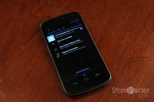
Customization is another strong point. With Android you can place widgets on the desktop, and customize wallpaper, and various other settings, bringing the handset one step closer to a full-on desktop experience. Google’s tweaked the way widgets get placed. Instead of a long press on the display, you’ll need to pull up the apps menu where widgets are now included. I actually prefer the older method, but over time I became accustomed to the new apps/widgets all-in-one menu approach.
As mentioned earlier there are some rough spots. I get what Google is trying to do here. Honeycomb was errant, and the new thinking is to utilize the same Android code base for both tablets and smartphones. That makes sense. As a result, ICS feels like the engineers shoe-horned bits of Honeycomb into the new codebase. For the most part it works exceptionally well. But there are inconsistencies. For instance, sometimes an extra menu will appear at the top right, or other times it will appear at the lower right corner. When in camera mode, the softkeys disappear (but can be “woken up”). There are several other idiosyncrasies you’ll encounter when using the phone over the course of a few weeks. Consider it a transition, as Google meshes the tablet/smartphone OS into one unified experience (as Microsoft is trying to do with Windows 8).
Connection wise I experienced no dropouts or weak bars as others have reported. Not scientific by any means, but compared over wi-fi to a Samsung Galaxy Tab 10.1 and Samsung Galaxy S II, the Nexus had as many or more bars in all locations I tested around the office, and at home.
Regarding the need for speed, 4G LTE is a dream! I was constantly amazed at how fast data pulled down. Verizon’s new network makes downloading apps, surfing the web, and watching movies (okay, yes, I’m grandfathered on the unlimited plan) a breeze. You simply don’t think anymore, “Geez, I’ll wait to do this on my laptop when I get back home.”
But…
That speed and performance come at a price.
Battery life on the Samsung Galaxy Nexus unfortunately is not a strong suit.

Whether it’s good enough, and worth the trade-off is a decision you’ll need to make. For most, it’ll be worth it. Many Nexus owners carry extra chargers in the car, the office, etc. At times during testing, the phone would inexplicably lose 15% of its charge in about 45 minutes while sitting unused. I realize there are many considerations – maybe the battery (1850 mAh) needs to be cycled to achieve optimal performance, maybe background apps are sucking the lifeforce out of the phone, or maybe that’s just life with a modern-day, high performance smartphone. Regardless, the extended 2150 mAh battery is probably a worthy consideration. And I should note that weak battery life is not germane to the Galaxy Nexus. 4G LTE smartphones in general (including those on non-Verizon networks) are all susceptible to charger envy.
When it comes to Android, the Samsung Galaxy Nexus is the lead horse. It’s the only game in town if you want a taste of Ice Cream Sandwich (although that will likely change in the coming weeks ahead), and thanks to decent Samsung build quality, it’s a powerful smartphone that will easily see you through a two-year Verizon contract. The Motorola Droid RAZR, however, is still my top pick for design – and if you’re willing to wait for ICS it might be worth considering (especially if a good car dock is important to you).
Compared to the iPhone 4S, I’d take Nexus every time. It’s the definitive Android experience. No wonder others peer over my shoulder. Android does things the iPhone can’t — and the bigger screen is an added bonus. Siri is impressive, yes. But do you want a psychiatrist or built-in Google Navigation?
ICS portends a new, slick design direction for Google. It’s right on the money. Sure, there are minor inconsistencies. And not many apps yet take advantage of new features available via ICS, but that will change quickly. As a flagship device, it’s a smart choice. Google has been known — despite its acquisition of Motorola Mobility — to pamper Nexus devices and give owners the red carpet treatment. Plus, future Android updates are likely to hit Nexus first.
Now, go forth and conquer.
Samsung Galaxy Nexus (Verizon Wireless)
4 out of 5 stars (Smashing)
Android 4.0 – Ice Cream Sandwich
$299 w/2 yr. Verizon contract+1: Large, vivid 4.65-inch screen; Android 4.0, while not a game changer, is polished and closest yet challenger to iOS/iPhone; Best notification system in the business; New default font Roboto is classy, modern; Flexible home screens with convenient folders, widgets; Excellent Google sync (apps, G+, contacts, etc.); Improvements to stock apps including Gmail, Calendar, Contacts and Settings; Removable battery.
But: Expensive; Poor battery life (consistent with other 4G LTE handsets); No Google Wallet (at least not natively); Still some quirky interface issues with Android; Average build quality; No expansion slot; Middling performance with many functions (e.g. rotating orientation, launching apps) actually slower than the 11month old Galaxy S II; Speakerphone lacks volume.
Verdict: The definitive Android experience. Nexus dresses the part. This is a fast, fun smartphone. Fair warning: Battery life is not the best, and ICS has some inconsistencies. Minor quibbles aside, it’s easily one of the top products of 2011.


