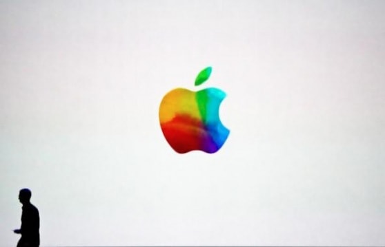
Yes, I know: it’s likely a touching tribute to Steve Jobs. What you see here is the tie-dyed, fanciful logo shown at the end of this week’s iPad announcement. As CEO Tim Cook walked off stage, we saw a decidely non-monochromatic homage. Or was it more than that? Some are suggesting this is a new logo, and that Apple will unveil it this year. I hope that’s true, and think it makes perfect sense. Here’s why.
1. Tim Cook needs to make Apple his own
Sure Cook is a supply chain/logistics guy. Nothing, however, conveys the Apple brand more than the logo. The current one is stylish, heavy on cool, and certainly appeals to the architectural crowd. It glows proudly on our MacBook Pro lids. It adorns glassy, steely Apple stores around the world. But if Tim Cook needs to put his thumbprint on the world’s most valuable company, and signal that he is ready to step out Jobs’ shadow and lead – creatively too – then a new, non-Jobs era logo is a good place to start.
2. The current Apple logo is 14 years old

14 years is old, really old. Just ask Microsoft about Windows and the need to refresh. The return of the rainbow would tug our heart strings. Apple is just as much about its current success and the iPad, as it is about Woz and Jobs tinkering in the garage with world domination.
3. Microsoft went monochromatic, so Apple needs to do the opposite
Did you see the new Windows 8 logo? It’s a simple, monochromatic play. Apple would do well to zag when Microsoft zigs.
4. 3D, 4K, and Holographic are the future
Apple is a visual company. Think “Resolutionary.” Right? Okay, maybe the puns are a bit much, but there’s no doubt we get all touchy, feely around Apple products because they look so damn good. There’s the stunning Jon Ives design. And there’s those screens. Even when they’re not super hi-res, like the SOMETHING X SOMETHING on my MBP 13, they always pop more than the competition. These same technologies play an important role in the living room, where Apple seeks to do battle (Apple TV) with a litany of traditionalists like Sony, Comcast, and DirecTV. Therefore, a colorful, shiny, playful logo would appeal to the family unit, those that would otherwise eschew the cool, architectural logo imprinted on current Apple products.
5. It just feels right
Admit it. When you saw the throwback mash-up logo at the end of the “new” iPad announcement didn’t you get just a tad giddy?
Awww, hell, let’s throw caution to the wind: Calling Sir Isaaaaac Newton…!


