“It appears to have been designed by a lunatic, and then hit with an axe.”
Forget The Verge, forget CNET and forget Gizmodo.
When it comes to iOS 7 that quote, by none other than Top Gear’s Jeremy Clarkson, just about says all you need to know about Apple’s brand-spanking new, “modern” operating system that powers iPads and iPhones.
I saved that quote, which was made in reference to the TVR Sagaris, months ago–on a Post-it note. I wasn’t sure why. But it made me laugh every time I saw it. For best effect you have it deliver it in your mind with Clarkson’s affectionate, sarcastic British accent and style: lunatic! an axe!
There’s other, equally, and decidedly more American ways, to describe iOS 7:
Bloody mess.
Dog’s breakfast.
An affront to designers everywhere.
Helvetica? Hello?
Hey Stark who moved my cheese? Jony Ive that’s who. Just remember that.
Take your pick. This has got to be one of the most disturbing design mash-ups to ever make it to a shipping product–one that received a stamp of approval from Jony Ive, a design legend.
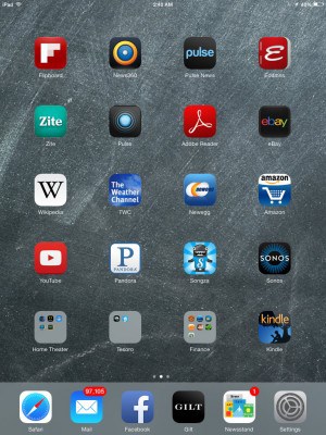
I don’t recall ever seeing such a completely whacked out, kindergarten-inspired jambalaya. It’s as if iOS 7 had the hands of a hundred designers at its throat, evidently all working in opposite directions. Inconsistencies reign supreme. The Game Center icon is abstract. But the Camera icon is painstakingly literal. Check out the new passcode screen and, trust me, you’ll shake your head in disbelief. Oh, and sometimes the virtual keyboard has a white background (most of the time), and occasionally (and apparently randomly) it’s black. Crying, optional.
This new iOS 7 stinks! I still have to make my own breakfast and tie my own shoes!! Get with the picture, Apple!
— Tim Simon (@timesimon) September 18, 2013
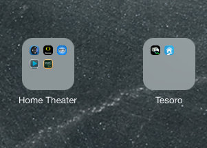
Before you jump all over me, remember this: the iPad Mini is my favorite tablet of all time. I’ve come to really appreciate–at times adore even–the Surface Pro, but it’s simply too clunky (and battery life is a show stopper). Android tablets are quite respectable (Nexus 7), and amazing bargains. But the Mini gets it right — it’s the right size, the right battery life, the right apps. Timeout! This is the folder backdrop on iOS7, featuring a solid defective looking gray:
Vomit bag optional; though I appreciate the whimsical nod to the Netscape browser of 1994. Predictably, The Verge gave iOS 7 8 out of 10. Predictably, CNET gave it 4 out of 5. Yet they treated the issue of its hideous design with kid’s gloves saying respectively “Design is disjointed and confusing in places” and “iOS 7’s new design makes it a compelling upgrade.” Perhaps their lightweight critique is appropriate given the grade school vibe of iOS 7. Surely there’s innovation under the cover. But what an ugly cover.
I kind of hate how ios 7 looks on my phone. Makes me feel like a 5-year-old reading a storybook. — Michaela Baltasar (@biscuiterie) September 19, 2013
Android still reigns supreme when it comes to notifications. Apple can’t seem to figure that one out. Bokeh is nice when you pull down the notifications menu, but the execution misses the point: we want quick summaries of what’s happening, not an entirely separate user interface. Total miss.
Timeout!
This is the Safari icon:
Yep, the early previews turned out not to be a joke. Apple followed through with what might be the most hideous icon ever made.
Multitasking in iOS 7, okay, let’s be fair: it’s pretty sweet. Four fingers up, and wham, just like Android, you’ve got a card-based metaphor. Fingerprint unlock. Very handy. I like that too. Though that nifty feature only works on the new iPhone 5S (gold?!). Also have you noticed the elegant way wallpaper subtly moves depending on the angle you’re holding the iPad, or iPhone?
Timeout!
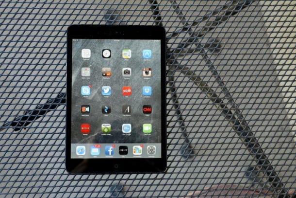
This is iOS 7:
Above all, Apple is known for: design. Related to that is aesthetics. They go hand in hand. Someone once told me that aesthetics is a form of innovation. That some of nature’s most marvelous innovations are related to accentuating beauty. As I wrote last week, however, innovation and Apple are no longer synonymous. iOS 7 is its crowning achievement — too many voices. Steve Jobs was a dictator. And, as we’re now learning, it served Apple well.
Perhaps I’m being too kind.
Design-wise iOS 7 lacks direction. It’s deeply flawed. Above all, it’s unfinished.
ALSO SEE: Apple, my friends, is dead
Side by side the old iOS, though dated, at least had a cohesive look. Going flat and doing away with skeuomorphic elements is all good. We really don’t need felt and wood in digital user interfaces. This, however, is Apple. A beacon for design. With the master craftsman and iPhone wizard Jony Ive at the helm, and surrounded by a deep, deep pool of talented people – this is supposed to be the 1988 San Francisco 49ers, not the 2013 Pittsburgh Steelers.
I can only guess that this rather unfortunate misstep is the result of group-think. Apple culture is apparently now more of a democracy than a dictatorship.
@biscuiterie I don’t like it either. too cartoony.
— Beth T (@sfbetht) September 19, 2013
I truly hope Google, with its impending KitKat Android update, draws zero inspiration from iOS 7. True, Android has always been Pears 101 to Apple’s Dance at Le moulin de la Galette. Recently though, with some gorgeous updates to Google Play, using Android no longer feels like walking through a bad neighborhood. In fact, Android design in many ways surpasses that of Apple. In an ideal world I’d take Apple hardware with Google software.
As much as I love the iPad Mini, which is the best tablet ever made–lack of Retina display notwithstanding–iOS 7 should sadly go down in history as one of the tech world’s most egregious designs, joining Microsoft Bob, the Pontiac Aztec, and the Apple III.
