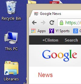
In case you haven’t seen it yet, pictured above is the new Google logo. It’s flat, clean, modern. Unlike Yahoo, Google has decided to do away with embossing and any sort of texturing. It’s simply the same six iconic colored letters–blue, red, yellow, blue, green, red–we’ve come to associate with the most famous web page of all time.
Google hasn’t yet updated its web page, or any other pages so far as I can tell, but you will find the new logo on the “new” tab screen of Chrome, which is how I grabbed the lead screen shot.
Flat is the new Black
As for the update, it looks classy. No need for anything dramatic–to tinker with this would be, in the words of Dr. Zaius from Planet of the Apes (1968), heresy! Still if you look at the current logo on the Google search page it’s clear that the it does need a bit of a hair cut and some shoe polish.
When marketers don’t have a lot of new sexy kit to talk about we tend to turn to other things, like logos, and colors, …and the 49ers.
Though I like the functionality of iOS 7, clearly I’m not fond of what Apple has done with the look. A lot of that has to do with the random feeling the overall design gives off. It will be interesting to see how (or if) Google applies a fresh coat of paint to its look-and-feel across Android and its mobile apps. We should know soon enough. Android KitKat (4.4) will land next month, along with the long awaited Nexus 5 — odds are it will, sadly, be made once again by LG. Google has already been rolling out visual updates to Gmail (including one today that applies Google’s preferred cards-style UI), the Play Store, and several other apps throughout the year so it’s in much less of a need for an entire makeover than Apple’s iOS which hadn’t seen a major design overhaul since its original launch six years ago.
Comparing Android on my Nexus 4 side-by-side with iOS 7 on my iPad Mini, I began to understand why Apple faced the more monumental job in giving its OS design a refresh. And that’s simply this:
The legacy of the original iOS skeuomorphic design.
For the most part Google didn’t dive into felts, woods, notepads nor did it attempt (for the most part) to have its mobile world mimic the real world. That, in my mind, is one reason why the visual jump from iOS 6 to 7 is just so jarring. Still, Apple surely could’ve done better than that atrocity that is the new “bookshelf.” My wife pulled that up and shook her head. “This doesn’t feel cozy anymore. It’s just a bunch of shades of grey.” Hang on a sec here…
Also, there’s another minor update to the Google Chrome browser that regular users will have noticed.
To access apps, you now click a colorful little icon on the bookmark bar, just below the back button:

I like it. Before, you had to click left and right to access either bookmarks or apps on Chrome’s new tab page. Now you can readily access either with somewhat less effort. In essence the new Apps button is a bookmark. Left-clicking it brings up the familiar apps web page. Right-clicking on it brings up bookmark management options. Convenient.
Still not much to talk about in terms of Mega Product in 2013
Unless Google pulls off some kind of miracle with Android KitKat–and it’s entirely possible–2013 is looking to go down as the year of color, and the year of incremental updates. Google played up Moto X’s color customization heavily. Apple, as we know, created a sales monster with a gold version of the iPhone 5. Amazon is emphasizing all sorts of colorful accessories for its new range of Kindle Fires (promising looking tablets they are). Also, we saw several new logos: Yahoo!, Bing, Google.
But what didn’t we see?
Major product breakthroughs.
ALSO SEE: 5 Great Things About the New Amazon Kindles
From 2007-2013 the tech industry saw the creation of not one, not two, but three major new markets and product categories: the smartphone in 2007 (iPhone), the tablet in 2010 (iPad), and wearable computing in 2013 (Google Glass- though, not consumer ready yet). That level of innovation is simply astounding for a short 5 year cycle.
Now, part of me believes, the industry is taking a collective breather.
Given that the mobile market is getting saturated much of today’s R&D is now going into apps, and services that leverage the install base of all these devices.
When marketers don’t have a lot of new sexy kit to talk about we tend to turn to other things, like logos, and colors, …and the 49ers.
Fast Company (they’re on fire with a beautiful new web site, and an emphasis on smart, long-form stories) has a terrific piece on Google’s new design ethos, which was given a “utility to beauty” shake-up in 2012:
“Google examined its culture, found that it was weak in design, and systematically set about solving the problem. As it did, Google showed that it has learned how to adapt to a changing environment. In tech, that’s the definition of beauty.”
Even if Google doesn’t introduce a dramatic makeover with KitKat we can at least look forward to the Xbox One, and Sony PlayStation 4 this holiday season. Oh, yes, and that mythical beast called Nexus 5.

