There’s a reason why Yahoo recently bought start-up Aviate. Home screens are a big deal. Bessemer Venture Partners recently estimated that each square inch on mobile devices is worth a staggering $16 billion. With hundreds of millions of us incessantly looking at our phones every day, it’s no wonder that the next big battle in mobile is take control of our home screens.
Home screen replacements, or launchers, have been around forever. At least on Android – all hail the open platform that lets developers customize the Android experience. Meanwhile Apple has such a tight lockdown on iOS it spoils the fun that customizing anything beyond the wallpaper is near impossible. Back in 2009 I recall fiddling with a bunch of launchers. Half the fun was comparing them and seeing how they changed, enhanced or, in some cases, destroyed, what Google originally had in mind for its mobile experience.
Back then home launchers such as Go Launcher, Nova Launcher and ADW Launcher were all about customization. You could tweak to your heart’s content: icon placement, launch menus, shortcuts, themes. It was a smorgasbord of choice. They’re still around and they’re incredibly versatility (I particularly like Nova).
While you gain contextual smarts with Aviate, you have to give up a thing or two as I discovered.
Manufacturers too have played the home replacement game by baking in their own skins into handsets. HTC Sense may have been first in 2009. To Android purists such as myself the idea of adding bloat to stock Android was a sin; over the years HTC and others such as Motorola with MotoBlur and Samsung with TouchWhiz have, admittedly, made in-roads and now offer reams of useful functionality not otherwise provided by Google.
In 2012 Google itself put its own spin on the idea of an intelligent home screen with Google Now. It’s absolutely terrific. Without changing the fundamental look-and-feel of Android, the card-based interface anticipates the type of information we may need at any given time. Yes, privacy concerns arise. How did Google know I was interested in Jared Leto? Oh, right, I did some background research on his new (and very good) documentary Artifact, and searched on my home PC. Google knew that of course. So it figured it would pull up related stories for me on Google Now.
Then Facebook gave it a go. It needed a mobile play. Facebook Home (2013) was the answer. Though it flopped, the move revealed the strategic importance for large tech companies to ensure they had mobile presence. Eyeballs were moving to phones and tablets. Ad dollars would follow.
In five years, when HTC first unveiled Sense and Verizon and Motorola unleashed its “Droid Does” campaign to an unsuspecting world we’ve grown up, and expect a lot more from our phones. In 2014 it looks like they finally deserved to be called “smart”.
Part of that has to with the idea of context. We hear that term a lot these days, and I can’t think of a more appropriate application of the notion to how our smartphones work. Google listens to us and responds amazingly well to us summoning it – “Okay Google” – from Mt. Data. Umoove, a game from an Israeli start-up, is eerily effective at watching us watch it.
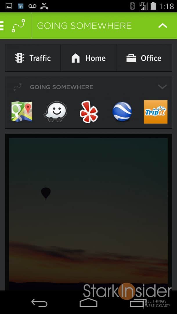
So it follows then that instead of relying on us to customize the experience this new breed promise of intelligent home screens do the heavy lifting for us. This is where Aviate comes in. In the car heading to the office? No problem, Aviate’s algorithm will anticipate the kinds of things you’ll do with the phone while driving (navigate, listen to music, find a restaurant) and ensure those activities and the related apps (Google Maps, Pandora, Yelp) are front and center. Just returned home? Aviate will serve up entertainment apps like Netflix, and other related services you might enjoy while unwinding.
Aviate, then, does it work?
Well mostly yes. It’s a work in progress (Yahoo has yet to remove the beta label) and portends some amazing capability.
I tested the app on a Nexus 5. It’s a pretty sweet combo. I found Aviate really flies; icons are vibrant and everything easy to read with either the dark or light theme. Aesthetically Aviate, with it’s clean look and shades of grey (with the dark theme) reminds me of Cover, the superb intelligent lock screen replacement for Android.

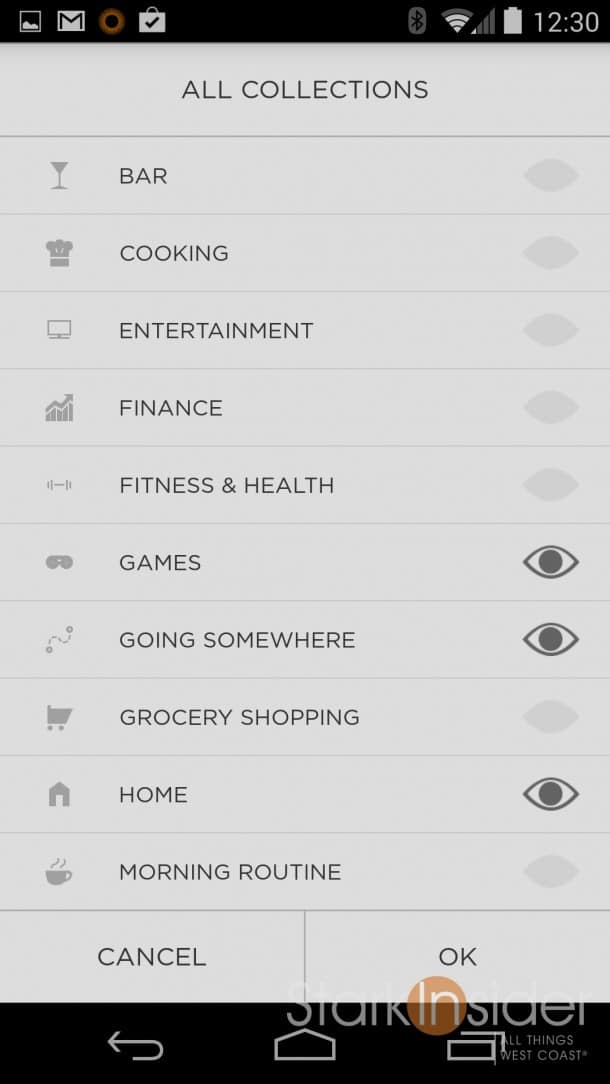
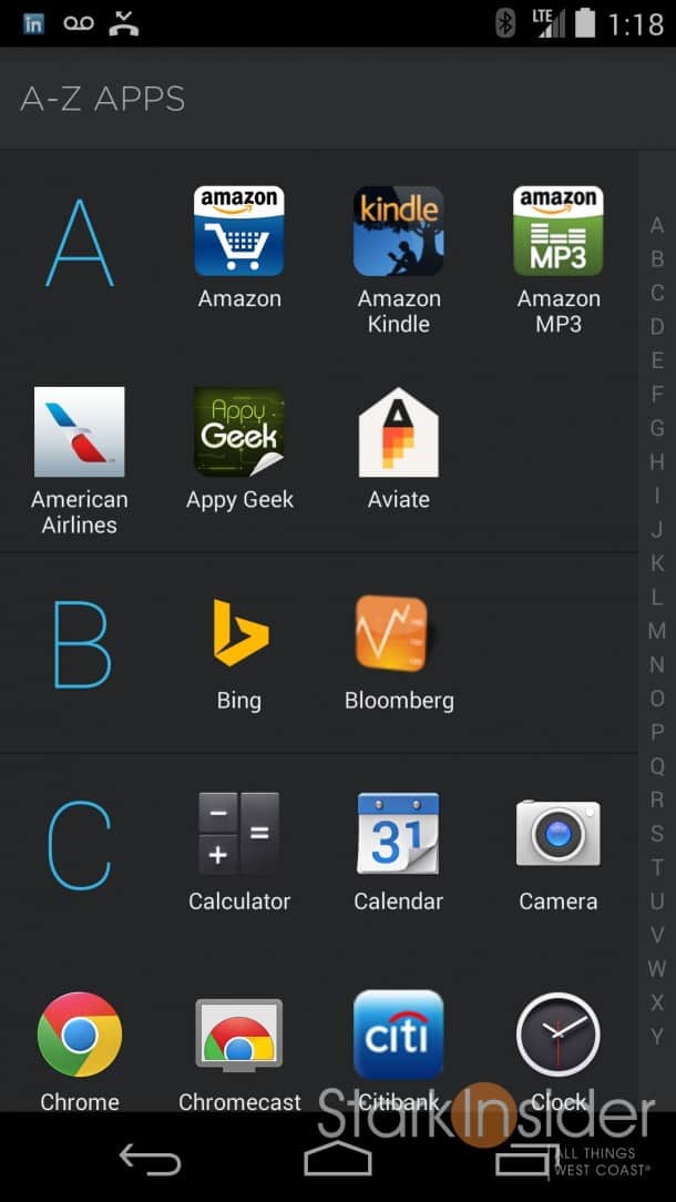
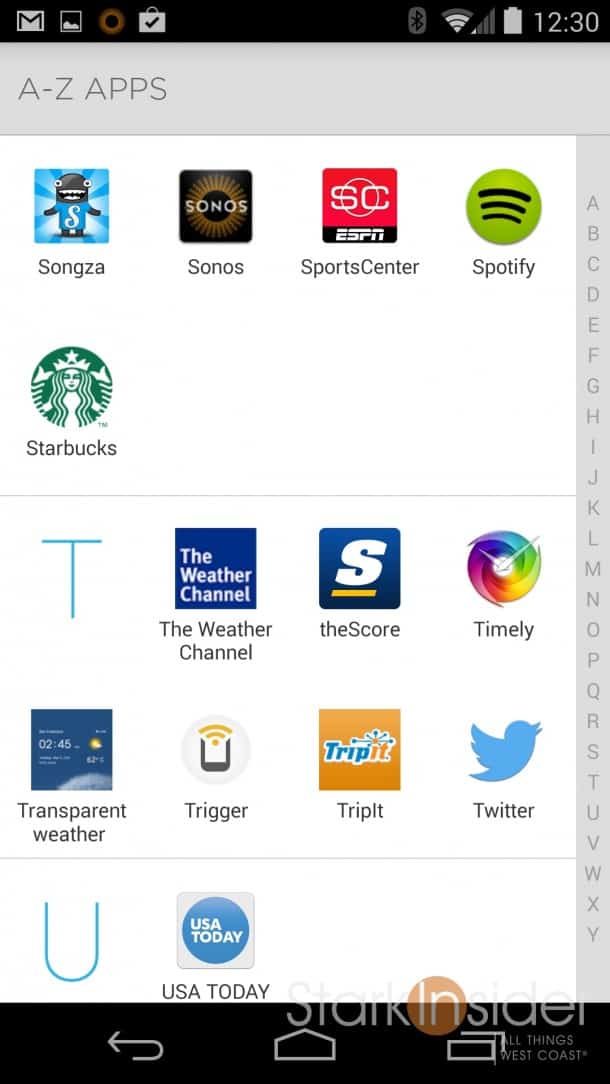
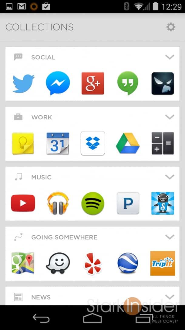
Apps are automatically sorted into collections, so you don’t need to spend time creating and naming app folders (in fact, there’s no such concept as a “folder” with Aviate). Swiping left reveals the various collections–social, work, music, going somewhere, news, home, etc. Swipe again the same direction and you get access to an alphabetical listing of all the installed apps on the device.
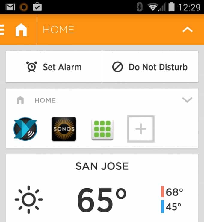
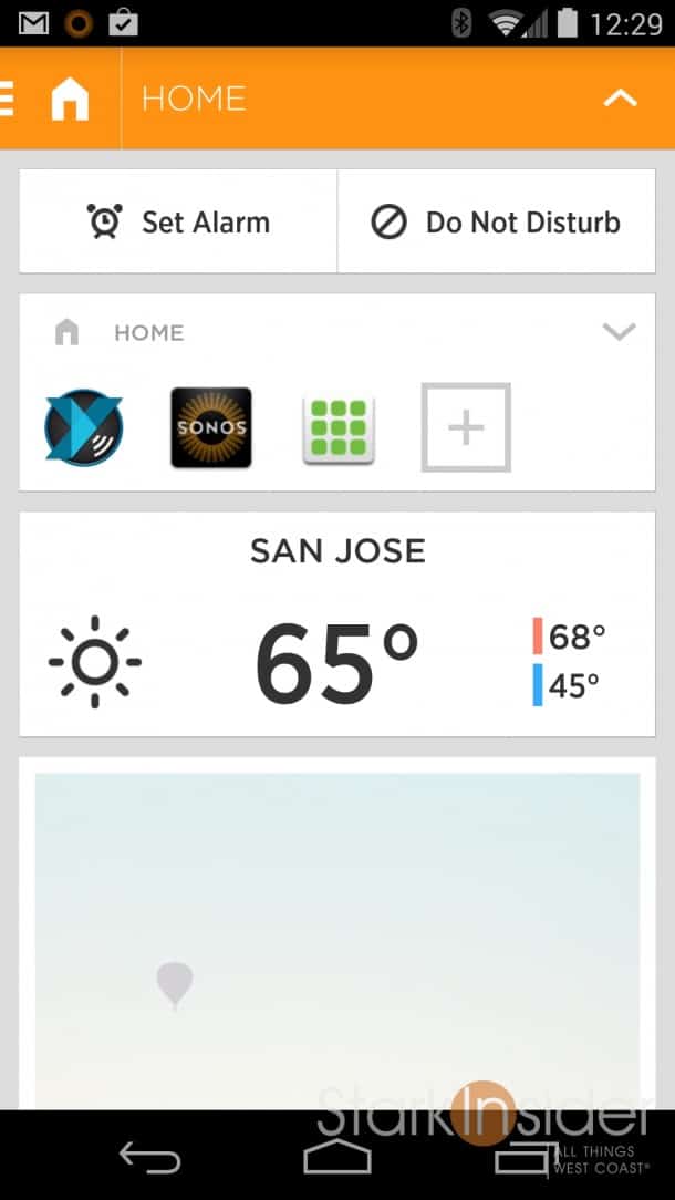
Meanwhile the main home screen shifts in appearance depending on the time of day or your location. At home, for example, the app tray has Sonos, the Play Store, Insteon (home automation), XBMC remote (home theater). At work, it shows my next few appointments and show productivity apps such as Dropbox, Chrome, Hangouts. I found it works very well. It completely transformed my Nexus 5 into a true smartphone, one that (for the most part) accurately predicted what I’d want to do at any given time or place.
While you gain contextual smarts with Aviate, you have to give up a thing or two as I discovered.
Google Now is no longer available with a convenient swipe to the right. Instead, it’s accessed with a long press of the home button. Not a big deal, but and adjustment nonetheless – heavy Google Now users might find this a nuisance. Also the “Okay Google” voice command no longer works – the phone doesn’t listen when using Aviate. That’s unfortunate. I hope the developers can add that capability. One of the big pluses of KitKat is Google’s active listening.
Another sacrifice is widget space. Aviate has a total of only four panels (spaces, home screen, collections, apps directory). Space for widgets is only allocated on the home screen. I was able to add New York Times, USA Today and CNN, but adding more caused too much congestion for them to display properly. For me, this is not too big a deal as I prefer to launch apps rather than rely on too many battery-draining widgets.
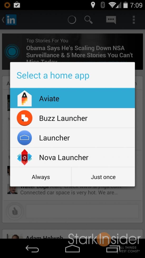
After a few days of running Aviate I began to understand the promise of the so-called contextual age, at least as it relates to home screen replacements. Google Now gave me a taste of that, and apps like Aviate (and other intelligent home replacements like Smart Launcher and Buzz Launcher) are on the verge of taking it to the next level.
The risk that companies take when investing time and money into building home replacements is that Google (and Apple) will simply cherry pick the best ideas and bake them into the core operating system. In essence, it’s like having an idea incubator – for free. The upside though is so gargantuan that the risk may well be worth it. Owning real estate space on our mobile devices means opportunities to place ads, up-sell apps and add-ons, and market related products and services to a somewhat captive audience.
I’m a bit of a creature of habit, so I find it a little disconcerting to have my icons moving around–ESPN SportsCenter is always one swipe to the left and in the lower left… yep, there it is!–so with Aviate I have to make some adjustments. And that’s why I find myself always returning to the stock Android experience at the end of the day. I’ll keep my on Aviate though (changing home screens is so easy with Android that it’s a snap to run three or four of them to compare and play with). No doubt, everyone else looking to grab a piece of our handset’s real estate–Facebook, Motorola, HTC, Samsung, Apple, Microsoft and hundreds of start-ups–will also be watching to see what Yahoo does with Aviate.

