Sonos is following the trend. Microsoft, with Windows 8, and then Apple, last year with iOS 7, led the charge towards designs that were flatter, simpler, and cleaner. Gone were three-dimensional effects, bevels and skeuomorphic elements.
Google too has been riding that bus for quite some time. Look at Gmail and you’ll see a clean, white-dominant design with not a heavy-handed effect in sight (unless you opt for one of the busy wallpapers).
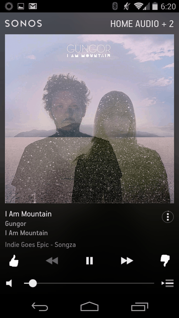
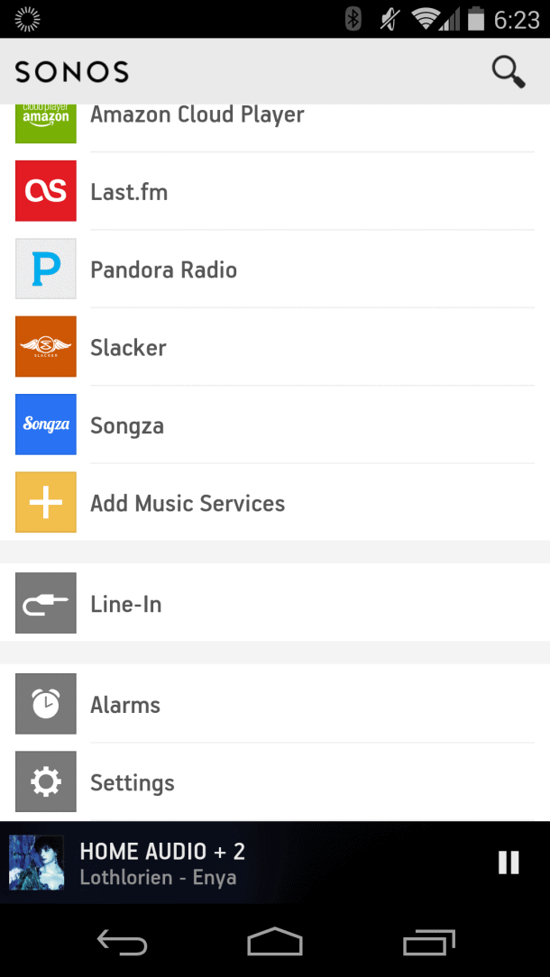
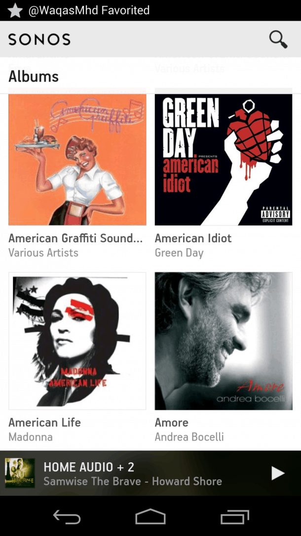
So it’s only natural that design-savvy Sonos would want to join the minimalist party. The whole home audio company’s new Android app is currently available in beta (registered users can download the beta from the Sonos web site) and sports a completely revamped, modern look:
I gave the beta Sonos Android app (Version 5.0) a spin on my Nexus 5 and came away impressed. Not that I ever felt the old interface was an ugly duckling by any means. Far from it. Sonos did Yeoman’s work with the original layout and look. With the update everything I appreciated about Sonos is still there, and, in some cases, made even better. Album art is almost always front and center, and is now larger, with images filling almost the entire screen (nice!). Menus are well organized; and music browsing is a breeze, be it a streaming service like Pandora, Spotify or the nifty new Beats, or a cloud locker like Amazon Player, or tracks served up old school style from a local hard drive.
With Sonos I’ve always loved the ability to control rooms independently (my Sonos configuration consists of a pair of Play:5 speakers, a Bridge, and a Connect connected to a whole home audio system). You can set different volume levels and music sources – say, play some Bossanova in the master bedroom, and Johnny Cash (“Ring of Fire” of course) in the kitchen. All of that remains with the new interface of course, it’s a hallmark of the Sonos system. All of that is still here of course and it operates almost the same way as before. In keeping with the new design, in lieu of blues and greys, there’s a classy black and white aesthetic to the new controls.
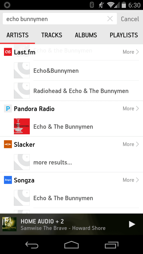
One big addition to the beta app is Universal Search. On previous versions you had to choose a specific service (Last.fm, Songza Spotify, etc.) before entering search terms (artist, album, song title or keyword). With the universal search box, you just type and go. Sonos returns results across all services. It’s fast, it works, and it’s a welcome new feature. I found plenty of Echo & the Bunnymen love in my test:
Given that all was right in my Sonos world I was apprehensive about the idea of a new interface. Again, was it really necessary? The current Sonos Controller App has a 4.3 average score and over a million downloads on the Google Play Store. Why mess with a good thing?
Fortunately, Sonos nails it.
The new UI is pretty, fonts are easy to read, and, best of all, I had no trouble navigating my way around music libraries, playlists and settings.
The sleep timer has been moved for those accustomed to using that to shut the system off after a predetermined time – you’ll now find that on a menu accessed by tapping a tiny three-dot circle underneath the track currently being played.
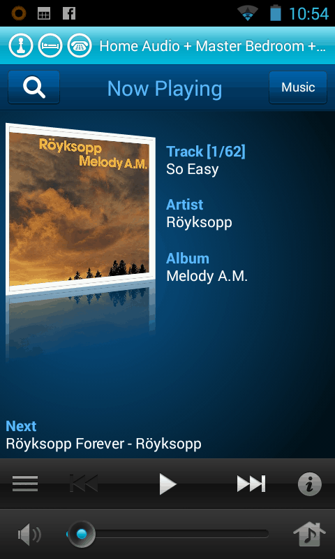
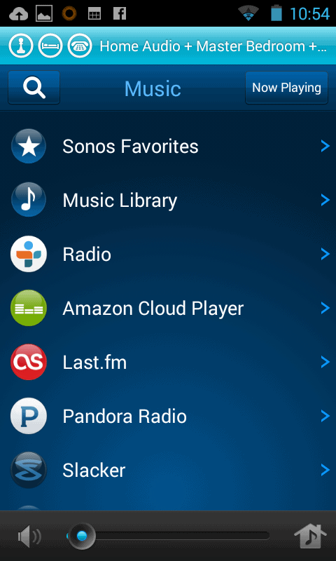
OLD SONOS LOOK
Here’s a few screen shots of the old Sonos app. “Now Playing” and “Music Sources”:
Once I installed the Sonos beta on my Nexus 5 I did get an occasional connection error. After updating my PC controller and resetting it there’s seems to be no issues now.
Sonos says the new app will soon be available for both iOS and Android with PC and Mac versions following later this year.
As I mentioned earlier I never thought Sonos really needed a fresh coat of paint. But they’ve done a first class job with the update and have given a Sonos a look consistent with some of the decade’s best design work for apps (Beats?). After using the Android beta I’m convinced the Sonos team is heading the right direction with their new look.


