I like Twitter. I like Cover (my review). But I don’t like the idea of Twitter and Cover.
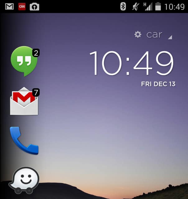
I had the same misgivings months earlier when Yahoo bought Aviate. It was a similar story. A web company buys an app designed to change the default user experience on Android smartphones. Aviate was (and still is) a clever take on the home replacement genre. Based on your location, it would alter the appearance of your homescreen, placing, for example, navigation and music apps front and center while you were driving, and then, later, swapping those out for apps like Sonos, Facebook and Netflix. Aviate knew when you wanted to be serious or playful. At least that was the premise. And, for the most part, the idea worked well. Fortunately Yahoo has not meddled with the formula too much (yet) and Aviate remains a compelling alternative to the standard Android user interface.
Why Twitter bought Cover yesterday is obvious: mobile is huge. Almost 75% of social networking takes place in an app, and not a web site. We love our phones, and we love being connected 7/24.
Twitter, of course, has an app. But it wants more.
It didn’t take long for us to realize that Facebook Home was hell on earth.
Just like Facebook (don’t even get me started on Mark Zuckerberg’s immoral and absolutely counter-save-the-world pay-to-play scheme for Facebook business page owners… shake down!), it wants our mortal souls. We are incalculably valuable to advertisers – GPS, context, and location-sharing services do more to just help us, they enrich companies looking to target products and services those most likely to buy (those most vulnerable at any given moment).
The easiest way to get there: by attempting to get us on their platform as often as possible.
Facebook tried this with Home. That too was an Android skin. It completely altered the Android experience. All of a sudden, chat heads were popping up on our phones even–“What up dog???!!”–when we were trying to deposit a check in a banking app. And just about every action led us to a screen that wanted us to engage on Facebook… What are you doing? Like this?! Check out this ad!
MORE STARK INSIDER: Cover App for Android – Give your lock screen some smarts (review)
It didn’t take long for us to realize that Facebook Home was hell on earth.
Let’s hope Twitter was paying attention. With Cover, another slick Android home replacement app, the social networking likely has a few goals:
(1) Fuel growth
It’s no secret that Twitter’s growth has stalled. If it can wedge itself into the core Android experience then maybe it can get more engagement.
(2) Increase ad opportunities
Ads are coming, en masse, to our Twitter timelines. That we know. But the issue is real estate. Facebook uses an entire web page. With so many columns and white spaces, there’s plenty of room for ads. Twitter relies predominantly on a timeline. If you’re not looking at the stream, you’re not using Twitter. But with something like Cover, all of a sudden there’s way more potential to slip in ads by Twitter… in all sorts of places, not just in the timeline.
(3) Neutralize Google Now
Google Now is a huge, not-so-secret weapon. Google is ostensibly using it to provide us with contextual information–sports scores, weather, stocks, driving directions–when we need it most. I use it every day, and love it. Nothing comes free, however. And all roads lead to Rome. Or in the case of Google, all roads lead to mobile ads (typically via Search). Twitter needs to neutralize that. But Google Now is baked into the default Android (KitKat) OS. How to defeat it? By using a home replacement like Cover. Bingo! Twitter can remove the built-in Google Now service (or at least minimize it availability) and, instead, replace it with all manner of Twitter-based stuff.
Given all that, I’m skeptical that this will work as Twitter plans (at least in the above scenario), and that, ultimately, Cover is doomed to obscurity.
With Facebook Home there is precedent. That is: users reject the concept of lock-in.
That’s why we love Android in the first place. We can download keyboard replacements, change myriad of user interface elements, swap out search services if we’re so inclined. Heck, we can even wipe the phone and install something like CyanogenMod, a terrific custom build of Android. Why, then, would we want to take a step backwards and run a home screen (or OS) built with a single social networking platform in mind?
Avoidance of lock-in is another reason why wireless carriers are blowing up their traditional 2-year contract business model in favor of pay-as-you-go, or less restrictive commitments.
It remains to be seen what Twitter will do with Cover. Maybe it will simply use it as the basis for a new, improved Facebook-like mobile app that shows Tweets on our lock screens. That could make sense. But if Twitter has designs for the Android user experience, and dramatically making my Nexus 5 look like one big stream, with ads running amok, it could be making a huge mistake.


