BMW has updated its logo for the first time since 1997.
The iconic German luxury automaker has posted an interesting history on the logo, explaining its meaning over the years. There you can learn if it is actually “a propeller or not”?
As for the new logo, I have some thoughts. But first here’s the old one:
Decent enough logo.
When I first moved to Silicon Valley I almost immediately headed to Stevens Creek auto row and bought… a BMW. After cross-shopping Audi and Acura, there was just something about the marque and its aura that stoked passion and made the decision obvious. Maybe I’m just a sucker for the marketing. Still, the 1999 model year was the first of a next generation design. And it had a manual shift. The 323i wasn’t the most powerful car in the world that’s for sure, but it was a hoot to drive up and down the California coast and in and around the San Francisco Bay Area (back when the roads were far less congested).
Being rear-wheel drive and so well balanced, the handling — aside from the Harman Kardon sound system — was likely its most remarkable characteristic. So sublime. Then again, coming from my old Pontiac Sunfire back in Ottawa back in the day that’s probably understandable.
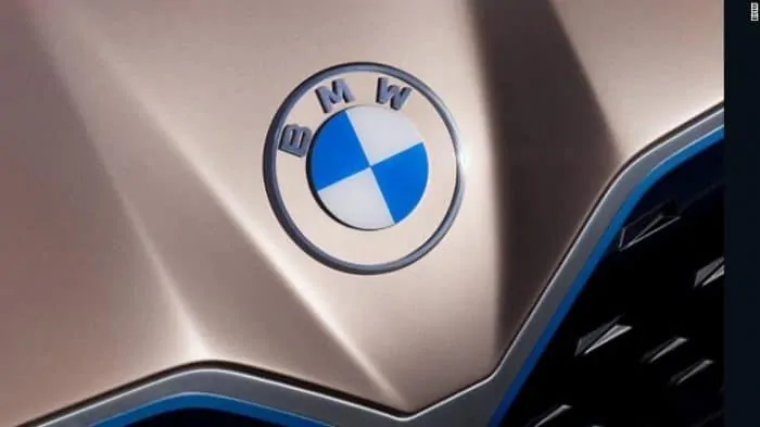
So I have a certain fondness for the brand, and am keen on all things logo and design. This is the new for 2020 BMW logo:
My first thought when I saw the new BMW logo: flat.
Indeed, gone are the shadows, and any sense of depth that was featured elegantly in the previous version.
Instead this one is definitively two dimensional.
The blue and white pie pieces in the interior circle are even more distinct now because everything else is a muted grey.

If anything this logo feels like it might have originated out of Apple or Google.
I recall when Apple did away with skeuomorphism in its interface design including logos for apps. That meant attempting to clone realism — say, a bookshelf for a reading app — was out, and flat, 2-D design was in. It was a clean modern look, as I think the new BMW logo is as well. Maybe a better fit, though, for a consumer electronics device or UI than a car.
In a way this update feels electric. I’m not sure why. Maybe it’s because early EVs always had (overly) modern design queues, possibly in an effort to make them feel like they were from the future. Most were way off the mark in my estimation. Tesla changed all that — both in design and sales.
Fitting enough the new 2020 BMW logo was first seen on the Concept i4. Again, an emphasis on BMW perhaps looking forward and modernizing in the process:
Still, I can’t help but feel this looks a bit piece-part. In the above image, the grey outer circle doesn’t really feel fully integrated with the inner circle and the blocky “BMW” typeface. It’s as if someone took some wooden parts from a kit and laid them out by hand on a tabletop.
My initial reaction is mixed. I’ll have to see it on the streets for a while to form a full opinion. Either way, it’s just a logo! Right!?
Change is almost always good. Any time we become accustomed to things — be it a favorite pair of jeans, a book we love to cozy up to, or, yes, even a logo for a brand — I’m always reminded of the “Who Moved My Cheese?” expression. In times of change, we are often out of sorts. Unhappy or uncomfortable. And over time, we adjust and possibly even come to love the new norm. (this is in no way a metaphor).
So bring on the future…


