Widgets were just one of many significant features introduced with iOS 14. But if you’re like me it’s one of the best — and long awaited — things to happen to the iPhone in a long time.
Spotify is among the latest to roll out its own widgets. And they’re available now (just be sure you’re on iOS 14 and have the latest version of the Spotify app, version 8.5.80 or higher).
The bad news?
They’re not the greatest.
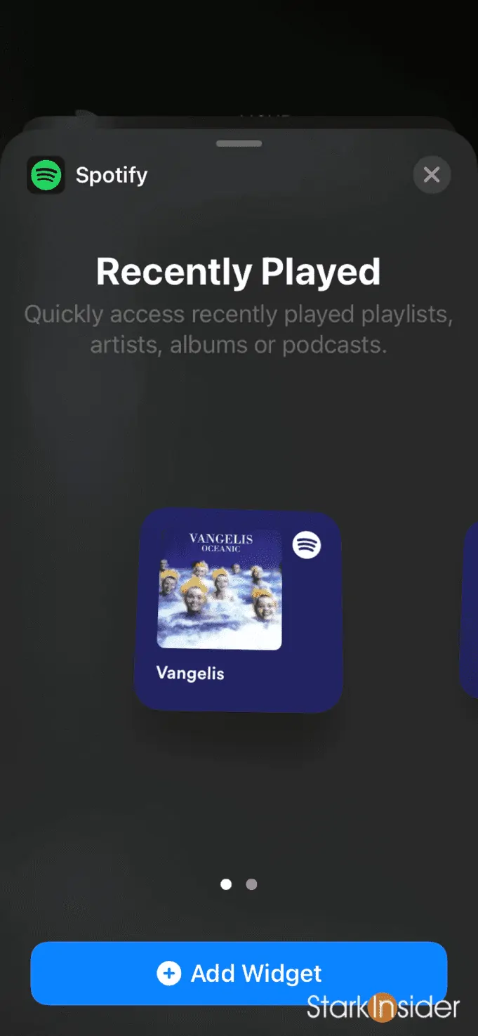
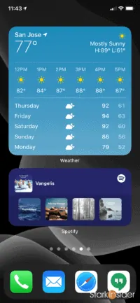
First, there’s only two widgets. And both are variations of “Recently Played”. Here’s the larger version on the home screen:
Basically it’s the same widget available in two sizes, a small square and a large rectangular version that fills the width of the iPhone screen.
I gave them a try on my iPhone XR and they work as you might expect. Simply long press somewhere on the home screen where you have some space. Then click the “+” icon in top left. Either scroll down to find Spotify or enter it in the widget search screen. There you’ll see the choices:
Tapping on the widget will bring you to a recently played playlist or album or artist.
In any case… it’s a start.
First we cried out loud for Spotify widgets. Then the team delivered us widgets. And then we cried out for more. I know, there’s just no winning in 2020.
As is typically the case, companies slowly roll out new features, assess user feedback, and iterate. No doubt more widgets will arrive, if slowly. There’s plenty of creative options. Playlists. Scheduling. Etc.
One thing that still surprises me with widgets on iOS 14 is the lack of a Now Playing widget for music and podcasts. I guess Apple thinks it’s easy enough to access that from the lockscreen or by swiping down to access the control center. Still Android has had this capability for a while (including, for instance, now playing widgets for Google Play Music and YouTube Music, and Spotify). So why not on iPhone too?
Meantime I’ll happily enjoy my Spotify widgets and be content that there are quite possibly bigger issues to worry about these days.


