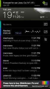
 Dubbed the intelligent home screen, SlideScreen gives Android users an alternative to the stock configuration. Thanks to Google’s open design, it’s one more reason Android fans have much to celebrate when it comes to choice. SlideScreen is the latest in a series of “home replacements” available on the Android Market that provide interesting customization and personalization. Others include Home++, Dxtop, Sweeterhome, and GDE. Yes, as you might have guessed, the developers are making marketing and naming decisions.
SlideScreen just came out of beta last night and is now available in both a free ad-sponsored or paid non-ad version for $6.99. I can’t imagine anyone tolerating ads though on their home screen for long. So if you like it, chances are you should buy it.
One thing that caught my eye about SlideScreen is its apparent BlackBerry-inspired design.
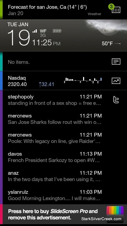
The main focus is on keeping you up-to-date on all that is happening in your world on one home screen. Little icons alert you to new emails, messages, missed calls, and more. But is SlideScreen ready to be my full-time user interface? I installed on it my Droid and gave it a go.
First, the good. It ran with no hitches, no crashes. At least in half a day of testing. Also, the setup is well executed, with a step-by-step guide that takes you through setting up Twitter accounts, weather location. In a matter of minutes it was up-and-running.
I also like the icons running down the right hand side of the home screen that update me on a number of important messages or pieces of information. I’m always looking for ways to work faster, be more productive. Especially when we’re running around town, up to San Francisco, over to Berkeley and back to San Jose again, I need quick access to our shared Gmail calendar and contacts. So I also appreciate that my upcoming appointments are displayed on the main panel.
Also, thumbs up for the fluid like response of the interface. With a flick of my finger across the center bar, panels scroll vertically smoothly with no lag. Move it to the top and you can then rotate through a full-screen display (filter view) of all the apps and information including: email, stocks, Google Reader, call log, messages, Gmail (other email services are not yet supported), Twitter and Calendar. Facebook is coming soon according to developer Larva Labs.
The apps are coded on the left with a sliver of color. It’s a slick, minimalist look that should appeal to BlackBerry purists that are used to an informative home screen without the need to scroll or swipe all over the place.
Now, the not so good. With SlideScreen you forgo Android’s multiple screens, accessible by swiping left and right. Instead to access your apps, you use the one touch icons on the home screen, or you click the menu button to access the complete list. This means you can’t use wallpaper (you can, you just won’t see it) and, more importantly, you can’t use all the wonderful widgets that really separate Android from the iPhone.
Also, as I mentioned, key services are still missing. You can only use Gmail (which for me is not an issue). Facebook is not yet available on the home screen (you can, of course, still access it via the native Android app).
Another nit, the font size (like a lot of Android apps) is too small, and non-adjustable.
Still, there is great potential here. It will be interesting to see what comes next. I expect the 2.0 version will be the one that might have a chance of occupying my Droid’s permanent home screen.


