The San Francisco Chronicle is the latest newspaper to jump into the iPad app fray. Yesterday, a digital version of the Hearst-owned daily was made available in the Apple App store. Content is free for existing customers, and $5.99 per month for new subscribers. I don’t subscribe to the Chron (although I visit the web site almost everyday) but a free 30-day trial is available. So I downloaded the app and gave it a spin.
What I found was an efficient, pleasant enough experience consistent with most newspaper apps out there (USA Today, NYT, etc.). Overall, I was impressed and consider this a must have for existing subscribers. Those seeking multimedia fireworks and uber-slick graphics will obviously want to look to magazine apps, but if you’re looking for decent local news around the Bay Area with strong writing and editorial, you’ll most likely really enjoy reading it on the iPad.
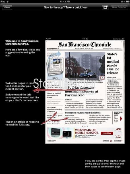
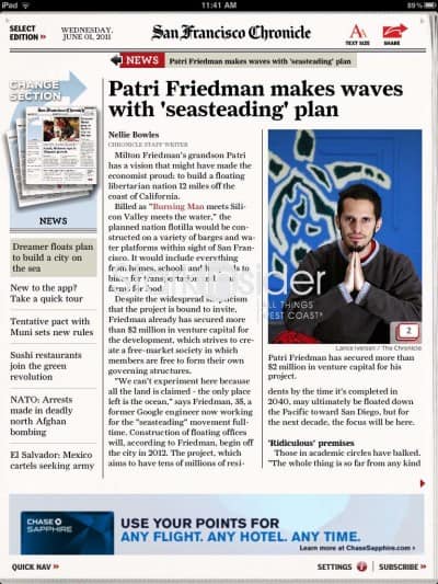
All the trademark iPad design hallmarks are here including swiping, pop-out image galleries, and multi-pane navigation. One thing I didn’t see: integrated videos – though it might just require more digging on my part to find them.
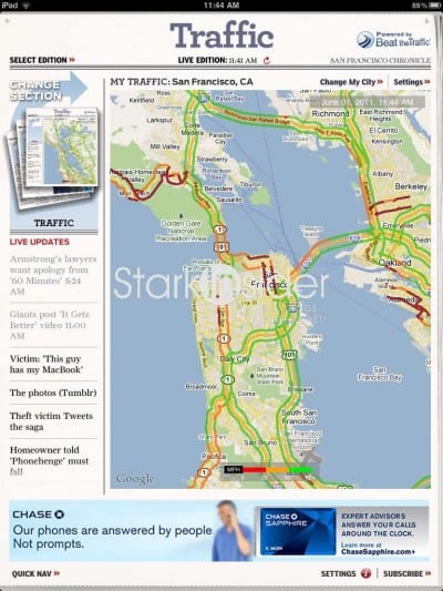
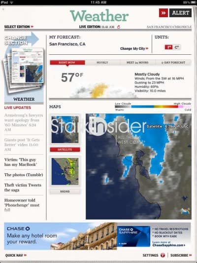
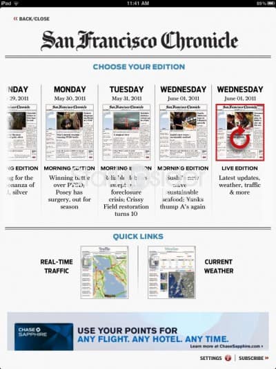
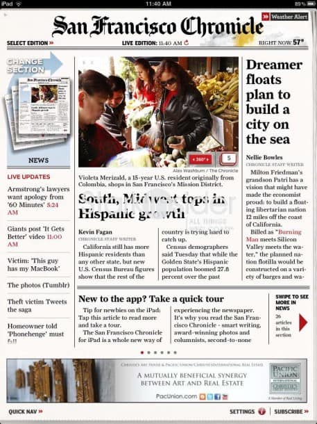
Like the fabulous Wall Street Journal app, the SF Chronicle is available in “editions”. Like their print counterparts these are static snapshots of the newspaper as it appeared first thing in the morning. The ideas it to mimic the traditional newspaper-reading experience. A “live edition” is also available that is refreshed throughout the day with the latest updates, weather and traffic. A button on the top-left opens a window that enables you to select an edition. From what I can tell during testing, the app provides access to the last 7 days. In addition, for those that want to read the paper on the go, and have limited or no Internet access, there is a “download and go” option which will copy the edition to your iPad. Using a slider you can specify how much data you want to bring down. It’s simple and I like the way this feature works.
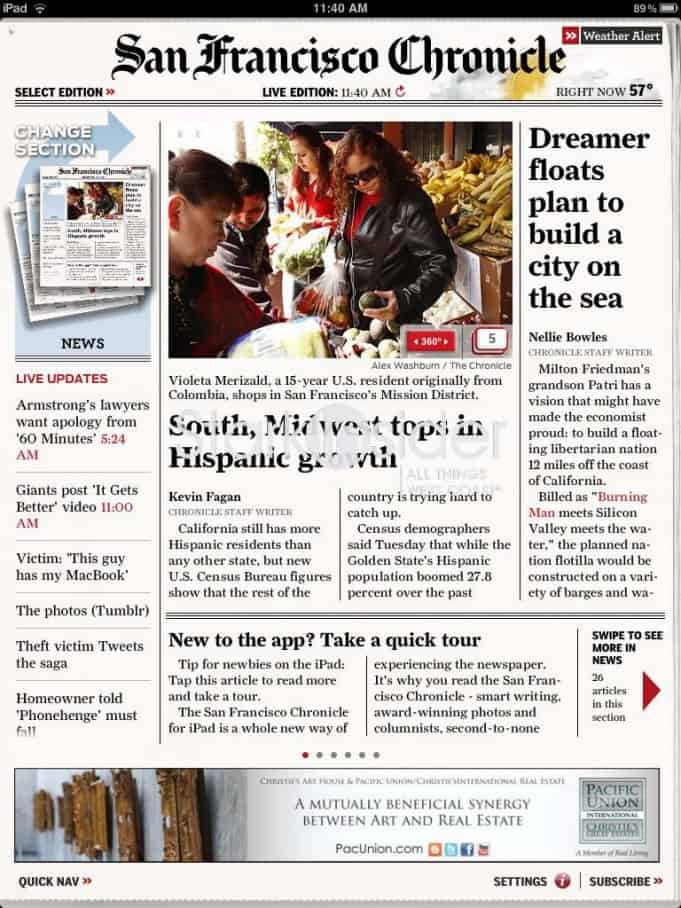
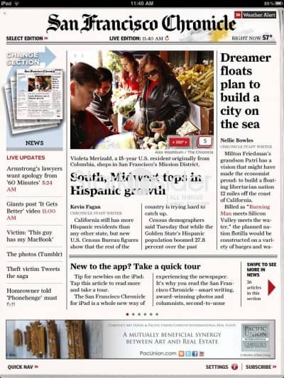
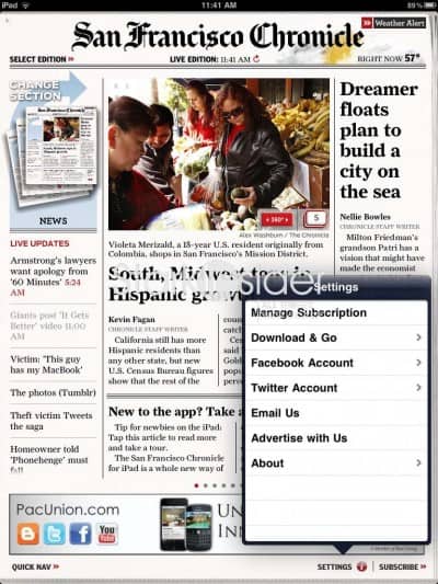
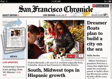
The front page has a classic aesthetic that conveys the Chronicle brand well. Three feature stories are stacked on the right with a large lead photo in the center. On the left is a series of live updates with links. The only ad is a small banner at the bottom. Swiping will take you deeper inside the respective section. In this case, there were 26 articles in “news.”
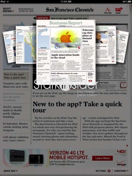
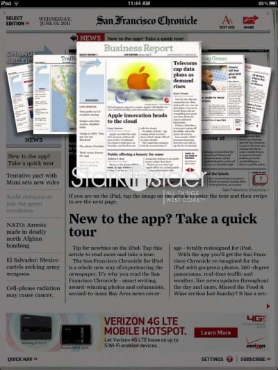
I particularly like the section browser. Click the icon on the left and you’re presented with a thumbnail carousel. Here you can jump to any of the 11 main sections (front page, Opinion, Bay Area, In Memory, Weather, Traffic, Business Report, Sporting Green, Datebook, SFiS, Blogger Report). Slick.
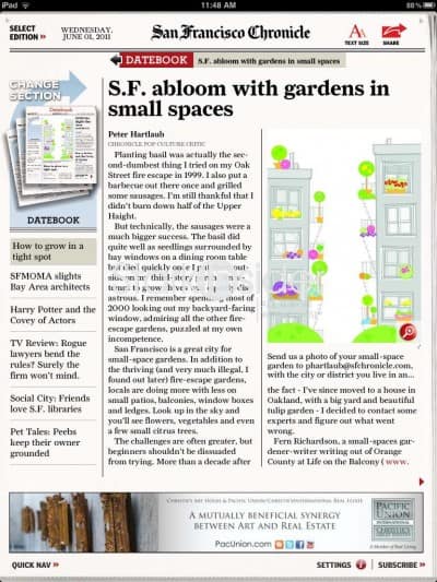
One design choice I find restricting is the decision to always display the left hand bar. It consumes about a quarter of the width of the iPad’s display when in vertical orientation. I can understand why it’s needed (navigation, quick links, etc.), but there are times when I’d like to see the full width used to better the overall experience. Perhaps it could be used for special features. It’s a minor nit, but worth pointing out.
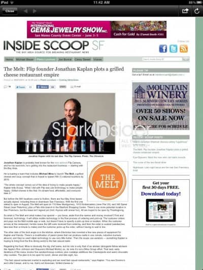
Perhaps not a Chron strong point, the app offers requisite social networking functions. Once you connect to your Facebook and Twitter accounts you can share articles to your heart’s content.
By no means is this app going to change the app world as we know it, nor does it set out to break new ground. What it does do, it does well. That is, it’s a an easy-to-use digital version of a classic, widely respected newspaper. I like it better than the Bay Area News app which functions more as a news aggregator/RSS reader for various local newspapers.
Whether the Hearst Corporation can transform this particular asset from the old school toss-on-the-driveway model to the new age of digital readers and tablets remains to be seen. That, of course, is the challenge an entire industry faces. But I can say that reading newspapers, like the Chronicle, on a tablet is a far more enjoyable and engaging experience. I won’t miss the ink stains anytime soon, and the savings in fuel and paper costs is a most welcome (and necessary) benefit.
iPad App: San Francisco Chronicle
4 out of 5 stars
Price: App is free, but requires subscription ($5.99 month/$59.99 year). A 30-day trial is available.
The Good: Easy to navigate. Snappy section browser with thumbnails. Last 7 days available in addition to a “live edition” with updates. Weather, traffic only a click away. Nice touch: the curled newspaper effect along the edges.
The Bad: Quarter of screen on left consumer by nav and updates bar that never disappears to allow for better use of space. Could not find any video content.
Bottom line: A must have app for any current Chronicle subscribers. Doesn’t break new ground, but a solid entry in the growing list of newspapers that are going digital.

